Panic Blog
Coda 2.6 with Touch Bar Support
By Cabel

We’re happy to announce the release of Coda to 2.6, which fixes a few bugs…
…and adds support for the swanky Touch Bar in the new MacBook Pro!
Coda’s Touch Bar support focused on the Editor/Preview, Files, and Sites views. Here are a few things you can do super easily on the Touch Bar, without having to take your fingers off the keyboard or move a pointer:
- Instantly switch between Editor and Preview
- Indent/outdent/comment lines
- Jump to a line
- Insert hex colors using a color picker (on the bar!)
- Create sites
- Switch between file browser views
- Create new files and folders
- Open the Web Inspector
- More!
We hope that you enjoy this nice new thing.
You can download Coda 2.6 here. (If you already have it, just auto-update.)
And if you haven’t bought it yet, buy it right here — try using Apple Pay!
Once you’ve given it a try, please let us know what features you’d like us to add to the Touch Bar in Coda!
The Future of Status Board
By Cabel

Short story: we’re discontinuing development of Status Board.
Status Board was something we’d always wanted. Originally a very nice web page designed to brighten up our office and act as our virtual water-cooler for company stats — as seen in this famous blog post — it evolved into a feature-packed, beautiful iOS app. We made it very easy to make beautiful boards, it worked great with video-out on a large screen (even despite the AV Adapter surprise), it offered lots of cool customizable modules, and it had a first-launch experience I still think is delightful to this day.
Unfortunately, while Status Board became a beloved friend to offices around the world, sales weren’t enough to sustain further development.
Why?
I think Status Board’s lack of success can be boiled down to a few things.
First, we had hoped to find a sweet spot between consumer and pro users, but the market for Status Board turned out to be almost entirely pro, which limits potential sales on iOS — as we’ve learned the hard way over the past couple of years, there’s not a lot of overlap right now between “pro” and “iOS”. Second, pro users are more likely to want a larger number of integrations with new services and data sources, something that’s hard to provide with limited revenue, which left the app “close but not quite” for many users. Finally, in the pro/corporate universe, we were simply on the wrong end of the overall “want a status board” budget: companies would buy a $3,000 display for our $10 app. Hmm, maybe we should’ve gone into production on LCD displays instead…
What Next?
Soon, we will remove Status Board from sale.
But! The good news for everyone that already has Status Board installed is that it will continue to work fine on your devices in the foreseeable future. There are a few things on the horizon to be aware of: due to API changes our Dropbox support will stop working in June of 2017, and we’ll continue to pay for our weather service as long as we can but sometime in late 2017 it will likely stop working also.
We’ve also just posted a final update, 2.0.13, that adds full iOS 10 support and fixes some bugs. If you use Status Board, make sure to grab that final update before the app is removed from sale in a couple of weeks! Update now!
And any customers who purchased Status Board in the last 30 days or so should contact us — Apple doesn’t provide us with the ability to process refunds directly, but we’ll do everything we can to help.
Thank You
For everyone who helped support Status Board during its tenure, it was a pleasure to work on this app, and we deeply appreciate your support, as always.
The Panic Sign
By Cabel

Image courtesy app: the human story.
After many many years of writing apps and doing things, Panic finally feels like a real company. Why now? Well, we put our name on a building. That’s right, we’re hittin’ the small big leagues, baby! But this isn’t just for show or ego — it’s a little bit cooler than that. Read on.
The Idea
As a kid growing up in Portland, I was always fascinated by a strange, bright, sometimes-flashing colored light on the top of the Standard Plaza building. You could see it crossing the bridge on the way to school — sometimes it’d be red, sometimes green, sometimes white. Weird.
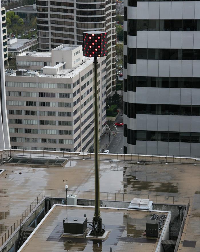
One day my dad told me the secret: it was a weather beacon. If the temperature was going to rise more than 5 degrees, it was red. Drop more than five degrees, white. Stay within five degrees, green. And if it’s flashing? Rain.
(Needless to say, the beacon almost exclusively flashes green.)
Something about this blew my mind and stuck with me forever. This little tidbit of knowledge felt like a secret between me and the building. This seemingly-decorative light did more than just just decorate, and I was pretty certain nobody else in my school (or later, my whole city) knew.
With the Panic Sign, I wanted to do something similar — not just feel cool about seeing our name on a thing but also build in a little magic for the city, something special for the observant, curious, and knowledgable. And I thought we could take it one step further: we’d put the magic in your hand.
The Build
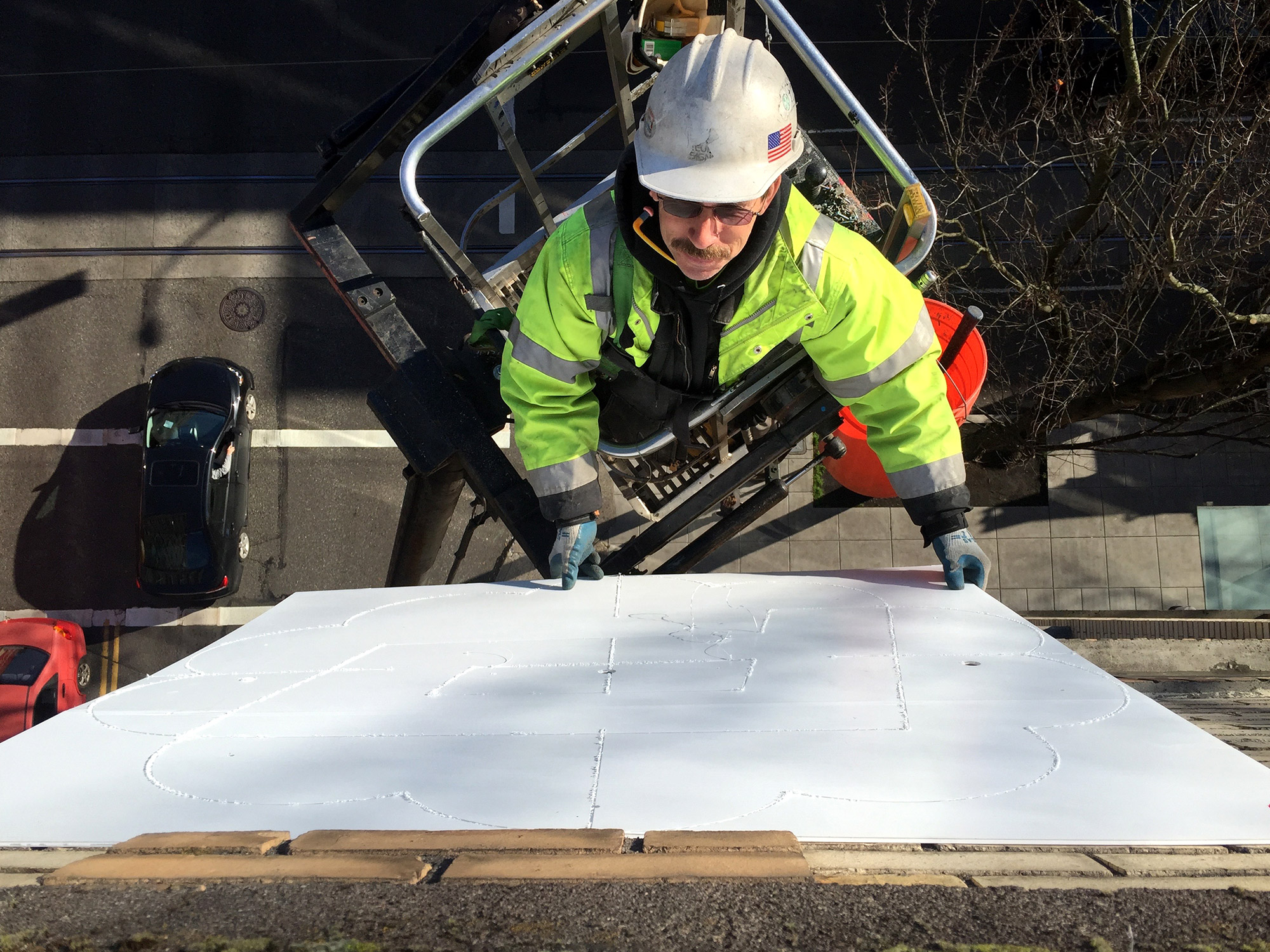
We hired Security Signs to fabricate and install the sign, for two reasons. First, they’ve been around since 1925 and have created some of my favorite signs in the city, from the ’50s swoops of Burlingame Fred Meyer to the unforgettable rotating loaf on top of Franz Bakery. And second, they were OK with our probably-unusual request: “can you build a sign but let us provide all of the internals, power supplies, and controllers?” (Their only stipulation: everything had to be UL approved!)
They got to work:
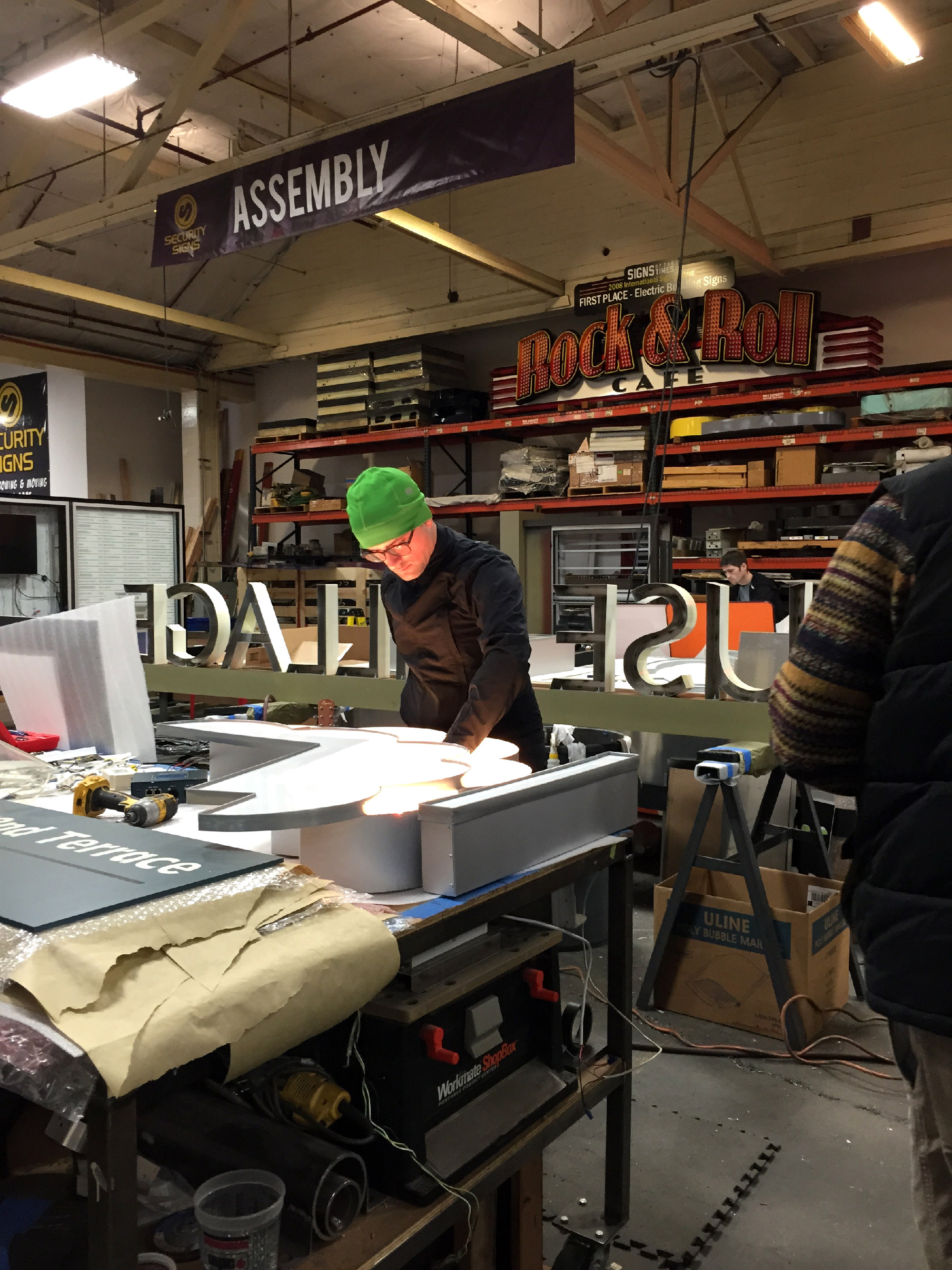
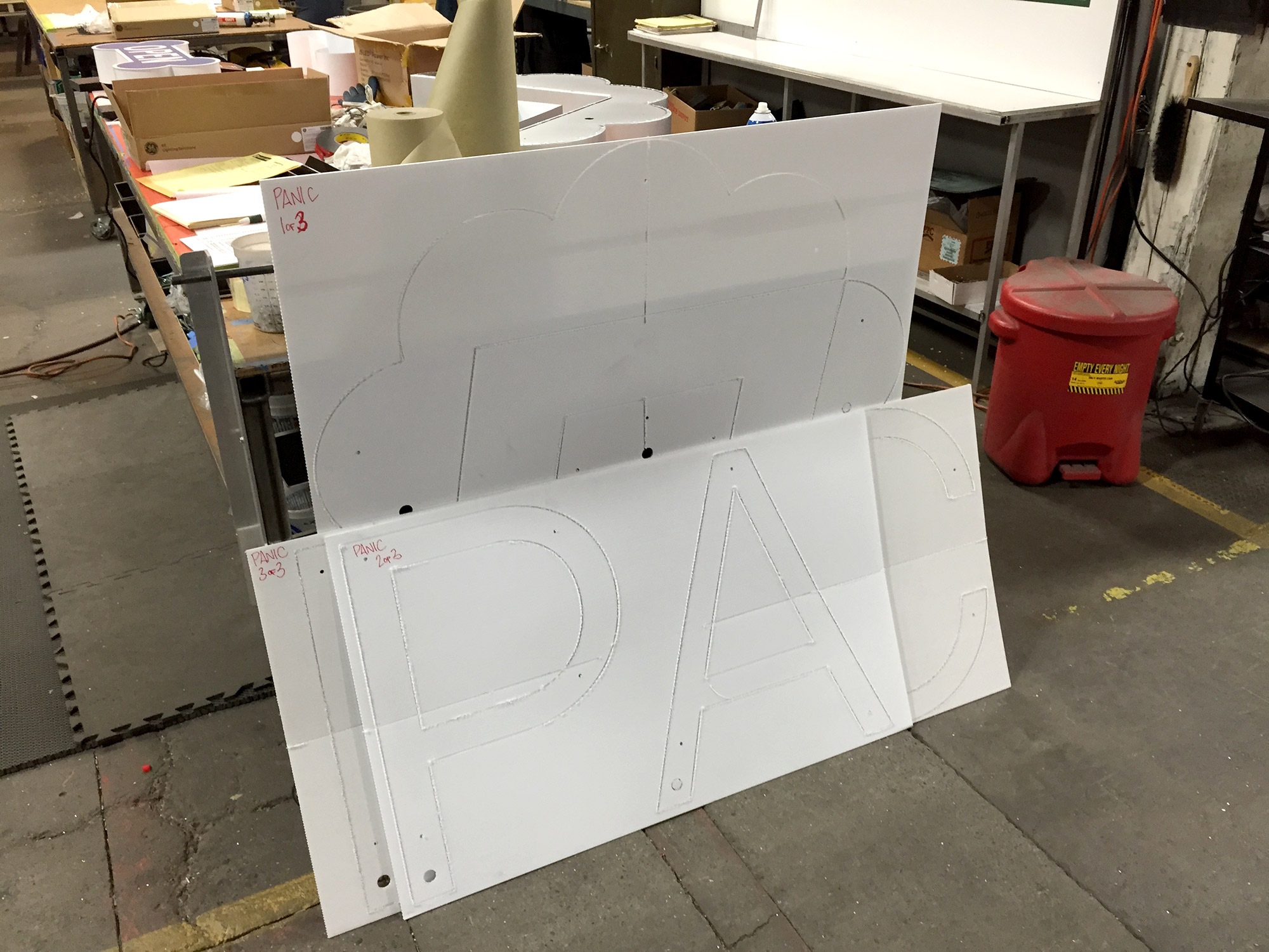
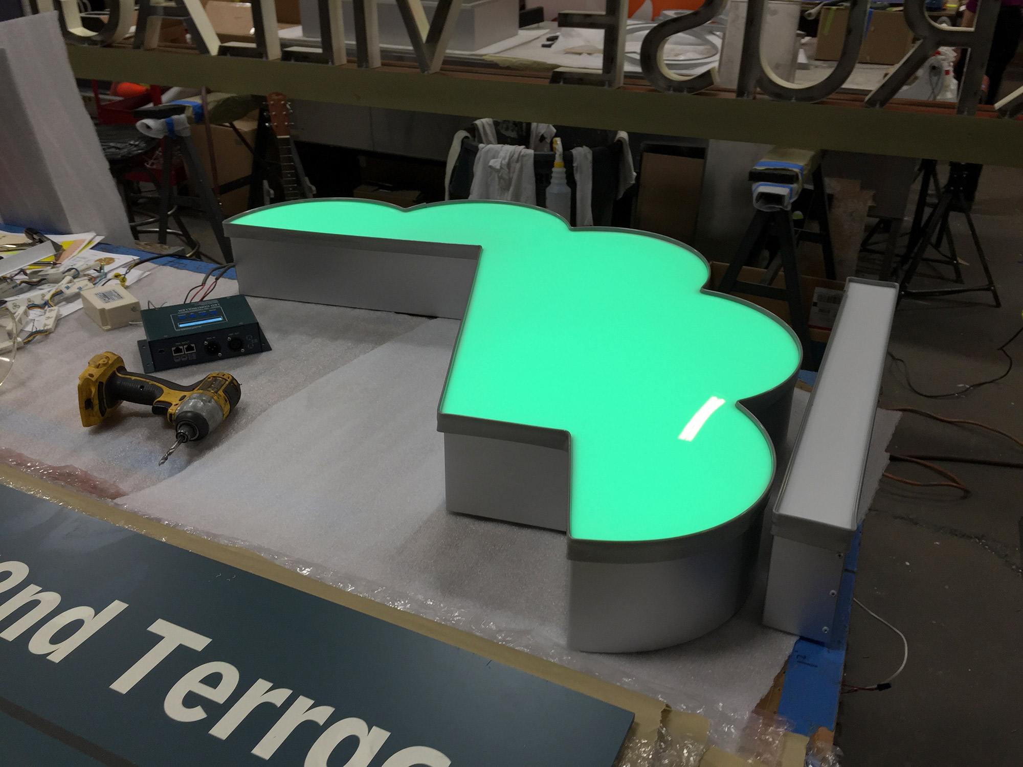
We put a test segment together with our controller and… it lit up ok!
The Install
Sadly, I can provide no pictures of me dangling precariously from a cherry picker, because this is one of those phases where you leave it to the professionals. It was amazing to watch — these folks know how to install a sign.
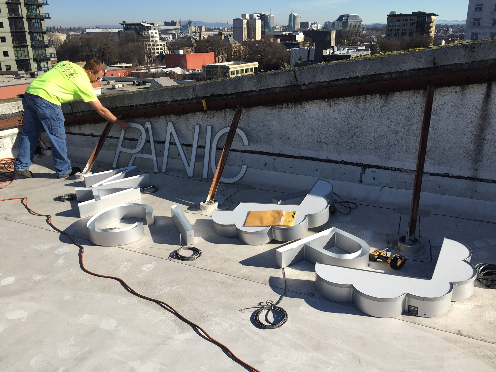
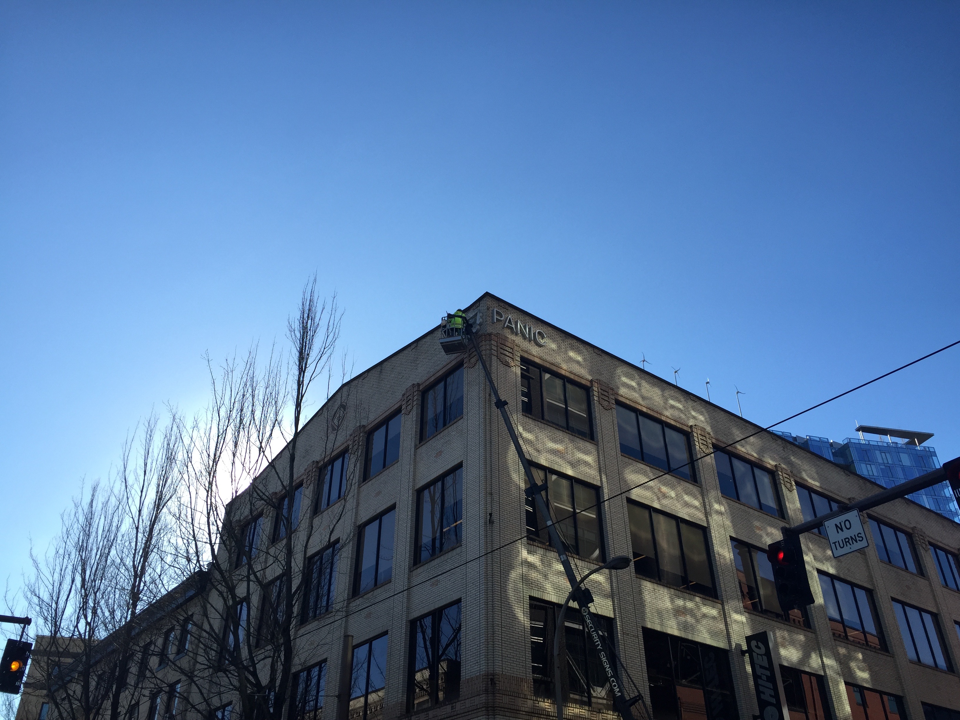
The Test
After a good day’s worth of installation, with everything in place, we hooked up a lot of stuff…
Nervously flipped the switch, and…
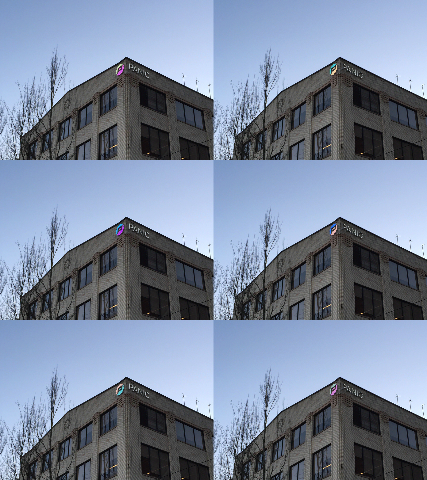
…success! Our Panic Sign lit up — and it could change colors!
Now, we just had to take it one step further…
The Magic
The idea was simple: wouldn’t it be cool if, at the touch of a button, you could change our sign?
Well, you can.
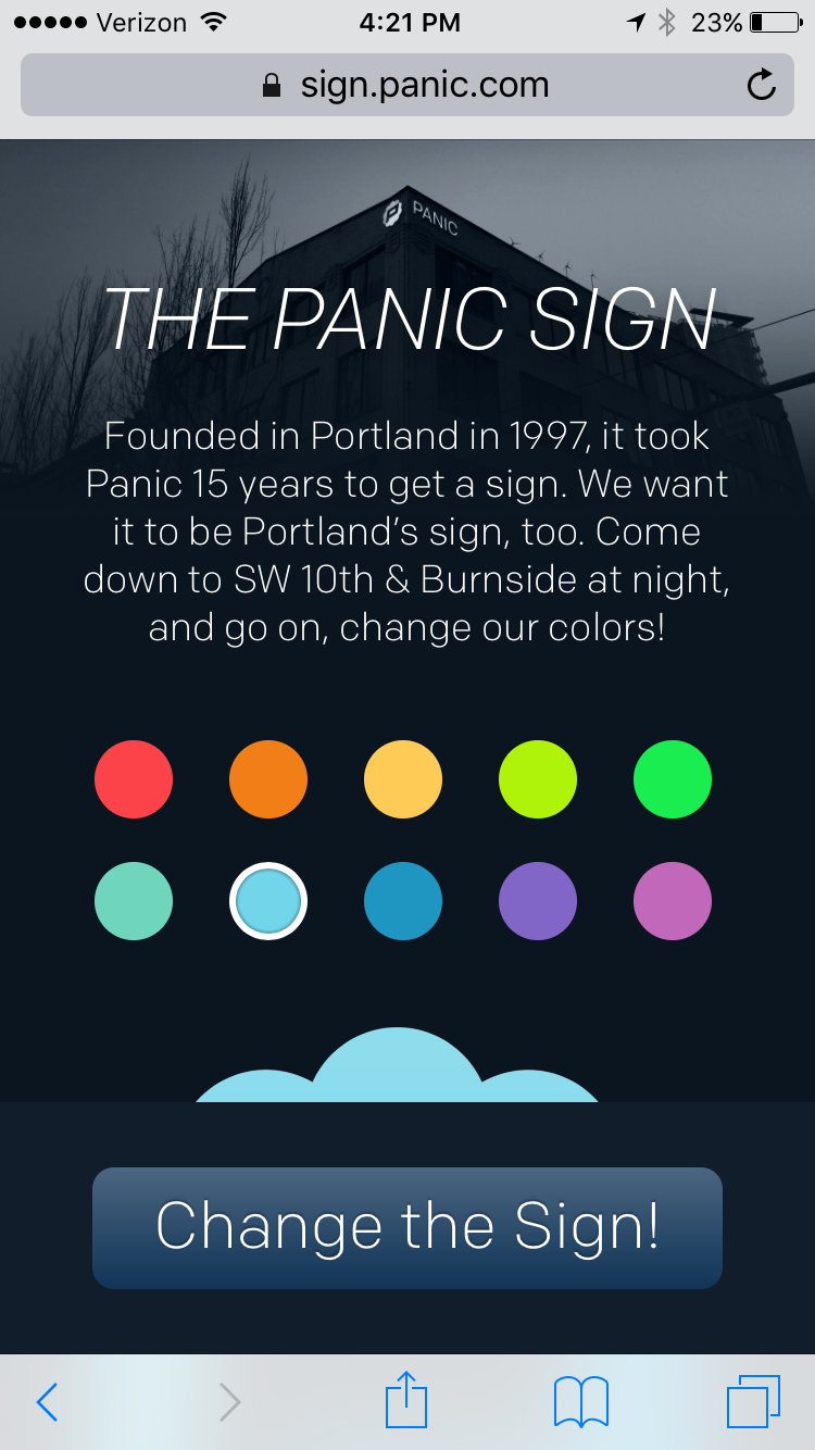
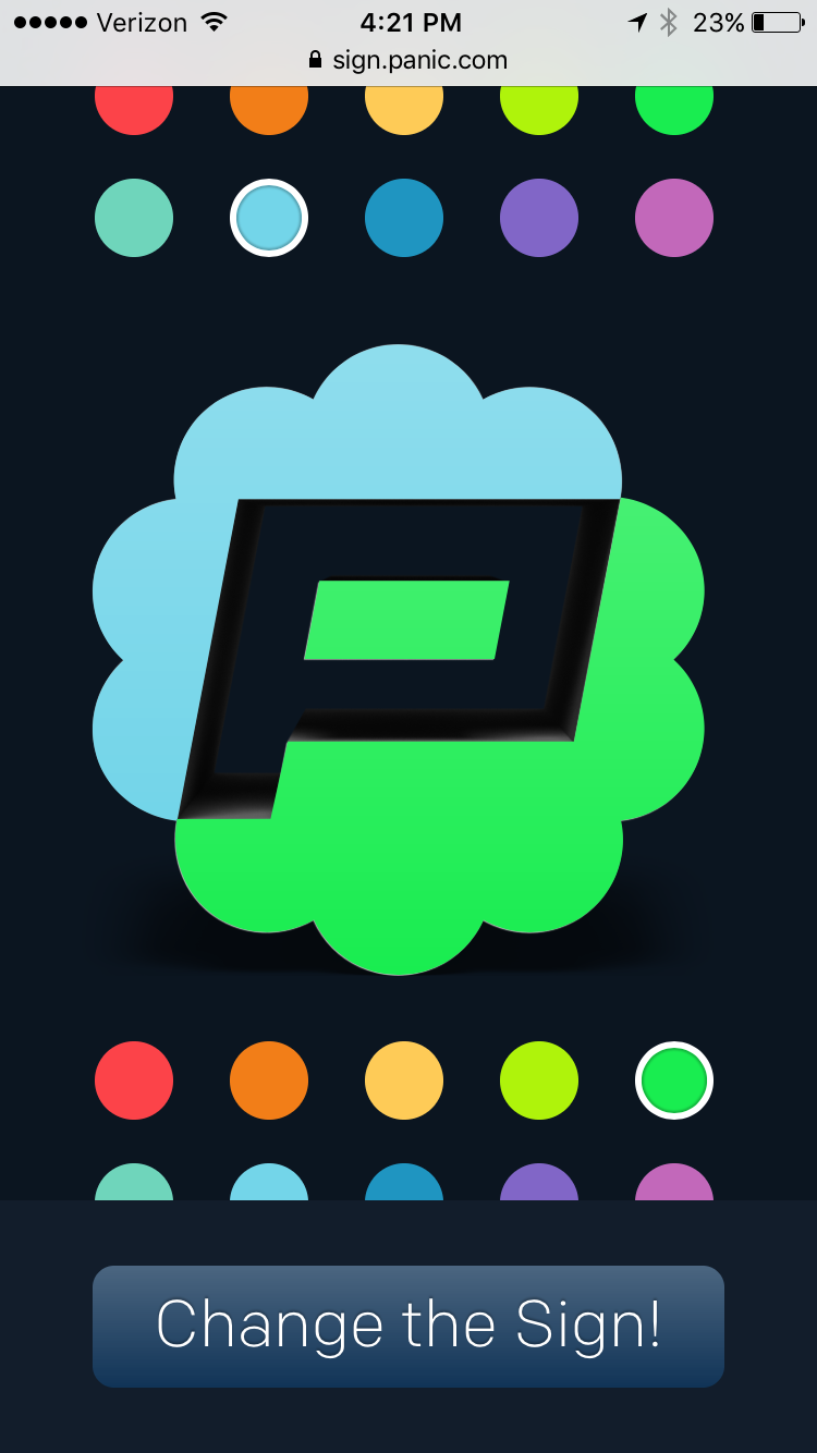
With a simple, clean web app, we’ve enabled anyone in the city to change the colors of our sign.
There’s something surprisingly special about standing on a street corner, tapping on your phone, and watching some colors you chose appear on a big brick building. I mean, don’t get me wrong, it’s not going to change the world, but it’ll change our colors.
(And just like my Standard Plaza weather beacon, I wonder — does it feel like magic because maybe nobody else around you knows how you did it?)
The Tech
Here’s the fun part (at least for nerdy dummies like me).
The first thing we had to do was take the Panic Palette — a set of colors we developed for website/apps/whatever — and try to convent them into similar colors for the RGB LEDs. This was basically just me sitting at my desk tweaking RGB values and eyeballing it on some lights. Once we had the colors set, it was time to build the controller rig.
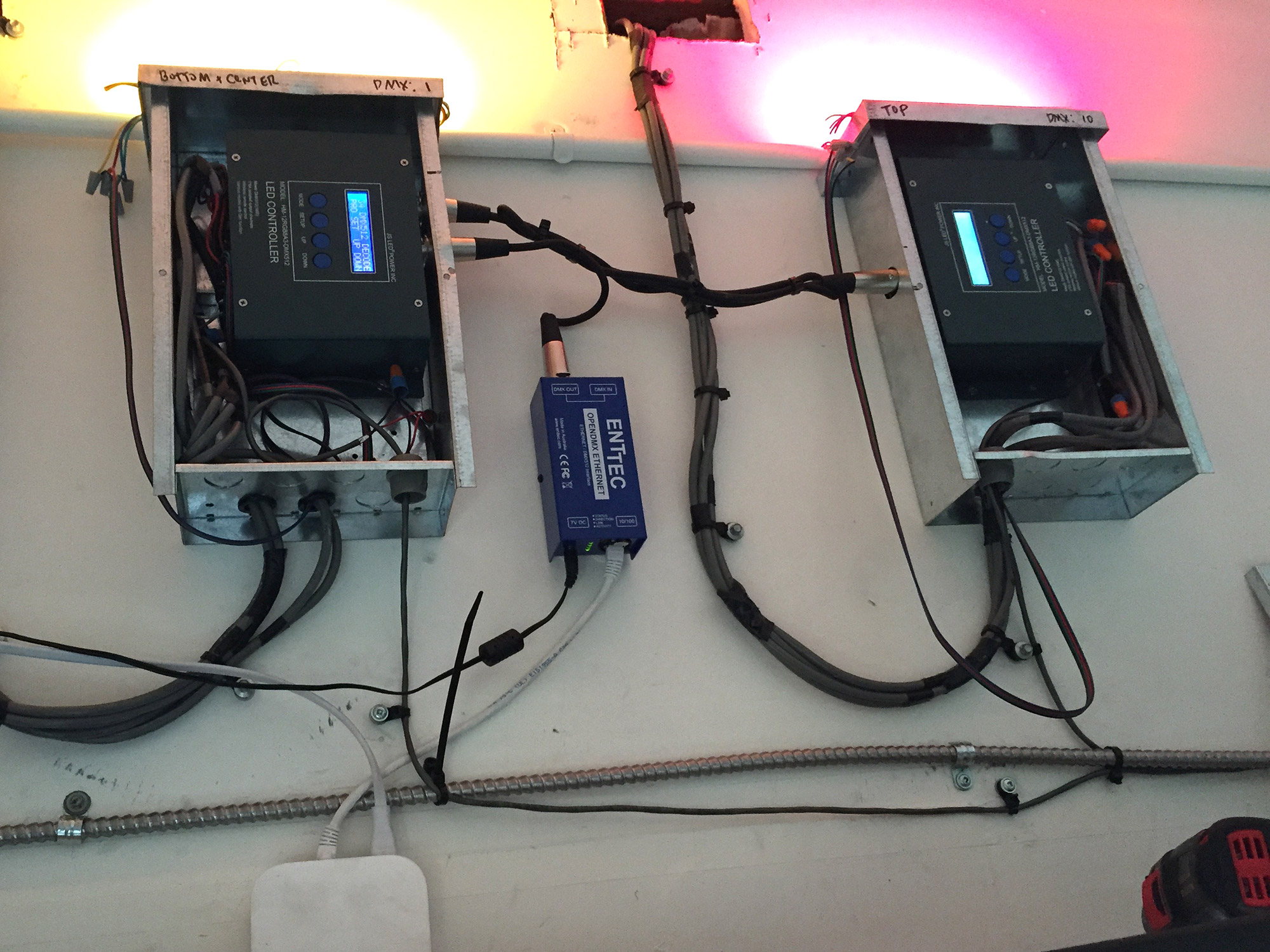
Here are the pieces of the puzzle:
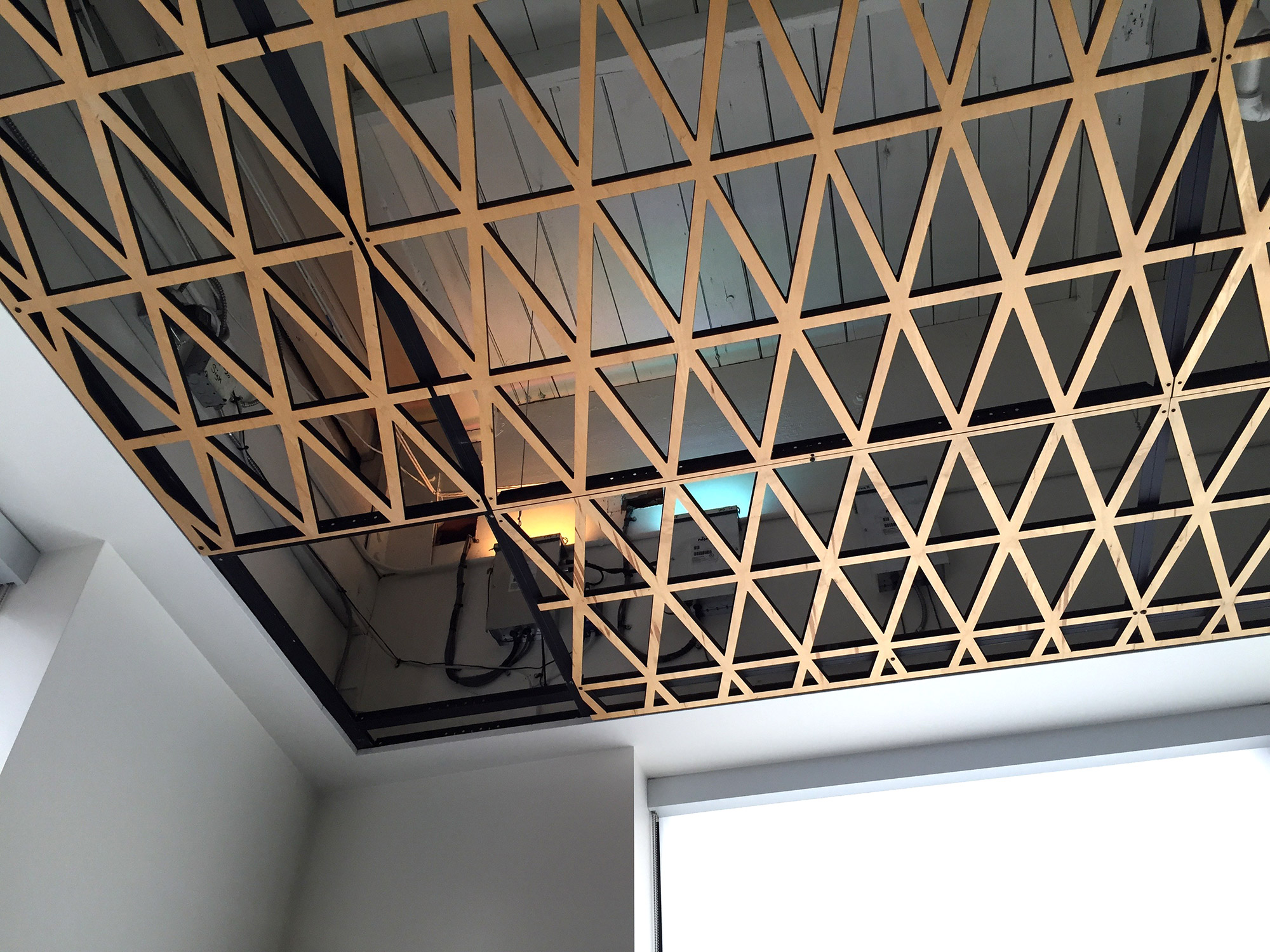
• RGB LEDs: places in the sign itself, we used JE-006M-04 from JS LED Corporation. (They’ve since been replaced by the JE-006M-06.) These modules were UL approved and super affordable — a real solid part.
• DMX Controllers. Something’s gotta make them lights change. Two HM-12RGB8A3-DMX512 controllers also from JS LED, one for each half of the sign. Each controller sits on a different DMX channel and waits for color changing instructions, then they drive the lights directly via separate RGB wires for each light strip. (The power supply powers the controller which in turn powers the lights. Also it’s so weird to me that DMX uses MIDI XLR cables.)
• Power Supplies. After running some cool math, we finally arrived at a 60 watt driver also from JS LED. Our first math was bad and we bought two 40 watt drivers — when we set the sign to “white” (full RGB active), everything overloaded and shut down. Oops. Turns out each “bag” of RGB lights = 42 watts at full RGB.
(I should note here there may be better/cheaper/other parts from other companies, but we just kind of rolled with JS LED since they were responsive and helpful!)
• Ethernet to DMX Bridge. To control the sign from a server, we needed to be able to send DMX commands. The Enttec OpenDMX Ethernet did the trick. You have to give it a static IP — no DHCP allowed — but it sits on your network listening for any “Art-Net” protocol packets to be sent over UDP. It converts them into DMX and sends them to the controllers.
• Airport Express. Because this whole rig is mounted in the ceiling with no ethernet jack nearby, we thought we’d use an Airport Express as a dumb ethernet bridge. But after months of insane debugging of sign sluggishness and eventual unresponsiveness, we eventually ran an ethernet line there and all of our problems immediately vanished and the signs responsiveness became instantaneous. Take heed! Use ethernet!
• Test Lights. We added a few tiny strips of test lights above the controller boxes, because debugging the sign previously involved phoning someone standing out on the street. Now we can, at a glance, make sure the lights are doing what we want. Plus it looks cool.
On the server end, I’ll let Steve explain:
Well, it's pretty simple! When the user taps the submit button on the web page, it sends an HTTP request to the "sign server", which is a tiny Node.js app running on its own port. The two sets of RGB color values chosen by the user are embedded in the request's URL.

The server breaks out those RGB values, does some sanity checking of them (each value must be an integer in the range 0-255), and performs some rate-limiting and other things to deter general abuse.

If the request looks good, the server uses the artnet Node module to craft a special UDP packet that gets sent to the Ethernet-to-DMX bridge to actually change the color on the LED modules. (In fact, it will send several of these packets to quickly and smoothly crossfade between the previous and new color selections.)

And that's it!
Now go out there and make your own cool sign! At the very least, one-up us by using using pixel-addressable RGB modules (think of the effects!) — that was my original plan but I couldn’t find any that were UL approved! Maybe they exist now…
The Intern
 For fun, we asked Carmen — one of our two amazing summer interns last year, Hi Carmen! We miss you! — to take our existing API and create a native iOS sign-changing app that we could all throw on our phones. She even went a couple of steps further: she wrote it in Swift, and she also wrote a watch app.
Carmen the student intern here.

I'm now a junior at Scripps College where I am majoring in computer science.  Somehow I was able to convince Cabel to take me as an intern, so I've spent my summer here Portland with the Panic team.

This Panic Sign project is what I spent a majority of my time on.  Using the app, or the watch extension, you can remotely select and change the color of the real life sign outside our building.

Before this project I had virtually no experience in iOS coding—let alone Xcode or swift.  But with heavy help from Heather, I was able to make this nifty project.  Although Xcode's auto layout sometimes made me want to cry, I enjoyed getting to do some front-end design work.  It was incredible to work with Panic not only because everyone here is ridiculously resourceful and smart, but also because everyone is outrageously nice and helpful.

Hope you enjoy changing the sign's colors as much as I enjoyed my summer with Panic.
Both her native app and the watch app turned out great:
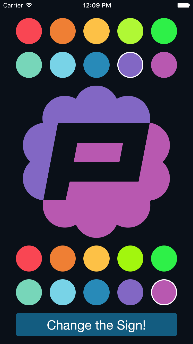
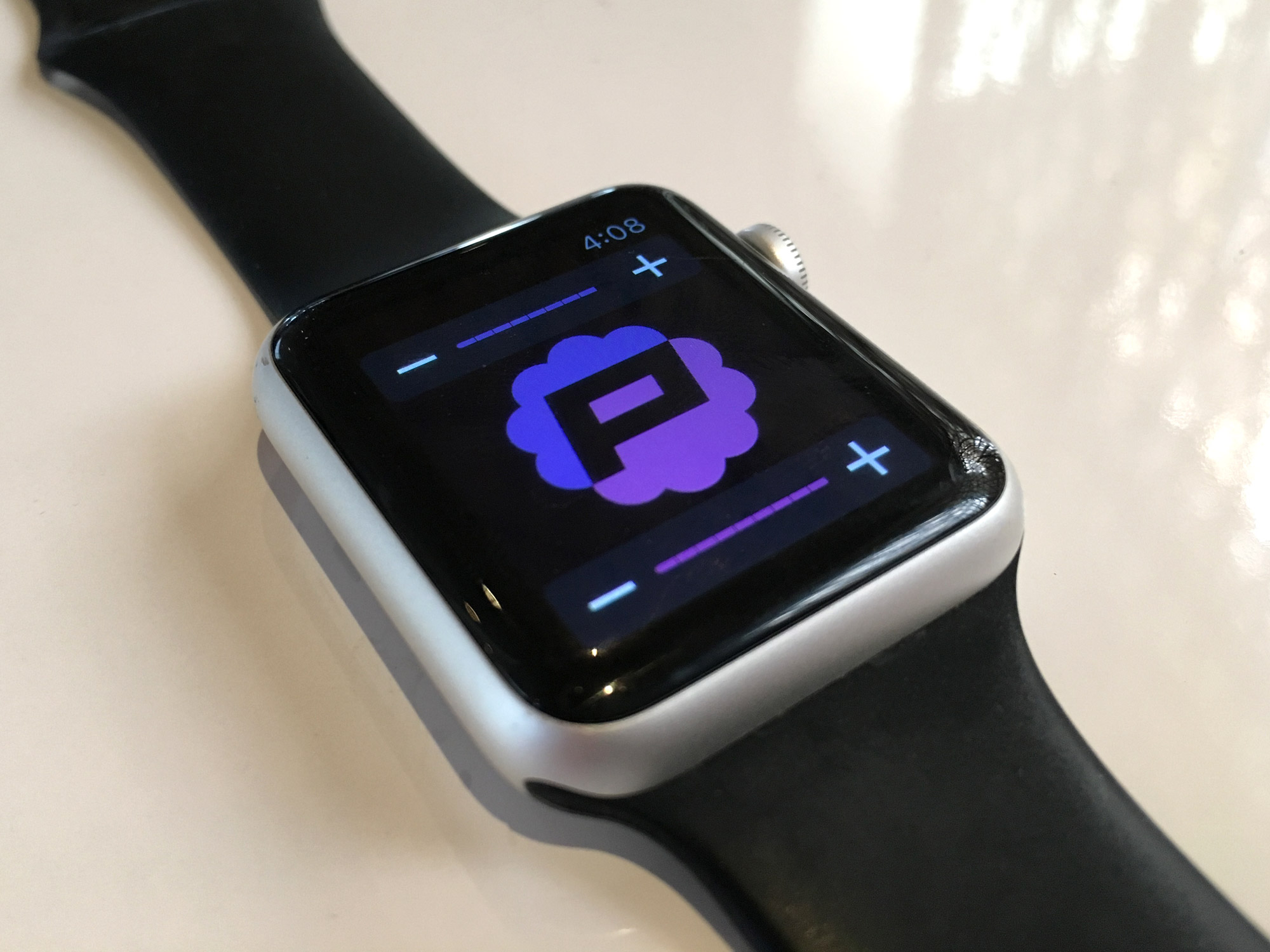
(Of course, we thought about submitting this “Panic Sign” app to the App Store but became worried Apple would reject it for not being “very useful”. While that would be a pretty valuable real-world intern lesson, instead we’ll try to find some other sneaky place to put this code!)
Now, It’s Yours
If you’re in Portland — maybe you’ve lived here forever, you just moved here from San Francisco, you’re visiting for a few weeks just for fun hopefully in the summertime, or something else — please come down to the corner of 11th and Burnside at night, that’s right by Powell’s books, stand across the street on the corner, and change our sign.
Impress your friends. Blow your child’s mind. Make a weird? cool? impression on a first date.
Just visit sign.panic.com, and enjoy.
Our sign is in your hands. Thanks for being a part of Panic.
Firewatch: One Month Later
By Cabel

The story of Campo Santo and Panic — and how we ended up being a part of a first-person adventure video game for Mac / PC / and PlayStation 4 — starts in 2013, and makes for interesting reading in retrospect:
How Panic got into video games with Campo Santo – Dave Tach, Polygon
Here we are, a little more than a month after Firewatch shipped. If not just for posterity, I wanted to take a moment to record some of what’s happened since.
Reviews
I can’t lie — my stomach was a wreck as launch day approached. Butterflies to the extreme, the kind of butterflies that keep you in bed a little too long, the kind I’m well familiar with whenever I tackle the unknown. But once Firewatch reviews started to appear, the world stopped spinning a little bit. Here were some of my favorite reviews:
IGN – Ryan McCaffrey
“It is among the very best of the first-person narrative genre, and it reminds us what video game storytelling is capable of in the right hands. It’s a game I can see coming back to every year or two just to revisit its beautiful sights and memorable characters – just like a good book.” 9.3
Rock Paper Shotgun – John Walker
“Firewatch is a rare and beautiful creation, that expands the possibilities for how a narrative game can be presented, without bombast or gimmick. It’s delicate, lovely, melancholy and wistful. And very, very funny. A masterful and entrancing experience.”
Polygon – Colin Campbell
“In the end, it feels like it’s about the emotions and cares of real people, not the animations of puppets.” 8.5
Wired – Chris Kohler
“It’s an emotional gut-punch all the way through, for many reasons, and largely a pleasure to explore and find yourself lost in—mentally, if not geographically. This is your next must-play story, another voyage to a place games don’t often take us.”
The Mary Sue – Marcy Cook
“Firewatch deals with love, loss, and how you put yourself together again after trauma. It does all this in a clever and engaging way that will have you emotionally connected to both Henry and Delilah. All of this is wrapped in a fun game that, once completed, I played over again.”
The Guardian – Nathan Ditum
“The writing is not just believable, it is likeable and funny. Henry and Delilah’s exchanges are full of the familiar tug and tarry of people getting to know each other, of playing and of flirting, and of reaching out to feel less alone.” ★★★★☆
There were also some cool write-ups about our genre and interviews with our team:
Firewatch and the Addictiveness of Lonely Video Games – David Sims, The Atlantic
‘Firewatch’ creators mix heartbreak and the creeps – Todd Martens, Los Angeles Times
Playing With Words – Laura Hudson, Slate
Video Games Where Hearts, Not Guns, Drive the Action – Chris Suellentrop, The New York Times
Then there were the incredible streamers — folks like Markiplier (who had a thoughtful and hilarious — poor Bernie! — experience), iHasCupquake (my niece’s favorite!), and Jacksepticeye who gave Firewatch their time. By my rough ‘n’ crummy math, there’s well over 15 million views (!) of Firewatch on YouTube, which is so hard to comprehend. (I also loved stumbling across the everyday streamers like EpicSoren, just people playing our game, and in this case, being really affected by it.)
In short: people’s response to Firewatch was overwhelming and amazing.

Sales
Panic’s metric for Firewatch’s success was probably calibrated a little bit differently than Campo Santo’s: of course we wanted to make the best possible game we could, but we also had made an investment we really hoped to recoup.
How’d it go? Firewatch’s budget, while huge for us, was modest for a game of its quality and scope, but we made our investment back in about one day. Firewatch has sold around 500,000 full-price copies in its first month. (It was even the top PlayStation Store digital download in February!) As an indie game, or heck, even as a “real” game, ok fine but not as a Call of Duty or Star Wars game, Firewatch can be considered a sales success.
We’re so grateful. And relieved. But mostly grateful.

Improvements
In many ways, shipping a game was like shipping an app. A lot felt very familiar: no matter how much testing you do on software (we all played through the game so many times on all platforms!) things are either going to be broken for some people or you’re going to think something isn’t a huge deal that other people will feel very much is a huge deal.
And again, like an app, the best thing you can do is be on the ball after launch, read tweets, read forums, work overtime, and fix the majority of the friction points as quickly as possible. So we fixed bugs. We watched streams for bugs. We read countless forum posts for bugs. And everybody at Campo Santo worked like crazy to make things even better. For example, a lot of people weren’t happy with the game’s performance on PlayStation 4, so the team cranked and quickly pushed out a PS4 patch that dramatically improved the PS4 experience.
And the great thing: we’re not quite done. We’re still fixing bugs. And we’re still working on ways to improve performance all across the board, including on PlayStation 4 and the Mac. There’s more to come.
(As a side note, there was one big post-launch mental difference for us at Panic: when you make a game, you’re telling a story, and there’s no “patch” in the world that will make a story perfect for everyone. We were fully prepared for this, but: some people really loved Firewatch’s ending, others didn’t. Both opinions are completely valid. But we wanted to tell a ‘real-life’ story, and those often end quietly and sadly. We’re just grateful people played enough to have an opinion!)

Fotodome
I don’t know if you heard, but Panic did an insane thing for Firewatch — at one point you find a disposable camera in the game, and at the end of the game, you can choose to upload the photos you took to our server.
Here’s a roll that was just uploaded today.
And then, if you want, you can actually order physical prints of the photos for $15, shipping included.
Now, at that price, this was never designed to be a massive profit center. We saw it as a very special opportunity to try something we’re not sure has ever been done before: give users a customized, personalized keepsake from a virtual journey, on demand, when they beat the game. What would that feel like?
So far, 214,802 photos have been uploaded, and June (thank you June!) has shipped out well over 1,000 sets.
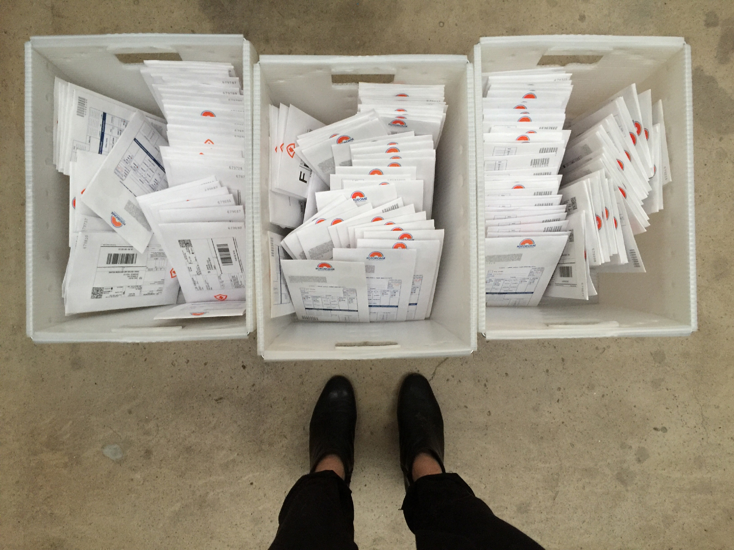
Here’s what it looks like when we ship an order:
[twitter_video id=”697888676546637824″ align=”center”]
(A little implementation trivia: those QR code separator sheets, when scanned, ‘type’ into the computer a special URL that launches our Endicia Mac shipping software and fills out the user’s shipping details. So not only do they help us separate out the print jobs, but with a single scan we print postage and a shipping label! Also, for you web devs, Patrick, who built the Fotodome website, describes it succinctly: “vagrant ubuntu ansible django nginx gunicorn redis rq pyqrcode cups (oh god cups) gutenprint stripe s3”. Ok!)
Here’s my favorite anecdote from making this crazy thing. We knew the conceit here had to be consistent: since the game takes place in 1989, this item has to feel like it came from 1989. Maybe it’d been lost in the mail for 27 years. So Neven and I spent a good deal of time dreaming up how it should look and feel, starting with what we would name our fictitious photo printing company:
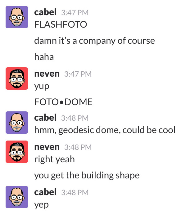
Once we decided on Fotodome — Neven drew a nice circle logo, I suggested we give it some aperture lines for a bit of a (not-exactly-Olly-Moss-level) visual pun, we both hunted for good period fonts — our new fiction was ready and we started to design the perfect retro photo packaging to sell it as authentic.
Later, Jake pointed out that, in the game, there’s a line of dialog from Delilah when you get the camera:
Try not to snap anything that would scar a photomat employee.
We knew what we had to do. Cissy was in the studio to record a few miscellaneous pick-up lines for Firewatch, and Sean had her very quickly record a brand-new replacement line:
Try not to snap anything that would scar a Fotodome employee.
And just like that, Fotodome was now a complete part of the world of Firewatch.
(I’ll take a moment here to point out just how lucky we were to have Cissy Jones as Delilah, and Rich Sommer as Henry. Such a significant amount of the game’s depth is solely thanks to their great acting delivering great writing.)
This whole thing wouldn’t have happened without people like Ben and Jake at Campo Santo who said “Sure, let’s give it a shot!” and worked overtime to design the in-game UI and put together all the uploading code. It was a true and very fulfilling collaboration.
And it’s been so cool seeing the response. We wanted the packaging to be a surprise, so we did very little promotion beforehand. Here’s Lazy Game Reviews doing an “unboxing” of their set of photos. Our presentation was so good, he thought Fotodome was a real company!

Writings
It’s nice to make a thing, but nothing has been as fulfilling in this process as watching people talk about the thing we made. Seeing people discuss the story, what it means to them, what they think happened, how it related to their lives, how it made them feel — another thing we’re not used to in the “I’d give it zero stars if I could until they add Mosh support!!!!” world of making apps.
Here is some of my favorite Firewatch writing. It’s safe to say this is spoiler city. But if you’ve played the game, you’ll probably enjoy reading these pieces:
Firewatch: Story Explanation and Analysis – Ewan Roxburgh, Press Start
Firewatch Am I A Good Man? Thoughts On Firewatch – Alec Meer, Rock Paper Shotgun
Learning to Love Nature with Firewatch – Gita Jackson, Paste
Firewatch Took Away Our Ability to be Good People, That’s Where it Shines – Olivia White, Polygon
So what about the men? A deeper look at Firewatch and Catherine – Katherine Cross, Gamasutra
On Firewatch – Dina Abou Karam
Firewatch, Projection and Isolation – Reid McCarter, Paste
How Firewatch Reminded Me to Remember – Jefferson Geiger, ZAM
Team Bucket – The Incomparable
10 Moments You May Have Missed In Firewatch – Hayley Williams, Kotaku
(Did I miss any good ones? Drop me a note in the comments!)

Fan Art
Once again, sorry to beat a dead comparison, but with very few hilarious exceptions, we don’t really get to enjoy much fan art when we release a new OS X file transfer client or whatever. It was extremely fun to see what people created after they played Firewatch (or watched a Firewatch stream). Here are some of my favorites.
(Click any piece of art to visit its creator.)
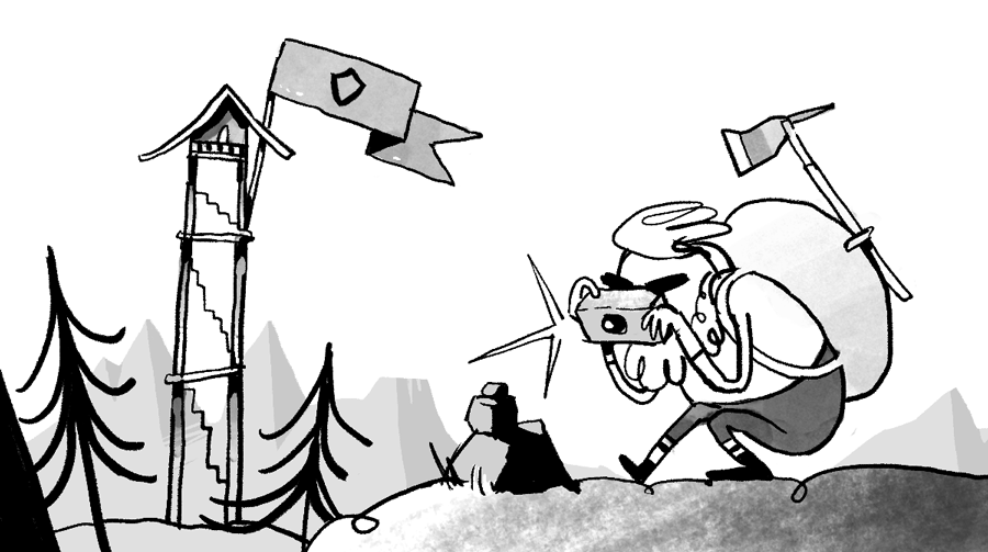

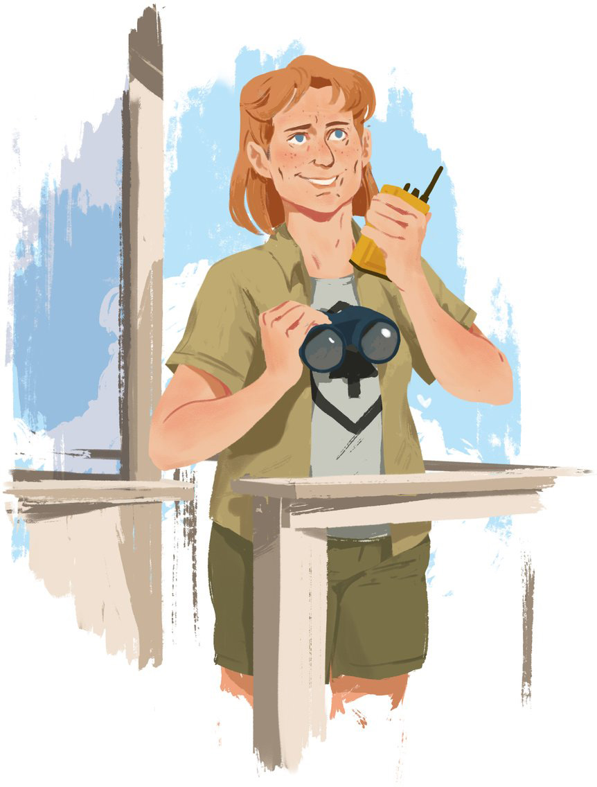
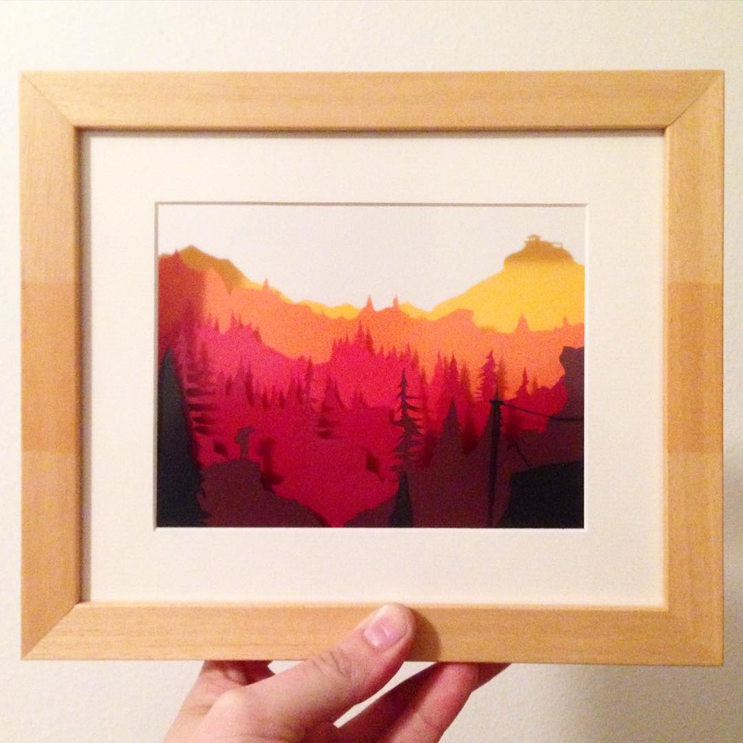
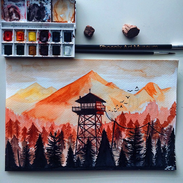
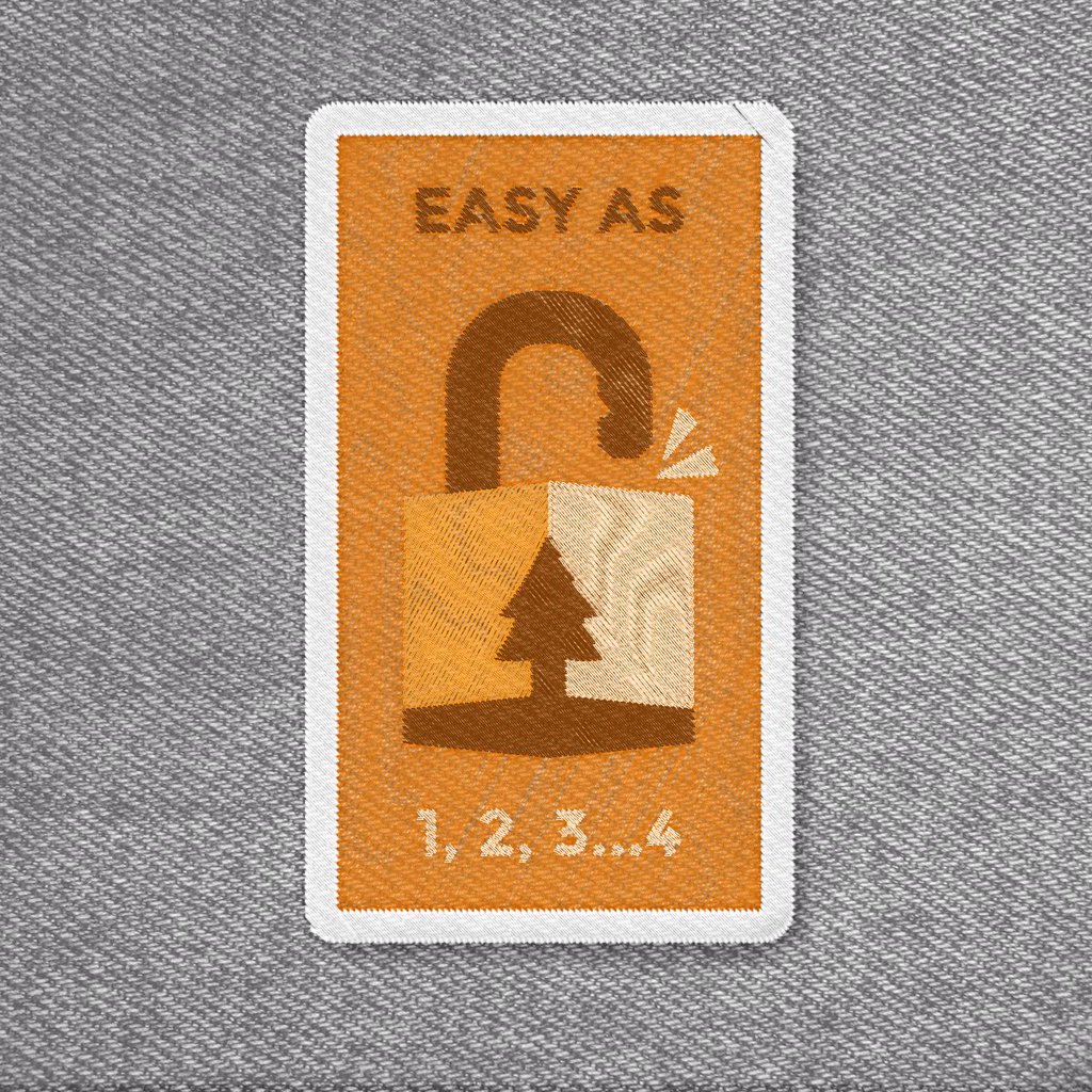
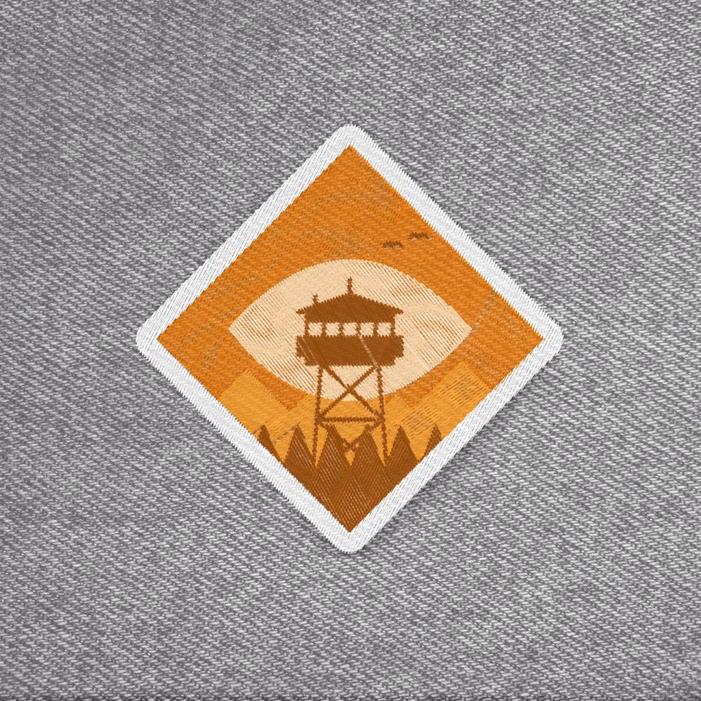
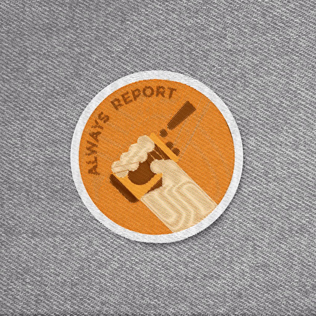
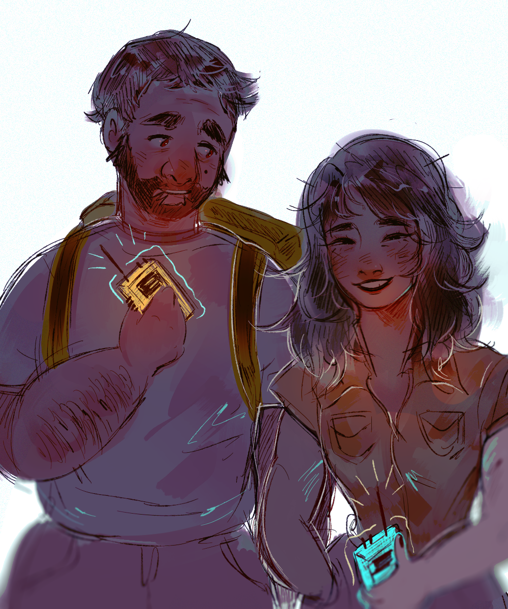
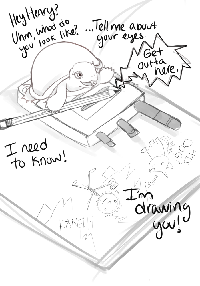
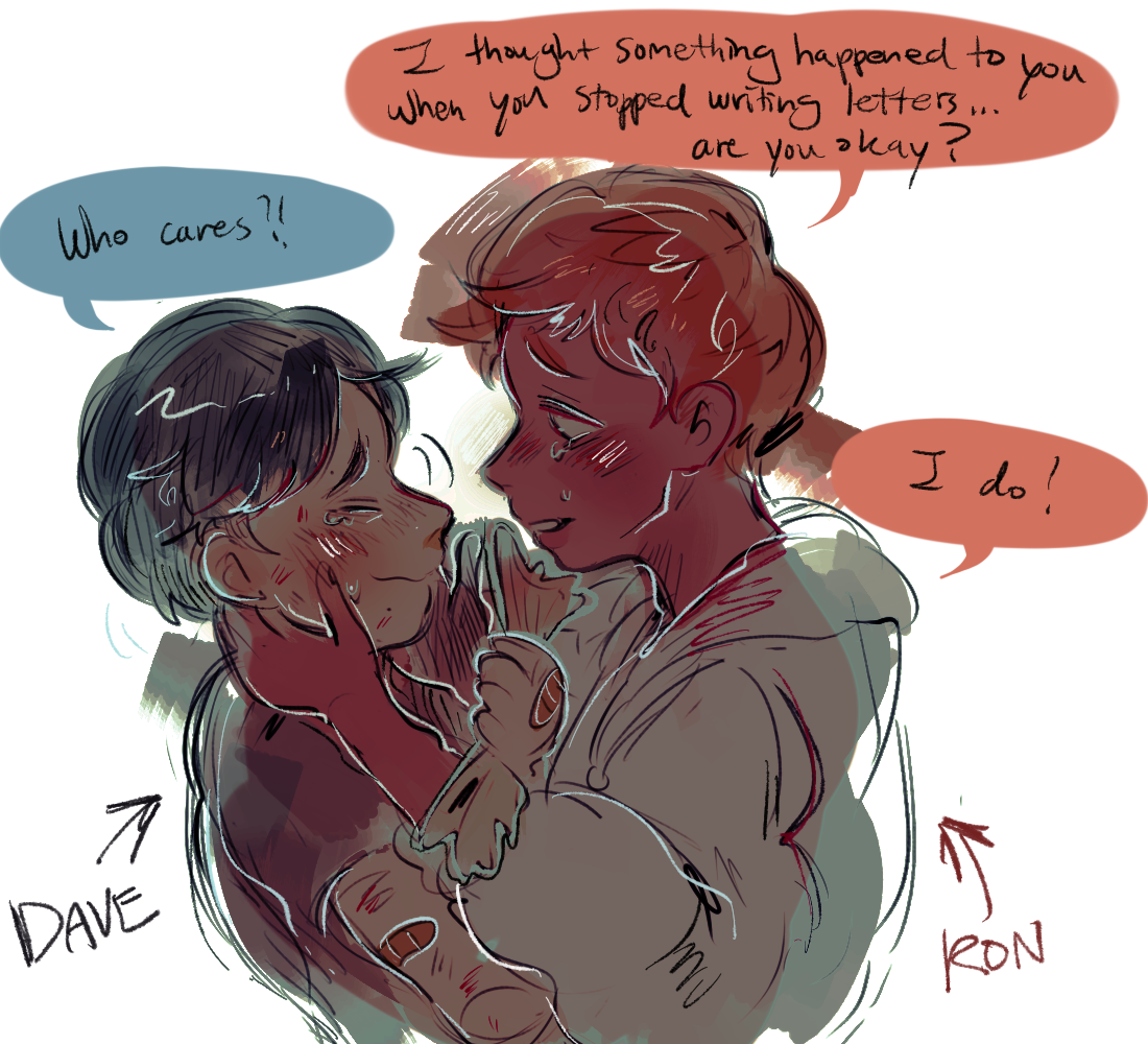


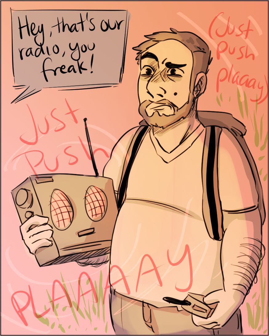
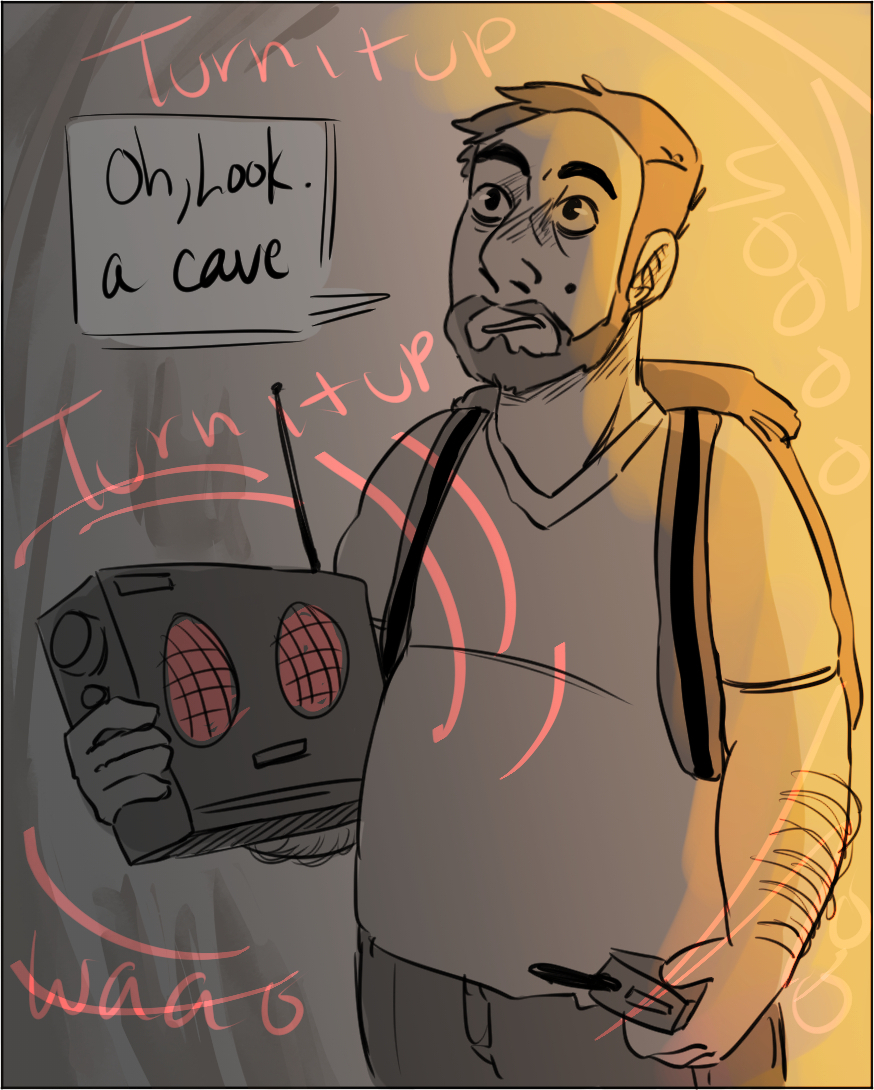
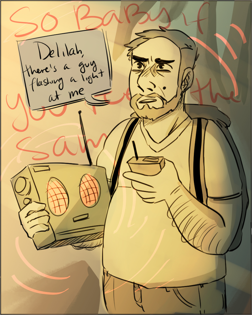
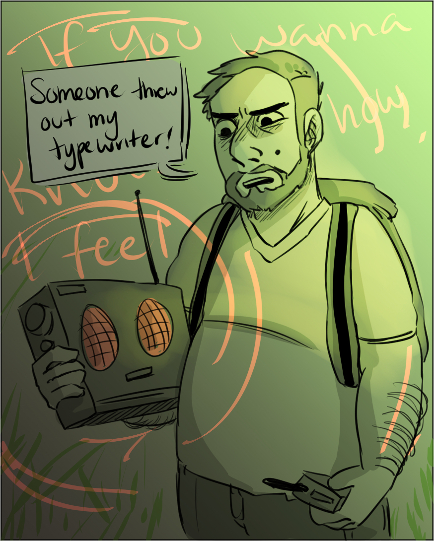
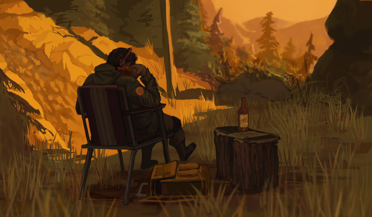
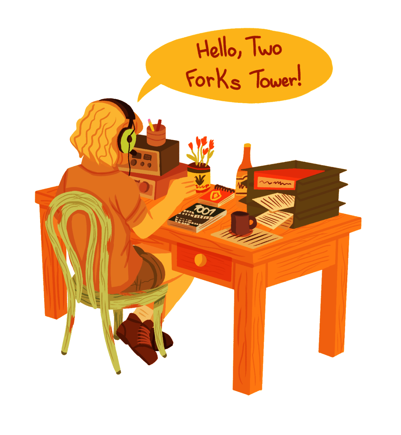
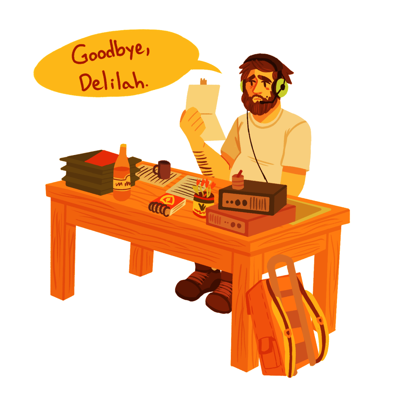
To everyone who took the time to write, draw, or play something inspired by Firewatch: thank you so much. It’s hard to overstate what it’s meant to all of us.

Notes
• Music licensing for the end-credits song was a funny challenge for us. I figured it all out — how to find the publisher(s) of a song, how to find who owns the master recording of a song, how to find the right contacts at those two companies to start negotiations to license — but no matter how many voicemails I left, one side wouldn’t call me back. I ended up hiring a licensing expert, who contacted the same people I found, and got it done in a couple of days. ? LA: It’s Who You Know™.
• Most of our marketing dollars went towards our super-nuts preview center at last year’s GDC. But it seemed to be really effective — we still hear people talk about it — and I think it helped set a tone of “oh, this game is the real deal”.
• One thing that I’d like to appreciate for a moment: the nice people at Sony and Valve who helped us throughout. There were a lot of unexpected bumps — a surprise Steam sale during our launch, the delicate business of navigating Sony certification — but the people behind both of these companies were extremely helpful and supportive, not to mention excited about our game.
• Keeping the “Twine Intro” a secret was tricky, but rewarding. We didn’t let preview streamers or press write about it, we never showed it at events, and the only people who learned of it before launch was a packed house at Pixar. In a world where we know everything about games before they come out, it’s awesome to hold back a things or two — surprises are good.
• (My favorite inside-joke story from production will hopefully be told in a future edition of the Campo Santo Quarterly. I’ll update this post when that tale is told.)

Ending
So the day after Firewatch ships, Steve and I fly down to San Francisco and head to Thee Parkside, a tiny little dive bar that shares a wall with Campo’s office. We drink and joke and eat a lot of corn dogs and I profusely thank everyone on the team, one by one, probably a little bit too emotionally (but I really meant it!), thanking them for their sacrifices, their creativity, their hard work, their brilliance. Sean Vanaman and Jake Rodkin of Campo get up and give a real nice speech, which is never easy, to everyone in the room doing the same, and it’s lovely. All of us find ourselves in the same weird afterglow of actually having done it, something I think feels weird and almost hilarious to all of us. How did this happen? What are the odds? We made this thing. So I give Sean a hug, and he leans in and says “let’s do this again.” That’s how Firewatch really ends.

(Our sincere thanks to everyone at Campo Santo for everything. Sean, Jake, Jane, Chris, Olly, Ben, James, Patrick, Nels, Gabe, Will, and I guess even Paolo — it was a pleasure getting to know you, and making something with you.)
The 2015 Panic Report
By Cabel

The complete Panic Family, circa 2015.
Welcome to the 19th year of Panic.
That’s one heaping teaspoon of life-time, but you know what? It doesn’t feel like it. I think it’s because things at Panic are always evolving — gradually evolving, but evolving still, like any good business. Things are always being learned. Ideas are always being tested. You’re treading water in some areas, but not in others. There’s enough change that each year has a certain “feeling”, a certain texture that can only be felt in retrospect. I would describe 2015’s texture as a little nutty, mostly smooth, yet significantly chewy.
I already went off the rails. Let me try again.
In 2015, we watched our processes and systems improve dramatically as our talented team took ownership of parts of our puzzle that suited them best. We got an all-in crash-course on the business and creative challenges of developing a cross-platform video game, something we’ve always wanted to attempt. We saw some experimental notions get put on hold, while others expanded. And we shipped a couple of great new apps and stretched our creativity. It was, all told, a great year.
Here’s a look back at 2015, and a look forward to 2016.
Releases
In 2015 we released two significant new apps:
This was an incredible, top-to-bottom overhaul to Coda for iOS — which we now just call “Coda” (but for iOS). A significant amount of work went into adding new features and improving the user interface, making Coda a truly desktop-quality text editor that just so happens to fit on your iPad — and now, your iPhone. I’m incredibly proud of this product, and based on the product reviews, it’s clear that our customers appreciate it also.
Happily, Coda was chosen by Apple as an App Store Best of 2015 and landed in iMore’s Best of 2015.
We also updated Status Board dramatically with a brand new UI, new panel types, and a new revenue model — it’s free to download the app and try it, and you can unlock more panels if you like it. The cleaned up visuals and extra room for customization really improved the flexibility of this app.
Plus, there were some interesting side moments:
We put together a pretty amazing, highly-themed space to promote Firewatch during GDC and get buzz going for our game. People are still talking about it, so I think we did pretty good! Also it smelled nice.
The Panic Sign
We finally got a sign on our building — and made it interactive, rolling our own software to control DMX lighting via a web page. It’s a little something fun for Portland — and it feels amazing to watch a sign change before your very eyes. Until we finally do a blog post about this (lol), all you need to know is if you visit Portland, please come over and hit sign.panic.com on your mobile device.
Little Things
Our office lobby was finally redesigned. (The rest of the building hated it, it’s a funny story.) We spruced up our own space, adding a second conference room, freshening up some tired bits, replacing the new hand dryers in the bathroom, important stuff like that. Oh, Steve had another baby. We got a new accountant. And, of course, we released the revolutionary Apple Watch. Wait hang on that was Apple
Updates
Not only did we release great things, but I feel we demonstrated dramatic dedication to our apps — we released the most high-quality, bug-free updates in our history. To give you the scoop, I’ll hand this blog post over to Ashur, who is currently leading our QA/Release efforts and is largely responsible for keeping this machine rolling:
This might bake your noodle: we shipped 35 updates across all six Mac and iOS apps by the end of 2015.
2.5.2 2.0 2.1 2.0 4.4.10 1.2 2.5.3 2.0.1 2.1.1 2.0.1 1.3 2.5.4 2.0.2 2.1.2 2.0.2 1.3.1 2.5.5 2.1 2.1.3 2.0.3 2.5.6 2.1.1 2.0.4 2.5.7 2.1.2 2.0.5 2.5.8 2.0.6 2.5.9 2.0.7 2.5.10 2.0.8 2.5.11 2.5.12 2.5.13 This includes major 2.0 updates of both Status Board and Coda iOS, and a significant revamp of Prompt’s emulation internals. That’s three times as many as last year — and an average of one release every 1½ weeks. Mamma mía!
Here’s a little bit about our testing and release process.
Each of these releases required regression testing and verification that the changes we made didn’t inadvertently cause problems elsewhere. If we ship something embarrassing, I document the hell out of it and make sure we don’t do it again. As a result, every project repository now contains:
- Detailed documentation of tests designed to confirm core functionality behaves as expected
- A checklist to guide the tester which tests to perform for a given update.
Through these tests, we occasionally catch medium-to-large issues before they have a chance to escape into the wild. Hooray!
Bug verification and pre-release testing only capture part of QA’s involvement in the pipeline:
? Exploratory testing
? Helping to determine which fixes and features should land in a given update
? Verification and release testingAnd everything that pertains to moving a candidate build from Development through Release falls under the QA umbrella at Panic:
? Updating screenshots
✒️ Gathering, preparing and filing release notes
? Pushing dSYMs to Hockey
? Archiving release builds, for future update testing and historical purposes
? Submitting to iTunes Connect or preparing the website for direct downloadsSome of these tasks take just a few minutes, others take much longer. Regardless, I feel like we’ve really made great improvements to our process, and we have many more improvements planned for 2016.
Thanks, Ashur.
I’m continuously proud of the effort that goes into making sure our apps are the best they can be.
Challenges
Not everything can be smooth, of course. A couple things that we struggled with in 2015:
iOS Revenue. I brought this up last year and we still haven’t licked it. We had a change of heart — well, an experimental change of heart — and reduced the price of our iOS apps in 2015 to normalize them at $9.99 or less, thinking that was the upper limit and/or sweet spot for iOS app pricing. But it didn’t have a meaningful impact on sales.
More and more I’m beginning to think we simply made the wrong type of apps for iOS — we made professional tools that aren’t really “in demand” on that platform — and that price isn’t our problem, but interest is.
So, once again, we will investigate raising our iOS app prices in 2016, with two hopes: that the awesome customers that love and need these apps understand the incredible amount of work that goes into them and that these people are also willing to pay more for a quality professional app (whereas, say, the casual gamer would not).
Shelving a New App. One of our interesting app experiments — an app to share and discover music — was 95% done, had a beautiful interface and some interesting ideas, plus a complete server-side component… then got shelved. It wasn’t an easy decision. It was mostly worries about revenue — it doesn’t seem possible that you can charge money for a social app in 2016, since mass adoption is critical. And is advertising really a thing we want to do? This is maybe one of the only times I wished we were a startup — with a “release now, figure out how to make money later” culture — but we’re not. I feel terrible for all the excellent work that went into it for seemingly “nothing”. That said, I am still determined make something out of it. We’ll find a way. I said: we’ll find a way!!
Balancing. We always have a million ideas over here, but balancing “keep our current apps going” and “run and do something new” is an eternal challenge that we struggle with. Too many distractions and you lose focus. No explorations and you’ve got all your eggs in dangerously few baskets. We’d love to make another Mac app. We have to find a way to make this work.
Next
2016 is going to be an extremely interesting year for Panic. Coming up:
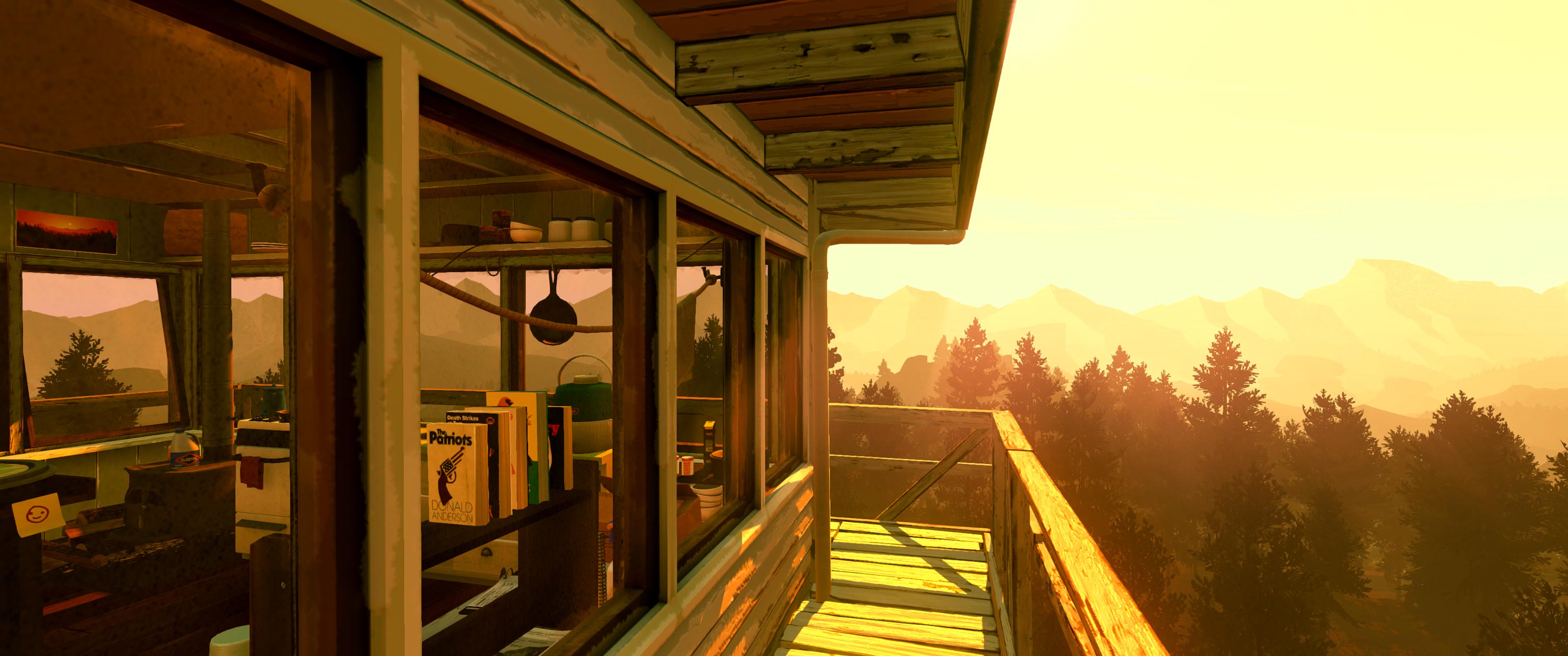
An actual screenshot of Firewatch running on a 21:9 ultra-widescreen monitor.
Firewatch. Holy smokes, it lands in two weeks: our first major video game, developed by Campo Santo (in co-operation with Panic), shipping on Mac, PC, and PlayStation 4. Can you believe that? And I’m really proud of it: it’s an incredible piece of work, in my humble opinion, a video game that unabashedly tells you a story with humor, heart, and beauty. The team at Campo did an amazing job building this game. We really hope it resonates with people. I’m nervous as all hell but it’s the excited kind of nervous.
It’s hard to overstate how much we’ve learned, and how Firewatch’s success (or failure!) could chart our future. Of course, our goal is to break even, flush with knowledge of a new industry. But if Firewatch does more than just break even, it opens up major questions for Panic: do we want to publish more games? It’s possible — it felt really rewarding ‘nurturing’ this game into existence. How do we do that and maintain focus on apps? What if we just lucked out with the greatest possible team for our first game and that will never happen again? And if we don’t recoup our investment, how does that impact our future? A lot of questions will be answered…
Prompt. A really great Prompt update is almost here, with a new tabs interface, split-screen support, iPad Pro layout, 3D touch, ECDSA host keys, and more. Hang tight, it shouldn’t be much longer!
Transmit. Later in the year should see a brand-new, major update to Transmit, that will increase speed, add Panic Sync, seriously expand protocol support, and more. A Transmit overhaul is long overdue and we are extremely excited to get this out to the world in 2016. (One open question: will we distribute it in the Mac App Store? Hmm…)
Coda Planning. We won’t ship a major new Coda in 2016. But that won’t stop us from having frequent meetings and discussions about the future of Coda. Coda needs to be torn down to the studs and radically re-thought and re-built for today’s web development landscape… while still retaining many of the core features that a large number of users love and rely on today to get their work done. While that’ll be difficult, we think we can crack it, and to be honest, it’s pretty fun and exciting to think about.
Experiments. Of course, we’ve still got some people working on crazy experiments and bold new ideas.
And who knows what else — there’s still tons of stuff we’d love to add to all of our apps!

Some of us goofs during our annual XOXO party.
Thanks
As always, thank you for being a Panic customer, and a Panic fan. Thank you for allowing us to run this company making neat things that you hopefully like. And thanks for giving us the chance to do what we love every day. I hope that our journey can also kind-of feel like your journey, because you’ve been with us every step of the way.
And of course, I must give my deepest and most appreciative thanks to the hard-working men and women here at Panic who care about one thing: making great products. I am so fortunate to work with this group of people.
Now let’s get out there and make the best of 2016!
(PS. Another change: Patrick, one of our iOS/Mac engineers well versed in modern web development will be off on a year of globe-trotting travel. Jealous. If you know anyone who can fill those shoes, e-mail jobs@panic.com!)