Here’s a story you’ve probably not heard before.
The Beginning
 As you probably know, in the late 70’s Panic was writing VAX/VMS automation code for the textile industry. Cotton attenuators, zipper sublimation, loom dynamics, that sort of thing. What you might not know is that, once the early 80’s arrived, Panic got hit hard with two things: unkempt mutton chops, and Pac-Man Fever.
More precisely, Atari 2600 Pac-Man Fever. Programmed by Todd Frye over the course of mere weeks, and only very generally resembling the Pac-Man arcade title we all loved at the time, the cartridge nonetheless went on to sell nearly 7 million units.
7 million.. at $30 a unit.. yes, when you’ve been charging basic consulting fees for months of mainframe code, and you’ve got a room full of bored programmers, one begins to do one’s math.
“You could fill one of those plastic cassettes with camel spit and those kids would still snap it up like over-eager turtles!”, we were (seriously) told. The Raz had a knack for simile.
And that’s how a small team of Panic programmers went to work making a series of four long-forgotten Atari 2600 games.
Back To Square One
I’ll be honest: the games were disasters.
Clearly “inspired” by existing Atari 2600 games, with cringe-inducing graphics (at one point, a tester confused a smiley face for a wagon wheel) and inscrutable gameplay (“Rotate joystick to fire!”, read the manual of one), the games, once thought to be the savior of the company, almost heralded its demise.
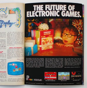
A March 1982 Electronic Games review bleakly captures the situation: “We can only hope that kids follow Nancy Reagan’s advice and ‘just say no’ to this steaming mound of [Panic Games Software].”
Almost immediately, the entire Panic Games lineup was being discounted at pennies on the dollar at every major retailer.
The rest is history. The games department was shuttered. The cartridges were never seen again (landfill?). The hot tub was sent back. And we thought that was the last of it…
A Surprising Discovery
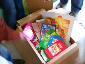
Cleaning out an old storage space during the move to our new offices, we were stunned: there, in front of us, were a couple of unopened cardboard boxes containing the last remaining items from this best-forgotten Panic era.
Empty, perfect-condition, never-used game boxes, and amazing heavy promotional posters once given out during a lavish CES party. All seemingly teleported straight from, and smelling a bit like, 1982.
And While This All Might Be Fiction…
…the cool boxes and art posters are definitely real!
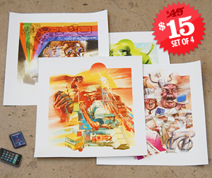
Surely one of the more esoteric Panic Art Department side-projects ever conceived: we commissioned local artist Lukas Ketner to try the impossible, and work in a lost art style that literally nobody in the world does anymore.
The concept: what if Panic was around in 1982, and our apps were early Atari 2600 games?
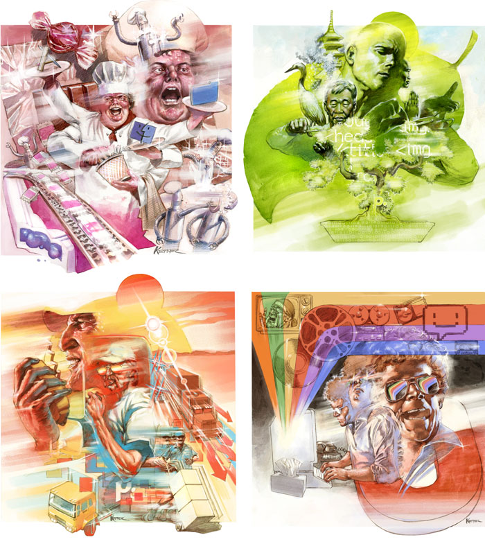
We were so excited by his pitch perfect, early-80’s, watercolor-and-pencil, quasi-terrifying, super-montage output, that we just had to make some stuff with it.
And lo, Panic Retro Posters and Panic Retro Boxes are now for sale!
These alternate-universe, time-warped re-imaginings of our Mac apps make for great collectables. They’re incredibly detailed and perfectly crafted. And we think you’ll like them, even though we realize the intersection in the “Panic Fan” and “Atari 2600 Fan” venn diagram may be very, very small.
(No need to ask: this was an art department project. It did not slow down development of your favorite applications!)

 Paul Carroll
12/8/2009 11:44 AMIncredible.
 Jonnotie
12/8/2009 11:49 AMWhicked awesome!
 Daniel Jalkut
12/8/2009 11:54 AMIn addition to having commissioned some incredible artwork here, I also applaud the concept and am impressed by how you guys seem to be really good at “keeping it fun.”
I am also really impressed with this WordPress theme you’ve gone and cooked up. Kudos to whoever is responsible.
 Fernando Lins
12/8/2009 11:54 AMThis is wicked, love it!
 Peter
Peter
12/8/2009 11:56 AMThe tissue box on the Unison guy’s desk was a nice touch.
 Sebastiaan de With
12/8/2009 11:56 AMAwesome beyond words.
 Chris Cieslak
12/8/2009 11:57 AMHere’s a question… WHY doesn’t anyone really do art in this style anymore? It’s so great. And Ketner really nailed it here, especially the CB Convoy Era stylings of Transmit.
 Glenn Hoppe
12/8/2009 12:04 PMMind = Blown
Stuff like this is why I love you guys.
 Joe User
12/8/2009 12:09 PMAny chance for some desktop wallpaper sized versions of that awesome artwork?
 Follower
12/8/2009 12:17 PMFrom now on I’m going to sing “Convoy” every time I launch Transmit.
 Paul Souders
12/8/2009 12:23 PMOh I’m definitely right in the middle of that intersection. I just have to know what’s on the back of the boxes.
And I love the tissue box on the Unison poster … nice touch.
 Rich
Rich
12/8/2009 12:25 PMOooh, that smug “prince” from the Checkers… grrrr.
 Erik Schmidt
12/8/2009 12:28 PMI think this may be the most awesome blog post in the history of the universe. Freakin’ amazing. GEE (Grinning Ear to Ear).
 Catherine Azzarello
12/8/2009 12:29 PMOK…I had an Atari, but not for video games–it was my first graphics computer! (I DID play Pong.)
 Jeff
Jeff
12/8/2009 12:29 PMHoly crap. This may be the most awesomely weird and unlikely thing I’ve ever seen.
 Michael
12/8/2009 12:32 PMWow. You are all so beautiful.
 Greg
Greg
12/8/2009 12:35 PMThose are awesome! :D
 Nathan
12/8/2009 12:41 PMTotally Rad!
Ooof. Still painful.
 vegaz
vegaz
12/8/2009 12:43 PMso great artwork… Big kudos to you!!!
I just hope that the new version of Unison will have some way to follow a thread… even a simple flag please!!
BTW, if you need a beta-tester… :-)
 Manton Reece
12/8/2009 12:47 PMI guess blogs are just like software releases: you can be first, or you can be the best. Congrats on the great design and new goods. This is an inspiration for the rest of us.
 Hamranhansenhansen
12/8/2009 12:48 PMThis is great 21st century advertising.
 John Lascurettes
12/8/2009 12:54 PMI might have bought the story if the 2600 game was called Transit instead of Transmit. I owned a copy of that (before the name change). ;)
 Eric Peacock
12/8/2009 12:59 PMFantastic. I’m loving every bit of this.
 David S.
12/8/2009 12:59 PMnobody does that kind of art? then apparently nobody has seen the box art for season 3 of The Venture Bros. that came out earlier this year: http://bluray.ign.com/dor/objects/14304245/the-venture-bros—season-three/images/the-venture-bros-season-three-20081212095007797.html?page=mediaFull
but yeah, fantastic box art, Panic. i love it. the one for Unison cracks me up….
 Dwigt
Dwigt
12/8/2009 1:02 PMHave you seen the artwork for the third season of The Venture Bros.? It’s a mock Atari 2600 cartridge with artwork drawn by Bill Sienkiewicz and it might ring a bell…
http://dvd.ign.com/dor/objects/14304243/the-venture-bros-season-three/images/the-venture-bros-season-three-20090225013133923.html
 Dwigt
Dwigt
12/8/2009 1:06 PMHey David, either that’s a wonderful coincidence or I suffer from split personality. I prefer it to be a wonderful coincidence.
 Jason Scott
12/8/2009 1:07 PMA shout-out to the Atari artists who originally created this “look”: Steve Hendricks, Jim Kelly, Bob Flemante, Cliff Spohn, George Opperman, Hiro Kamura and Warren Chang,
 Jonathan
12/8/2009 1:12 PMI would imagine the popularity question could, in some small way, be gauged by how many people besides me bought the Adventure dragon t-shirt when it was around.
 Waldo
Waldo
12/8/2009 1:15 PMthese need to be made into icons
 brandon c
12/8/2009 1:16 PMThese are so rad! I’ve been hoping that someone would rediscover this imaginatively deceptive box art style, where the stuff inside never met the outlandish expectations spawned by the illustrations – except in the case of Panic, which definitely has the Awesome Inside. Great work!
 Tom F
Tom F
12/8/2009 1:29 PMLove that magazine ad. “MAKE CANDY OR SOMETHING.”
 Dustin Wilson
12/8/2009 1:38 PMThis has got to be one of the most amazing things I’ve looked at in recent memory. Great new site, but some of its layout is a little messed up in Opera 10.
 Jonathan
12/8/2009 1:41 PMThis art is made of win! Lukas captured the art style from that era just right!
 Zak
Zak
12/8/2009 1:44 PMBeyond awesome. This is almost words-fail-me awesome.
 gb
gb
12/8/2009 1:59 PMWait, I’m not sure the Finder logo existed in 1982…
I have to say I love this, and am overwhelmingly jealous of having the spare time to commit to something as wonderful.
Now, to find those roms and turn them into iPhone (web) apps.
 Brandon Malicoat
12/8/2009 2:03 PMThe bald dude in the Coda graphic looks kinda like Billy Corgan. Also I’m going to have to request wallpaper versions of the graphics (even if I have to pay!). So awesome.
 Twylo
Twylo
12/8/2009 2:21 PMThis makes me incredibly happy in the pantular region.
Like, oh. my. god.
You guys are A-OK in my book!
 tolleson, terry
12/8/2009 3:04 PMSo… I came here and appear to have misplaced my mind… as though it was, quite literally, blown clean from my skull. Seen it about amongst your awesome collectables?
 Adam Rice
12/8/2009 3:12 PMYou guys do realize that now you need to port these games to OS X, right (is it porting when the original version only exists in your imagination?)?
 Kosh
Kosh
12/8/2009 3:14 PMWOW! Brings back my youth! The Transmit Box is beyond words…. cool, like Atari’s Indy 500! For those who’ve forgetten, this is what I’m thinking: http://www.vgmuseum.com/scans/scans2/indy500.jpg
 Sam McDonald
12/8/2009 3:31 PMI don’t really have anything to say, just that this comment for is beautiful, and calling for me to fill it out.
 SSteve
12/8/2009 3:53 PMI haven’t seen that old Panic logo in years. It brings back some great memories. My grandmother (who was a bit of a skinflint) bought me a discounted copy of Unison one day when we were shopping at Gemco (http://www.royhooper.com/gemco.html) in Colma.
 Ruzel
Ruzel
12/8/2009 4:28 PMWow. Wowee-wow-wow! I think that between this and the Venture Brother’s DVD art, we can predict that a great disturbance in the Memeforce will arise. The Transmit is my favorite for mood, but the Coda illustration best captures the nature of the program: simple, elegant.
 Brad Strickland
12/8/2009 4:48 PMMan! You guys did an awesome job reproducing the old atari box cover style. Those are awesome and just in time of Christmas. =)
 voline
12/8/2009 5:09 PMLooks like Lou Reed was using Unison during the “Sally Can’t Dance” era.
 Joe
Joe
12/8/2009 5:51 PMSo…. what’s that Kleenex for in the bottom right panel?
 John Evans
12/8/2009 6:17 PMKleenex box nothing, why is Hulk Hogan on there?!? (In his late 90s “Hollywood Hogan” phase, it looks like!)
 room34
12/8/2009 6:50 PM“And we think you’ll like them, even though we realize the intersection in the “Panic Fan” and “Atari 2600 Fan” venn diagram may be very, very small.”
It’s not THAT small. I’m right in there for sure. The game art posters will soon be framed and decorating the wall of my home office, along with my own reprints of the game art from Asteroids, Berzerk, Star Raiders, Yars’ Revenge, Space War and Missile Command. The perfect accompaniment to Coda on my Mac screen as I am cranking out code.
Brilliant!
 Mau
Mau
12/8/2009 9:32 PMJust amazing! I’m hoping to some day have some of this cool karma you guys posses and share.
Thank you!
 Kosh
Kosh
12/9/2009 10:12 AM@SSteve
GEMCO nostalgia! Brilliant! My wasted youth growing up in Southern California in the mid-80s. My main source for Atari and Commodore 64 games.
 Tyler B
12/9/2009 3:43 PMI would love one of these graphics on a shirt.
 Albert Yarusso
12/9/2009 8:27 PMFantastic job on these boxes, I definitely need to get a set. Lukas Ketner nailed this art style perfectly. I may need to commission him for a 2600 homebrew game or two. :) For those who are curious, here are the Atari boxes from this era:
http://www.atariage.com/box_style_page.html?SystemID=2600&BoxStyleID=2
Click on the small icon to the right of each row to see the box for that game.
 Step Schwarz
12/10/2009 7:52 AMPHOTOSHOPPED!
(Read: I’m buying these.)
 bruce
bruce
12/10/2009 11:12 AMooh, count me in for a Unison T-shirt if it ever emerges (and the above Lou Reed reference is spot-on.) Tremendous work.
 col pannick
12/10/2009 3:35 PMOne quibble: wish the Mac icons had been from same era.
Otherwise: full Win. Spinal Tap for gamers.
 Daniel
12/10/2009 9:04 PMYou guys really had be going, I was like “Holy shit they morphed into a tiny Mac app company over the decades!” Now I feel foolish. Thanks.
 Jonathan Gibson
12/11/2009 6:41 AMExcellent.
Thank you for sharing this. It brought warm memories.
I have a personal connection to this artwork and believe I saw the original work this was based on. As a child I grew up around the vocational artists churned out by the Advertising Art School in the Bullier Bldg. on SW Washington Street, downtown Portland, Or. The practically-oriented teachers always brought in local advertising directors, graphic artists, etc to demonstrate what’s happening in the field. This ‘Lost 1982 Artwork’ was a style promoted by several of the younger, hipper, teachers and guests who often cited software companies as strong clients and viable option.
After High School I joined the AAS ranks where I first began painting interior wall supergraphics before large outdoor murals. For my part I jumped from urban murals to architecture school before settling on interactive media, but all that training and life experience was an immense advantage as I played with the earliest versions of BarneyScan (PhotoShop), PixelPaint, ColorStudio, etc and I always gave serious feedback to the developers that made for better tools for everyone. Um, your all welcome ;)
I can answer Chris Cieslak about why artwork like this isn’t done anymore. Besides the (endearing but passé) stylistic kitsch there is a lack of hands-on commercial art craft: few American schools these days, except the fine arts, train the visually creative to push real molecules of pencil, watercolor, gauche, and airbrush – and your not going to learn them tied to merchandising, layout and typography.
I’ve attended both commercial & fine art where I learned to control my hand and eyes in ways I see Gen-P (the post-Photoshop generation) lack – no offense intended. The market simply dried up for hands-on graphic arts over the last few decades and surviving vocational schools dropped emphasis chasing shiny pixels.
However far we’ve progressed, a stylus+tablet is still a shout away from real brushes on real paper. It’s why I find shopping Trader Joe’s hand-made signage more pleasant than inkjet price printouts on megastore shelves, for example. I also like seeing touch surfaces finally going big. Regardless, I’m training my boy to 1st handle a paintbrush in one hand before reaching for a touchpad with the other.
Somebody has to steal those jobs back from overseas, right?
 Jean-Jacques Cortes
12/11/2009 7:18 AMExcellent job, bravo ! I remember very well this era, because 1982 was the year when I began to use computers. I hope you will make desktop pictures with these covers.
 Hans v
12/11/2009 7:38 PMGlad to see you’ve finished these! Now asking Santa for some posters…
 room34
12/14/2009 5:56 AMI received my order of both the game boxes and the art prints in a mere 4 days. I took your advice and framed a couple of them (Coda and Transmit, the two Panic applications I use on a daily basis) to hang on the wall in my home office. Looks so great I had to post a photo on my blog: http://blog.room34.com/archives/4163
A word of encouragement to anyone considering ordering these, but perhaps hesitant due to the cost: the quality here is unbelievable. If you appreciate the aesthetic and the concept as much as I do, you will not be disappointed, and they are worth every penny. Absolutely fantastic.
 Chris Cieslak
12/14/2009 5:29 PMThanks to Jonathan Gibson for the explanation!
 DaveX
DaveX
1/13/2010 11:31 AMI also want some wallpaper versions of the artwork– also “make candy or something”… hilarious!
 Discount Oil Paintings
1/13/2010 6:17 PMWell, this are awesome…. Great new site.
 Lukas Ketner
1/22/2010 1:23 PMThanks Jonathan! That’s essentially the explanation I got when I asked local great Mike Dringenberg (of Sandman fame) how this style was done. I went through a lot of supplies and frustration before finally asking around among some of my more senior peers as to how to get that wonderful bleed, and messy ghosting that’s present in the old squiggley montages (I was mainly referring to Joe Ipsom’s Atari sports game graphics, which is what the Venture Bros. cover is spoofing as well). There’s something very important about training classically with real materials that I had to find on my own because my art school didn’t teach much of it. Believe it or not, a good portion of these were painted digitally, but it wouldn’t have turned out the same without the technique grounded in real materials.
Thanks to all of you for the kind words :)
 wingnut
1/23/2010 7:50 PMIf only the games & Instruction booklets came with it :(
 SeasonOfPain
2/6/2010 6:49 PMWow, I just stumbled on this post. This is absolutely awesome… such splendid memories! That exact issue of Electronic Games that you used happens to be the one copy of that magazine that I still have lying around somewhere (can’t remember the date but it definitely had Miner 2049’er on the cover discovering some treasure). :)
Oh, and while I probably won’t buy a picture or box, I would totally buy this in a T-shirt if you guys make something available.
 Zack
Zack
2/26/2010 3:17 PMIncredible. Great idea, and flawlessly executed. I’m blown away. The 1982 magazine ad is completely convincing. Well, actually, it’s all completely convincing. Great job Lukas, you nailed that box art.
 Austin Ivansmith
8/5/2010 2:17 AMHey guys. These paintings are amazing! I actually had the same idea for a project and wanted to commission a piece, and doing a search for “atari commission painting” brought up your page first. Pretty rad. Well, I may still do it someday but now I know I won’t be the first. :) cheers!
 Larry Bastardo
1/6/2011 11:18 AMNice web site, but the “paper clip” cliche should be outlawed in the field of web design.
 MARKODORE64
2/11/2011 4:17 AMThe wise and talented outlaw nothing.
 Corie Johnson
3/17/2011 12:53 PMI just arrived via twitter link. I have no idea what panic is but I love Atari art, and Ikea. So send them my way.
 Paul Shipper
10/20/2011 8:29 PMCan’t believe I only just stumbled on this – Congrats and kudos for doing your bit to revive the old school illustration… one of my aims too…! Thanks!
 steve
steve
1/17/2012 2:48 PMwow you get a thumbs up for this – beautiful artwork and takes me back to the good old days.
 Gentian Sula
10/2/2012 12:44 PMper bisnes te vogel
 Troy Augustine Salt Lake City
4/11/2013 9:39 PMVery good post. I am experiencing a few of these issues as well..
 Tim Gavin
4/25/2016 2:04 PMFiction?! Pish tosh! Wasn’t Coda’s last update in 1982?