It’s time.
Now, technically, Panic Inc. started in Steve’s bedroom. Then we shared an apartment, then another apartment, then moved into a small office. Finally, a few years ago, we landed in the newest Panic Office — one we got to design and build out from scratch, from empty raw shell to finished product. I’ve been promising a photo tour of our office forever, and I think I’ve held off because I secretly wanted this space to keep feeling “special” — our space, a space that could surprise guests, not just a long-scrolling page on the internet. But, it’s been a while, and it’s hard to invite the entire internet over for lunch.
So, let’s do this. Please join me on a complete photo tour of the Panic Office.
The History.
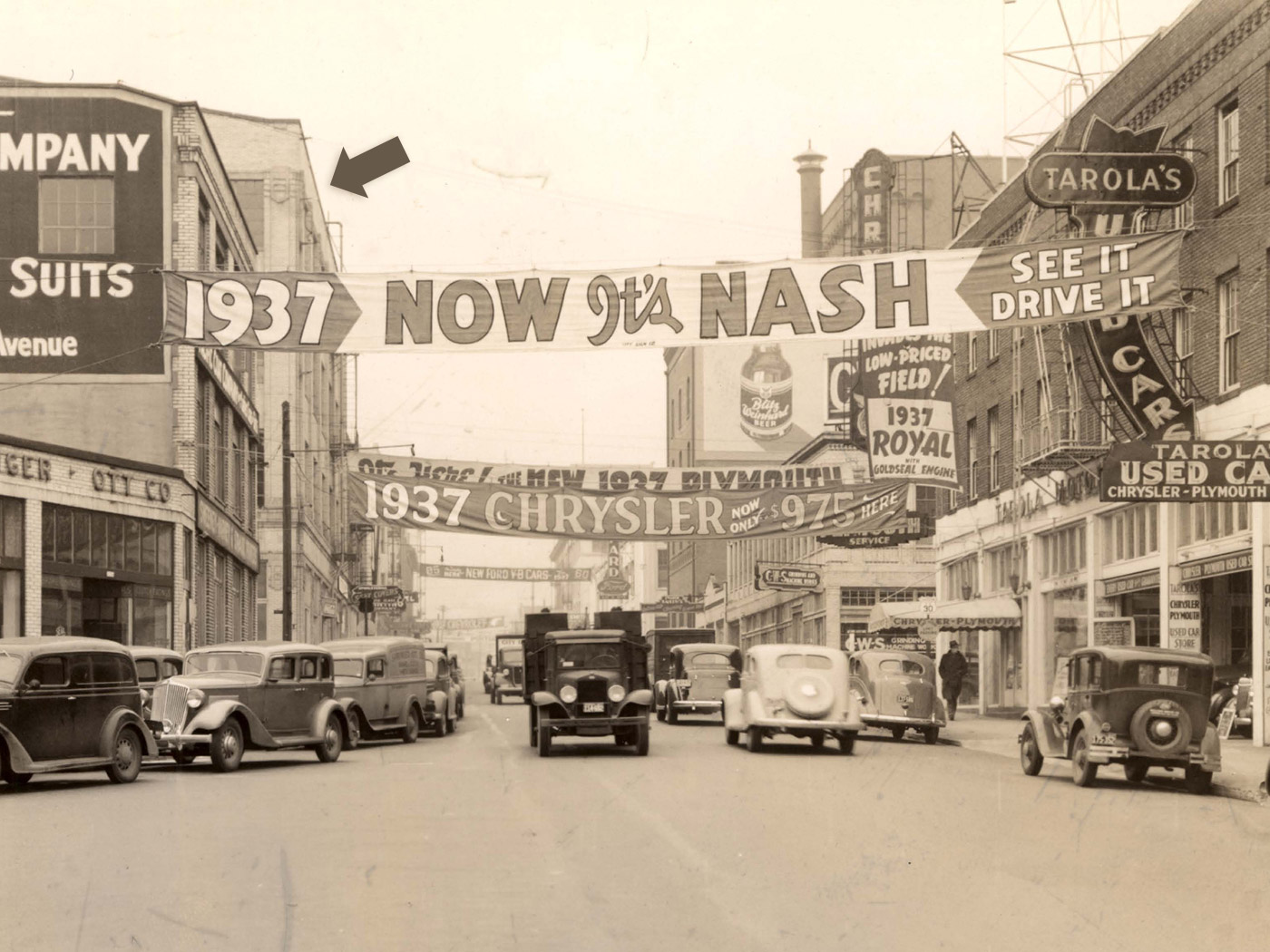
Our building was once part of Portland’s Auto Row on Burnside. We confirmed this when the concrete guys stripped the paint from our floors — they found (and were very concerned by) perfectly spaced rows of permanent oil stains. There could be no doubt we’re sitting in a once-garage. So awesome.
The Planning.
We knew a few things. We wanted an open space for everyone to share. (Open space? Sure. We’re usually really quiet. And when we do talk, it’s often something important where it’s nice to have team input. Or we’re workshopping jokes for Twitter.) We knew we needed a conference room for discussion. We needed a nice kitchen. And I loved the view from the roof.
But what does Panic look or feel like? It’s hard to express the “Panic Feeling” to others.
Our architect, Chris, eventually whittled everything I told him down to three key thoughts: we want to be ‘cool’ without being austere, we want to be ‘fun’ without being zany, and we want to exude an air of importance, but with a wink. With some inspiration from Louis Kahn’s Yale University Art Gallery (and, personally, Epcot Center) we got to dreaming. And sketching. And rendering.
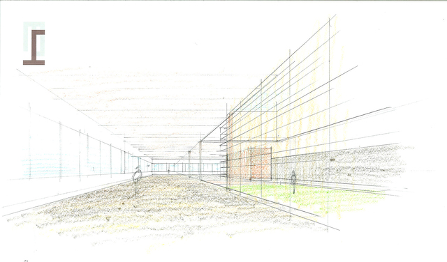
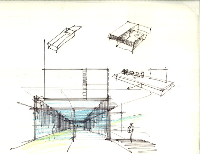
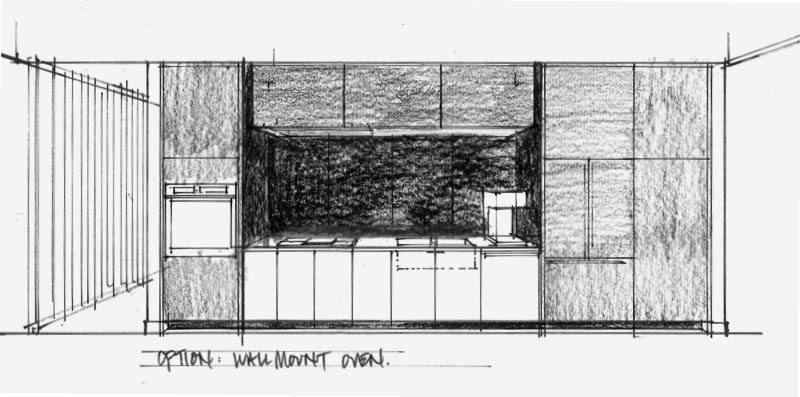
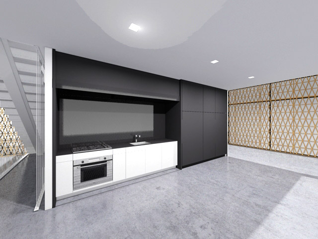
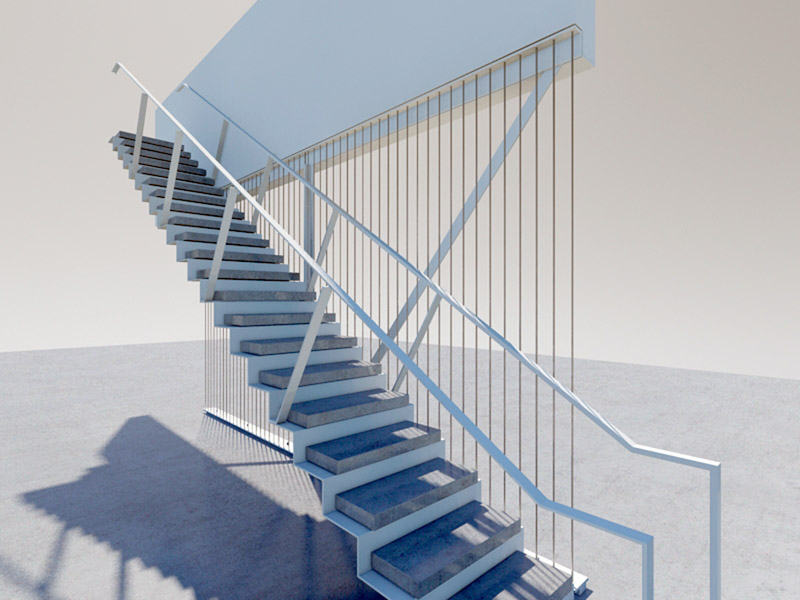
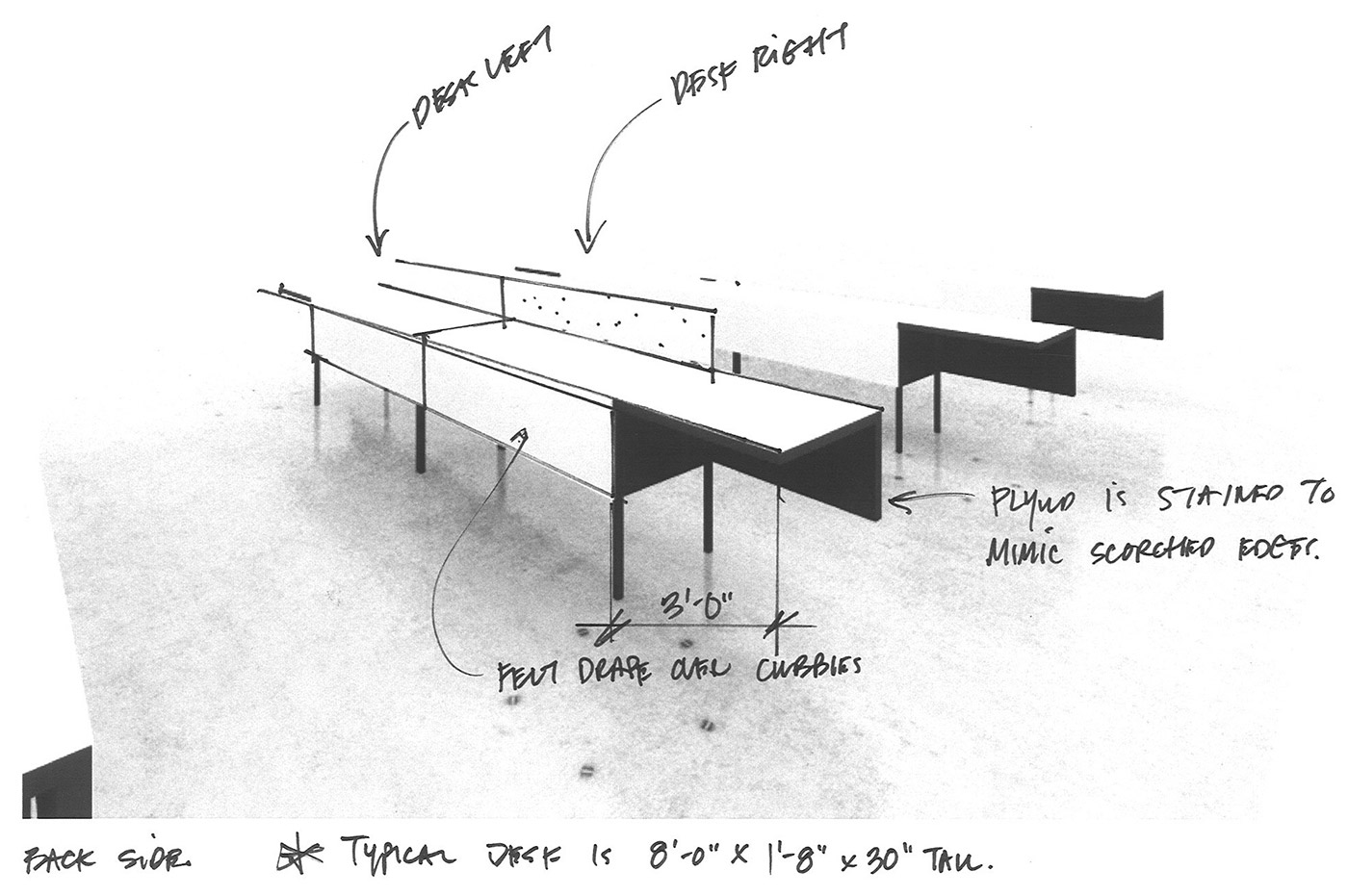
The Buildout.
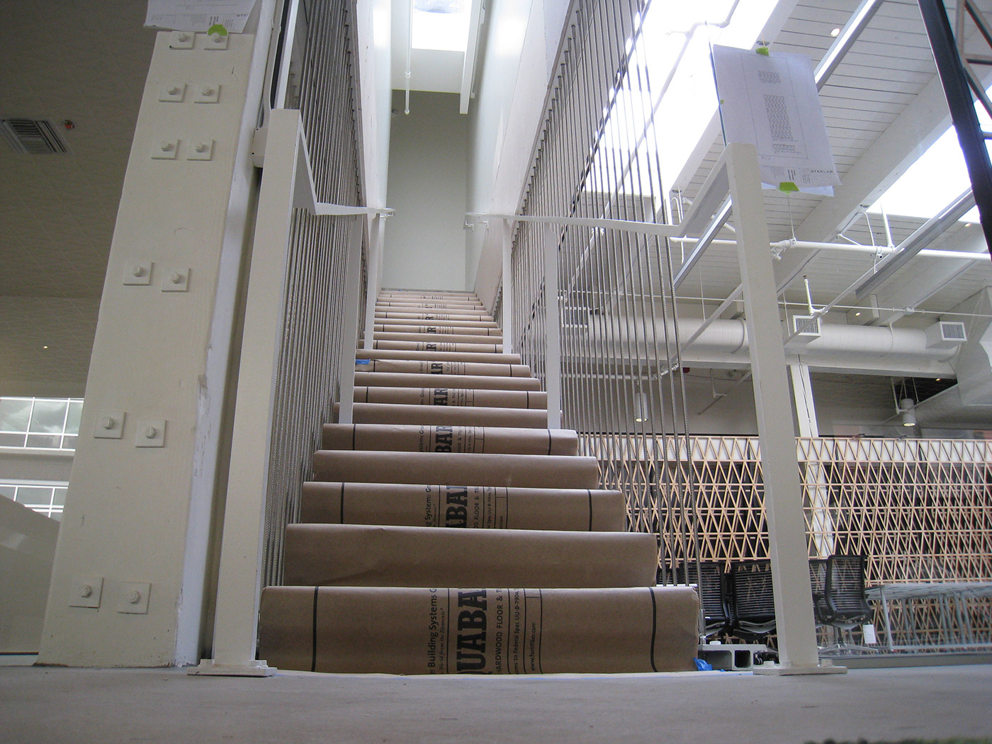
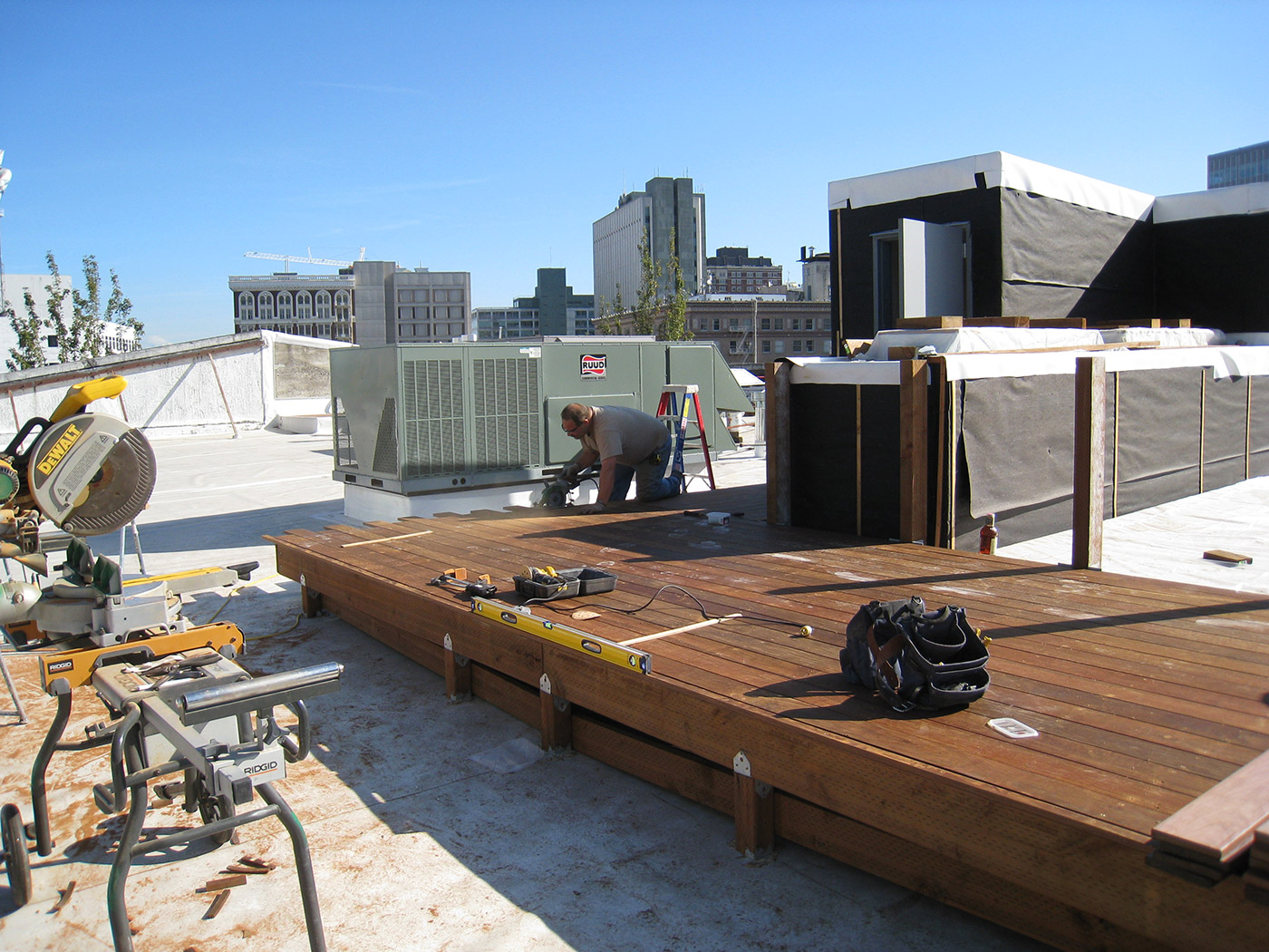
I couldn’t help myself. I walked over every day to check on the construction. I’m sure they hated it. But as an added bonus, I got to correct the odd annoying wall-mounted conduit or poorly-planned light before it was too late.
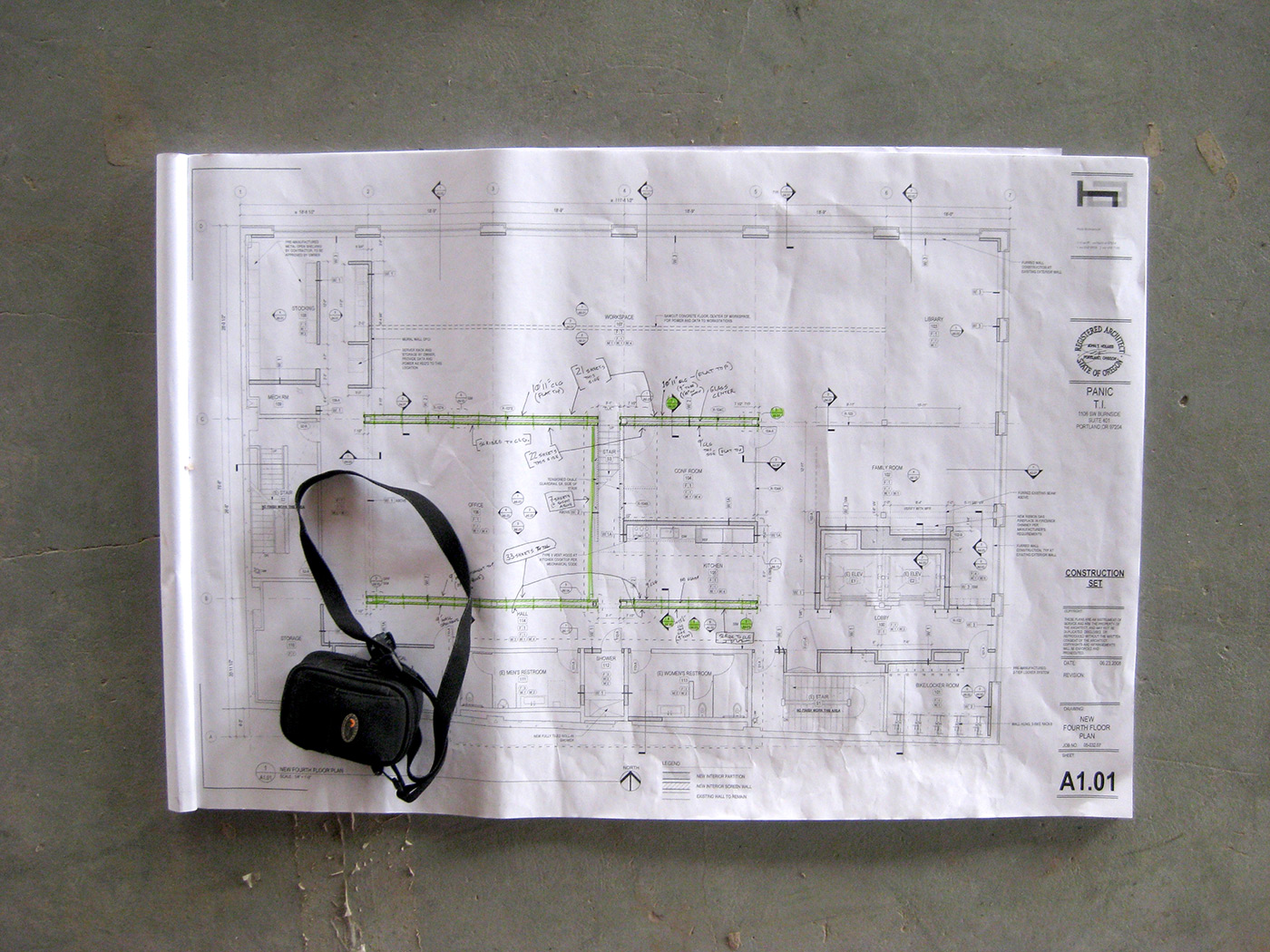
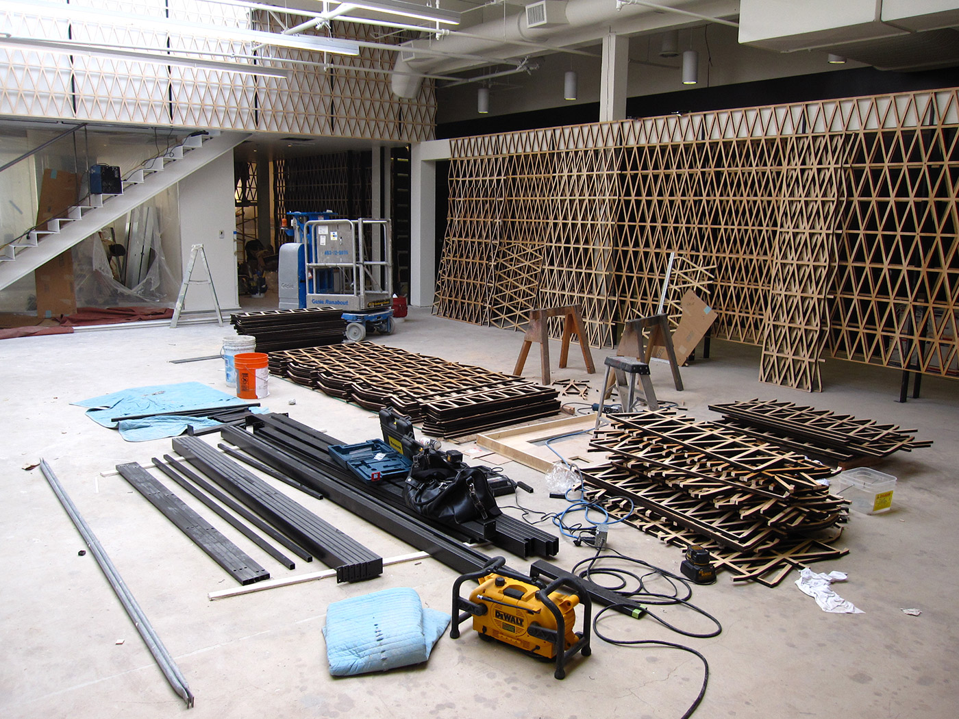
The Grand Opening.
Finally, almost a year later, it was done.
We moved in, and it felt good — like we were maybe, finally, a real deal.
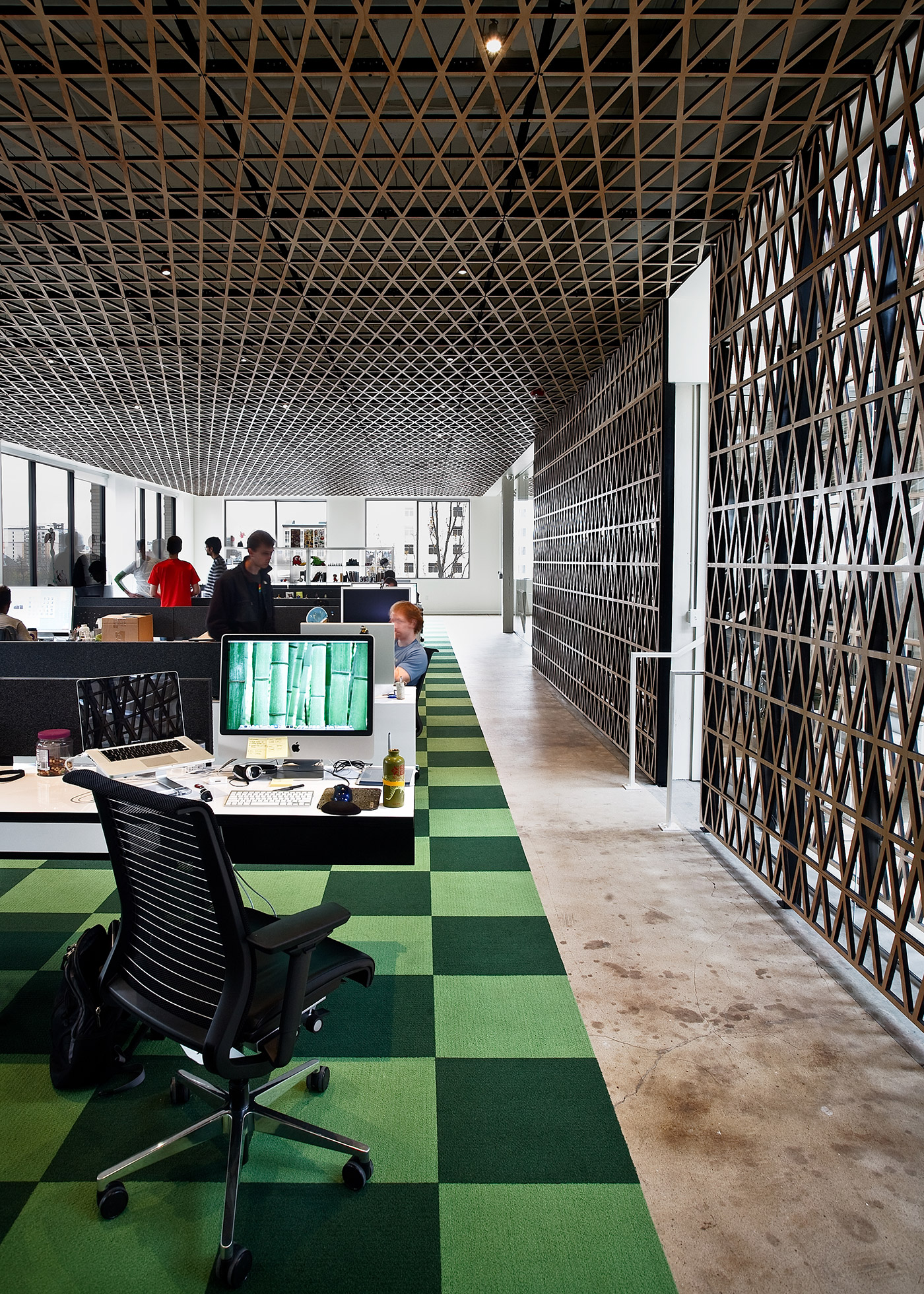
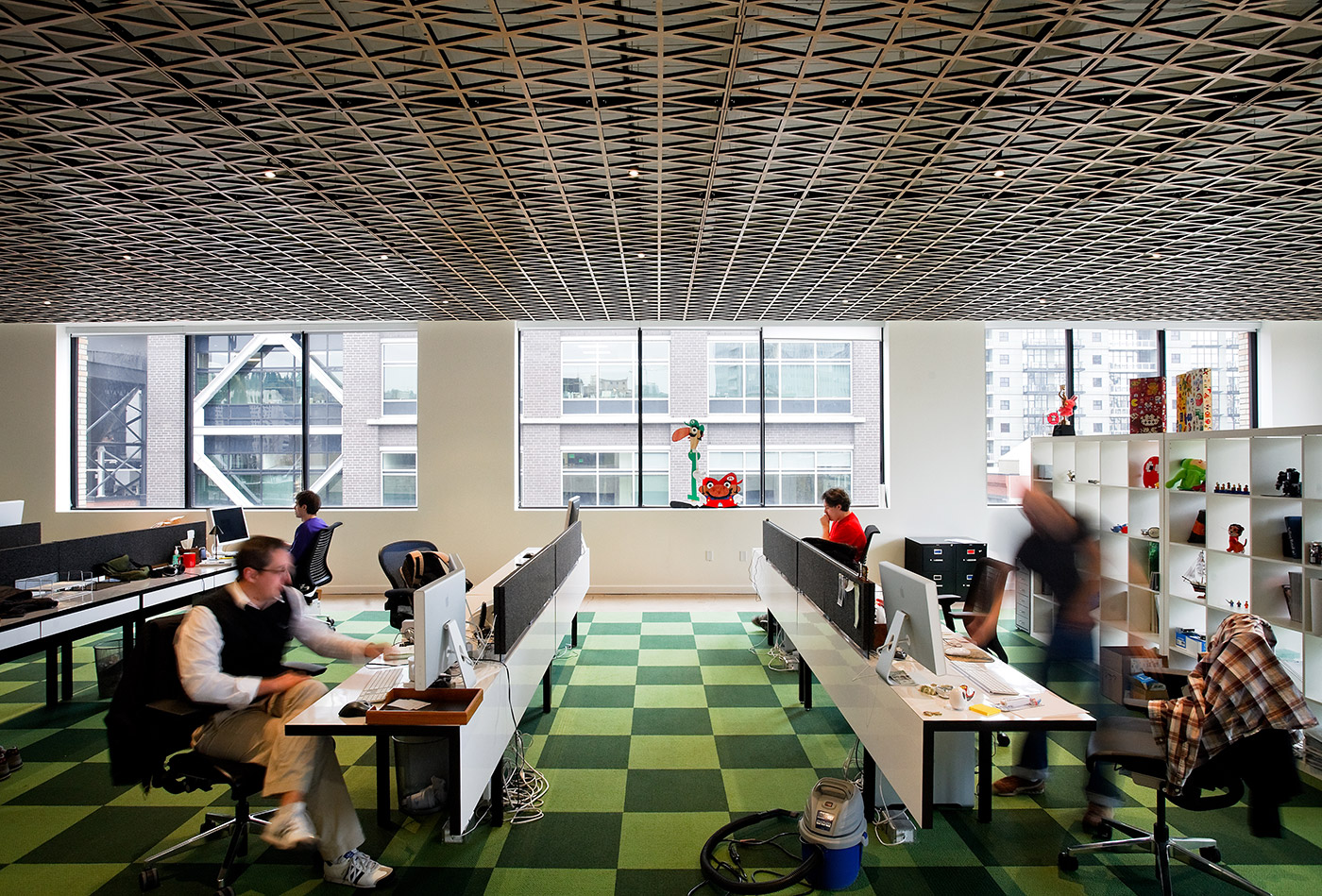
Here it is, day one:
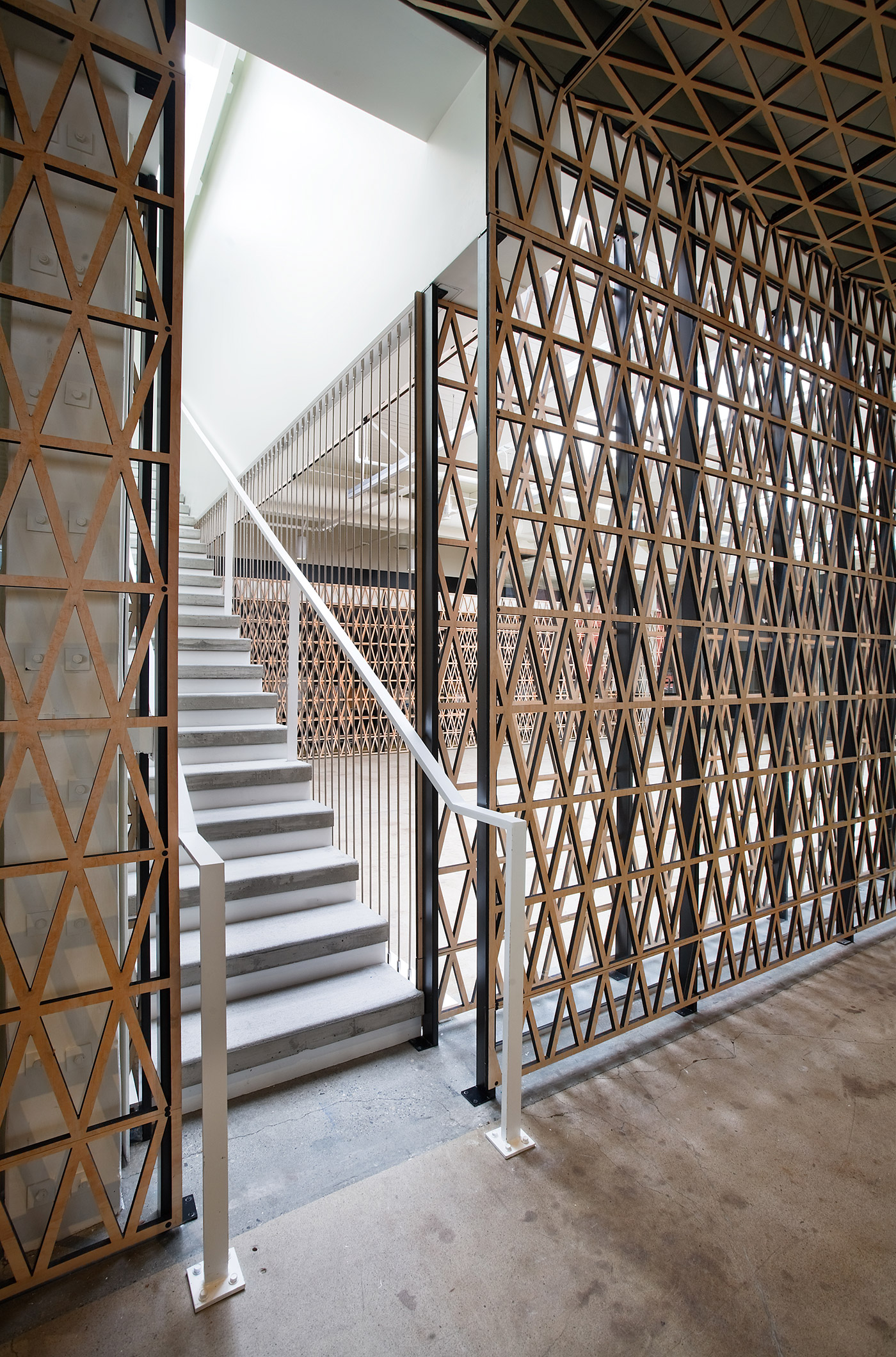
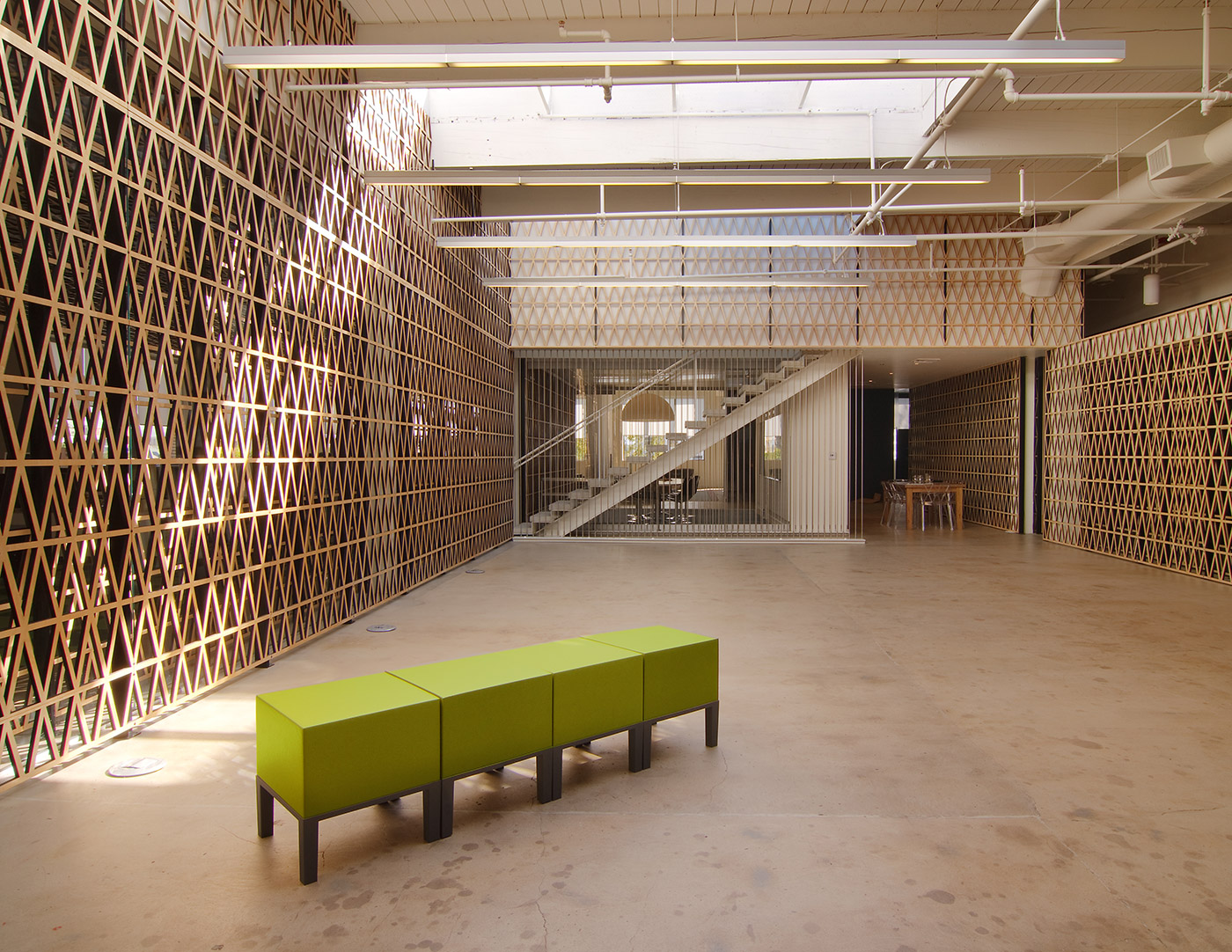
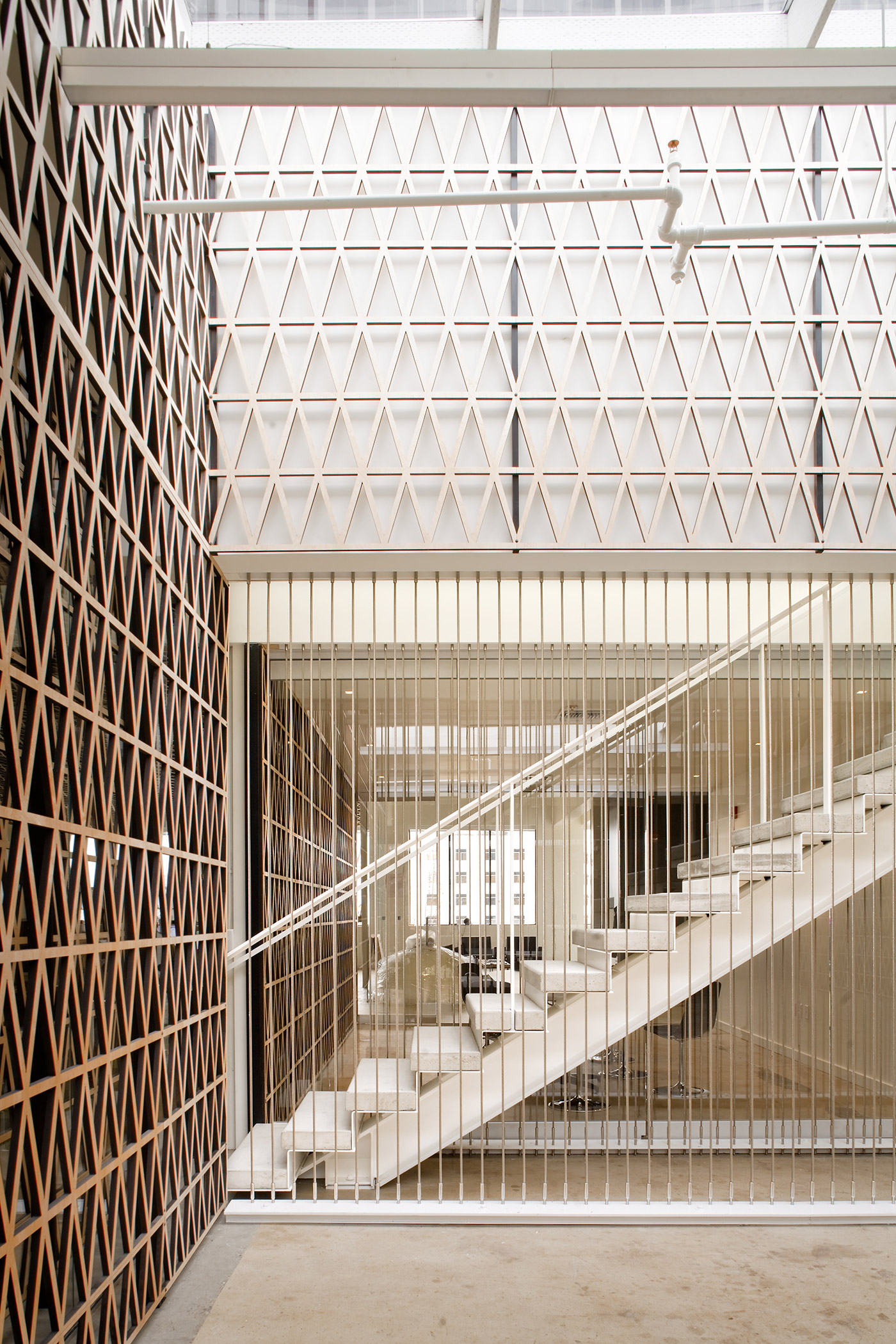
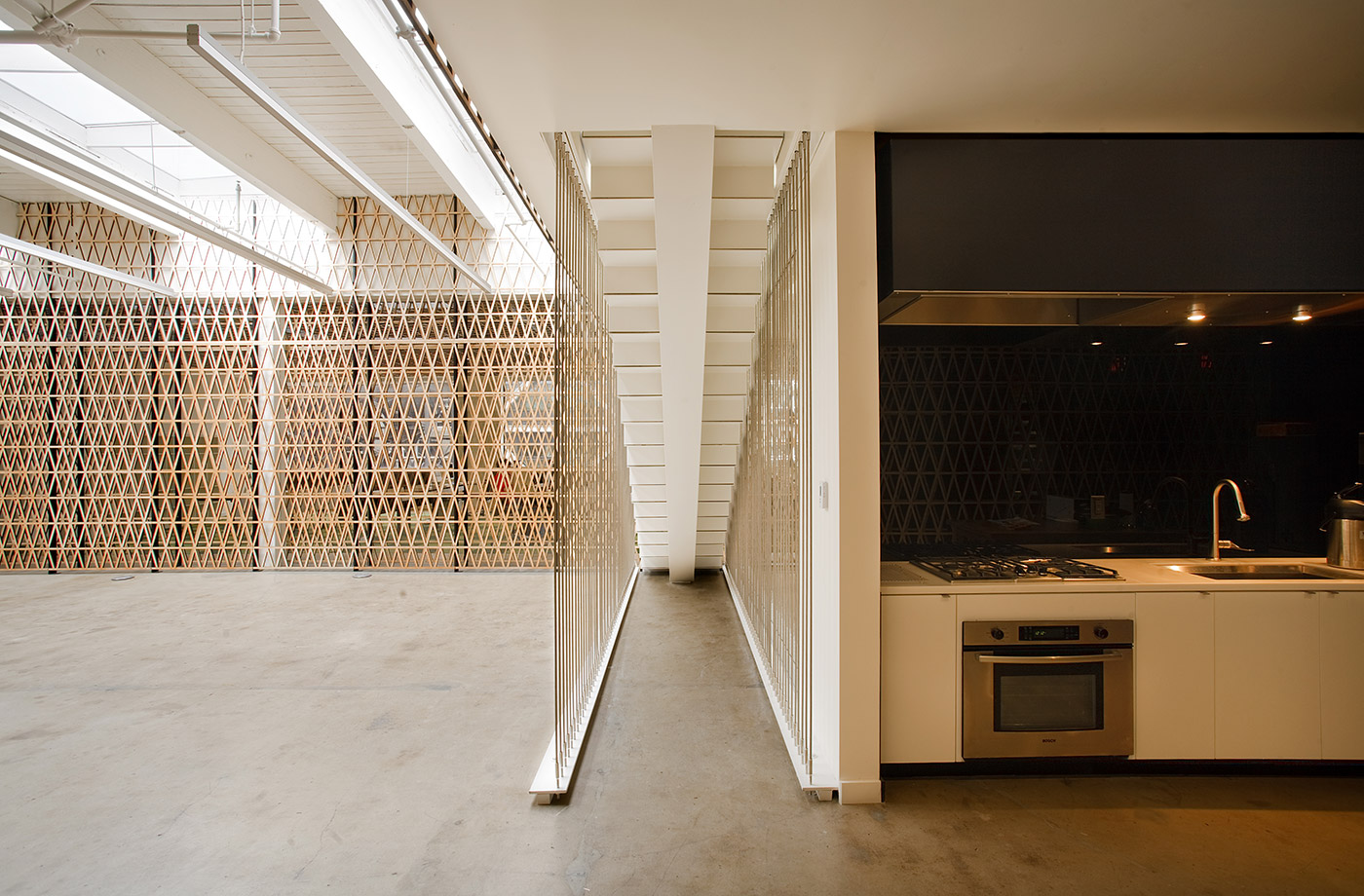
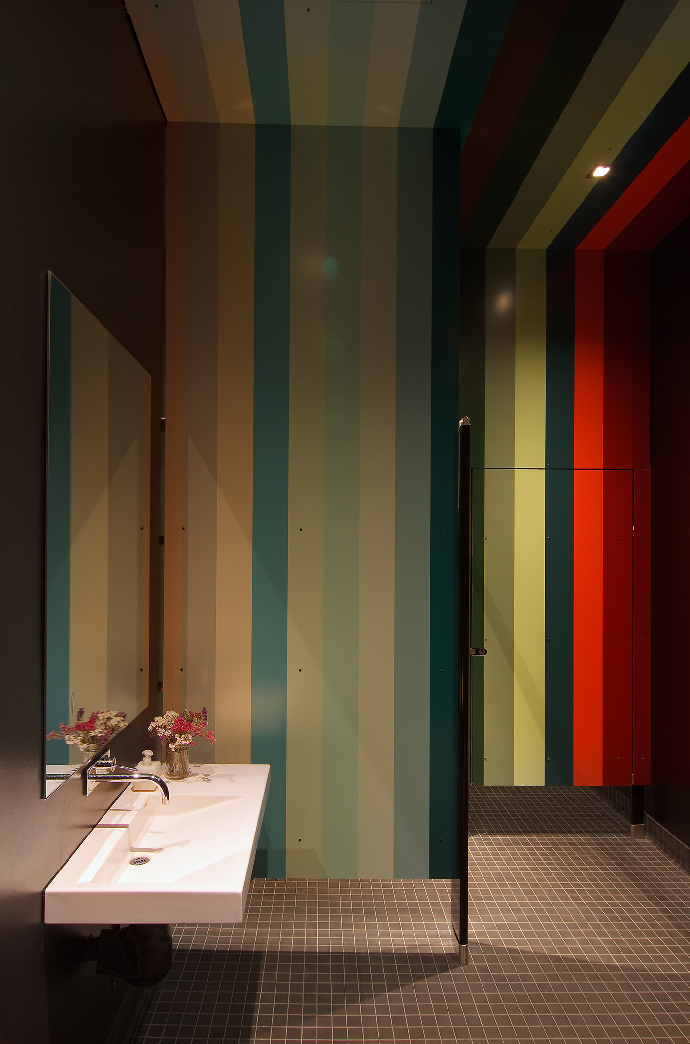
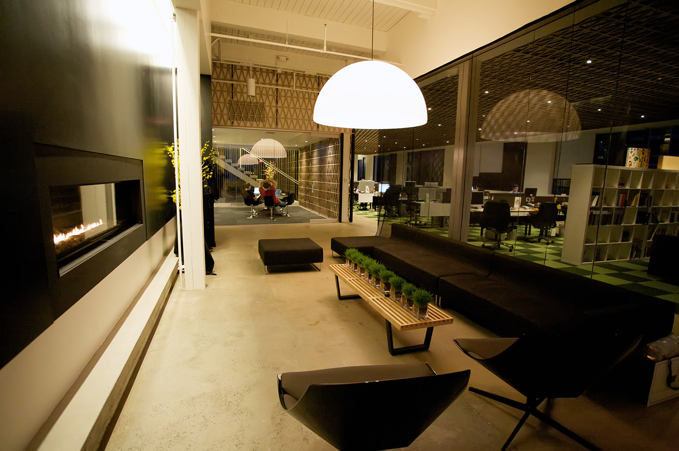
The Signage
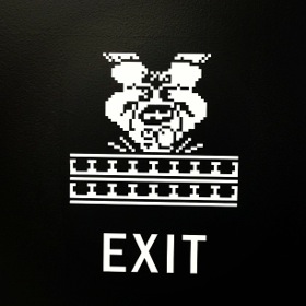
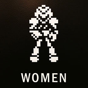
Neven and I couldn’t resist getting 8-bit-nerdy with the office signage. Maybe someday we can use our own game characters.
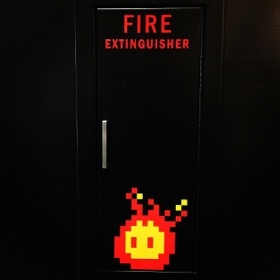
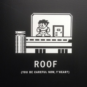

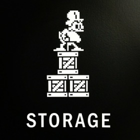
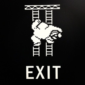



The Living Room.
It’s done. We’re moved in. But we didn’t stop there. (We’re certainly not short on ideas.)
With the help of our interior designer, Andee, we first decided to spice up our “Living Room” area with a little more life, so we commissioned a pattern. And that pattern beget a rug. And pillows. And tables. And a curtain…
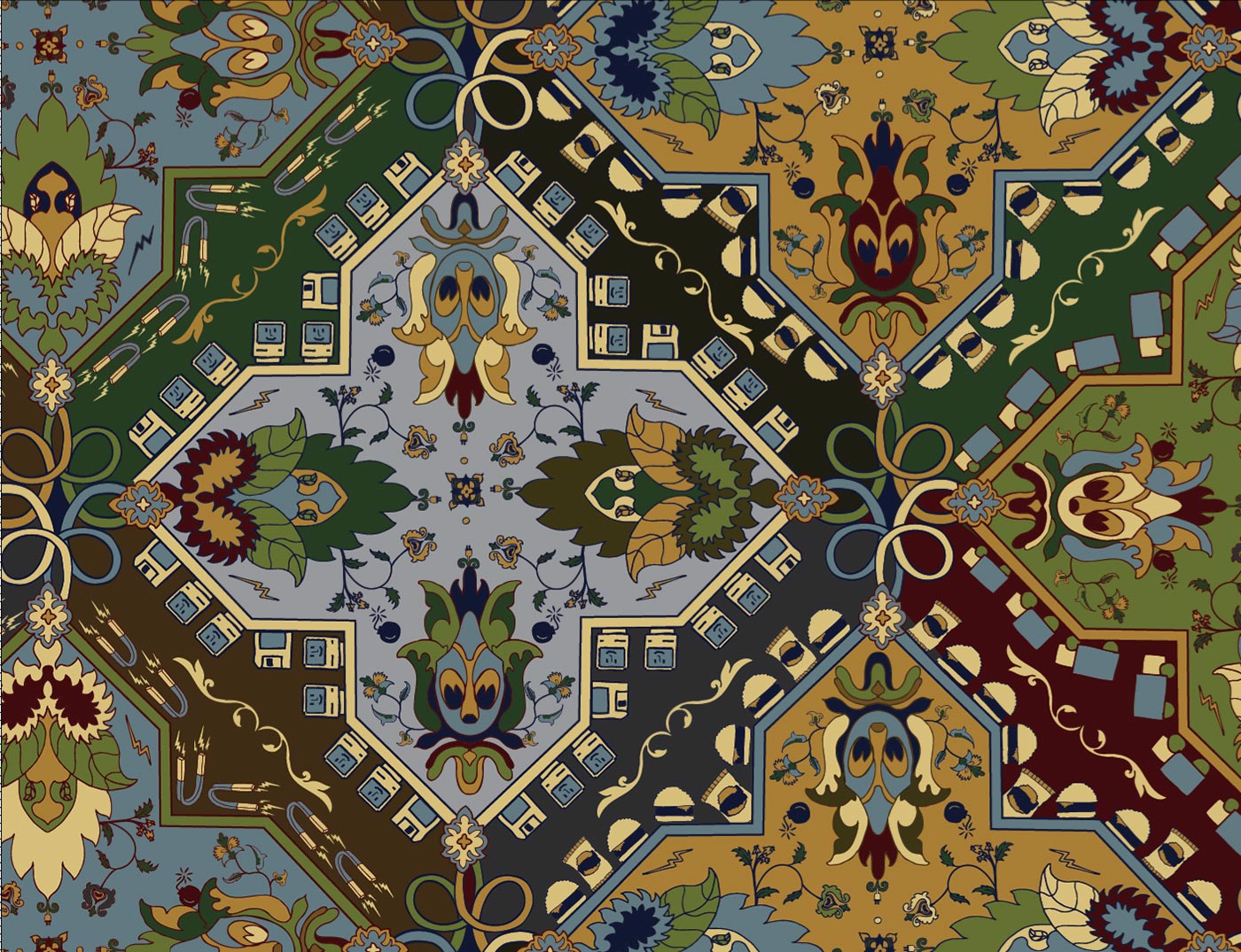
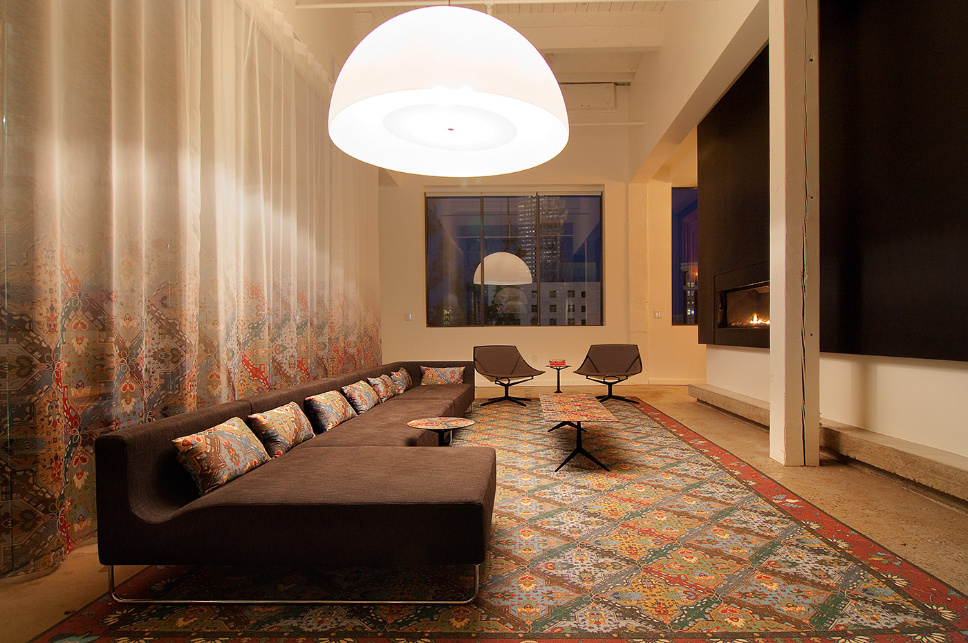
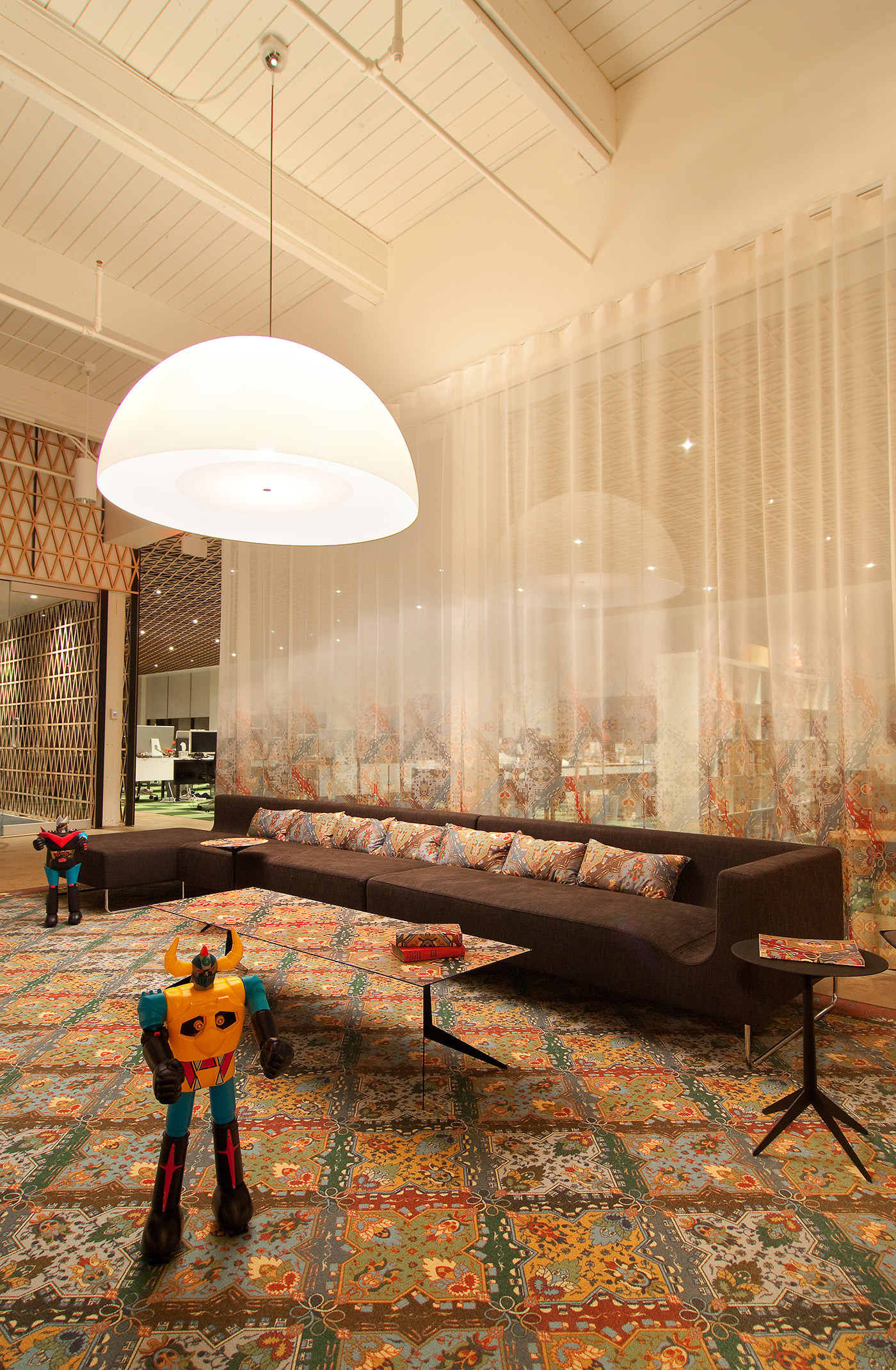
(If you look very closely at the pattern, you might recognize some old friends.)
Then, The Planning of Something Interesting.
We had a little phone closet, for the occasional (rare) phone call. A tiny corner, three ceiling lights, a nice window.
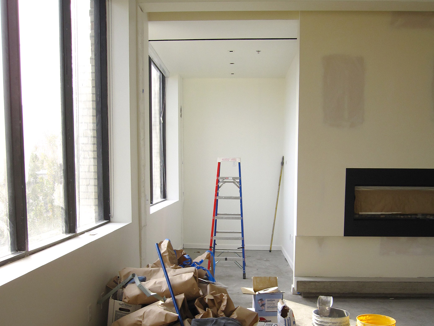
We thought we could dream up something a little more special. So, with Andee, we got to work.
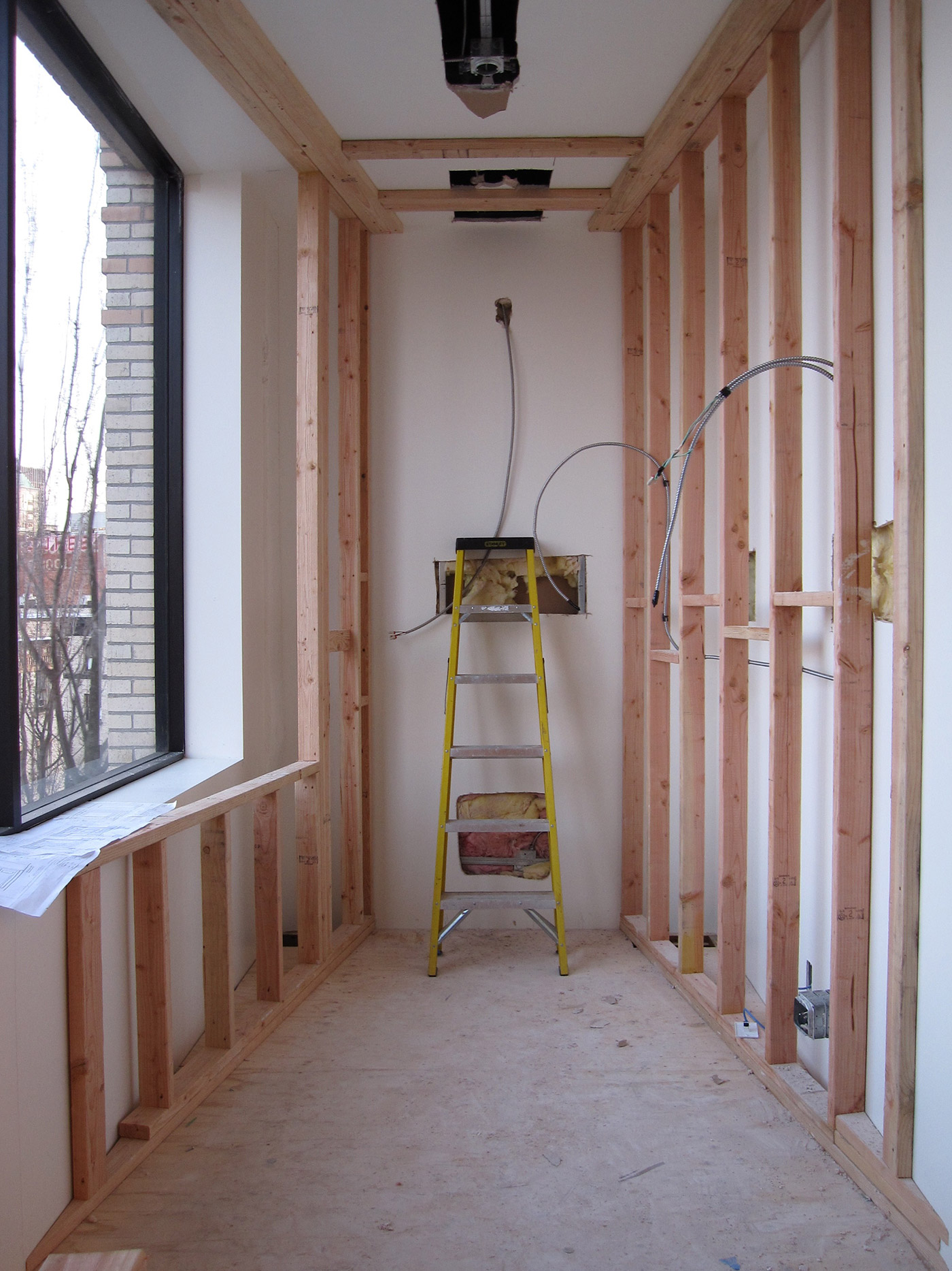
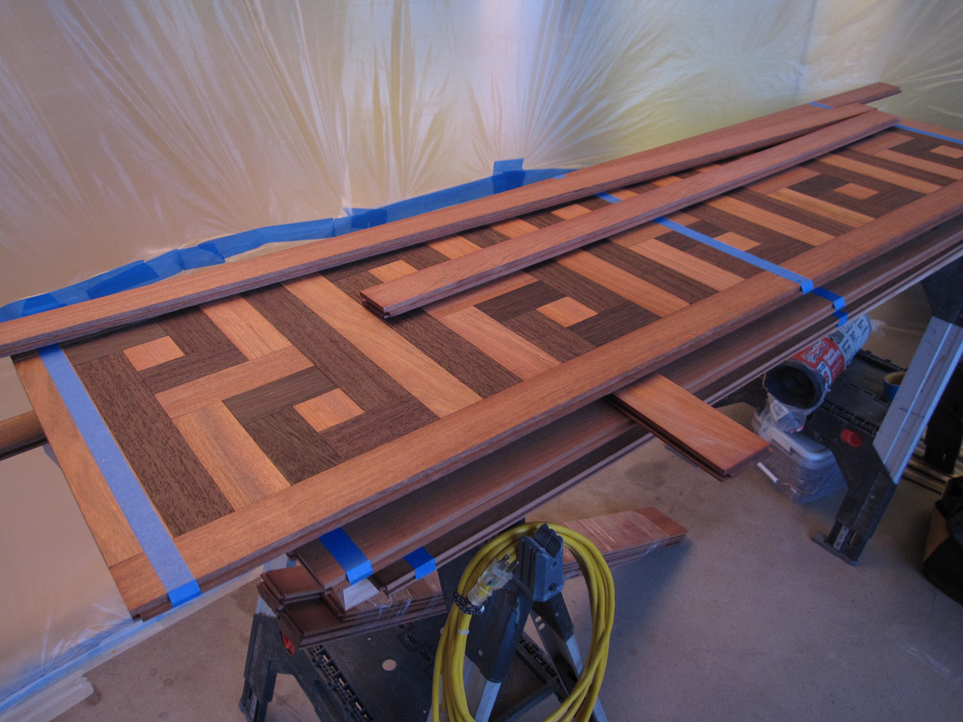
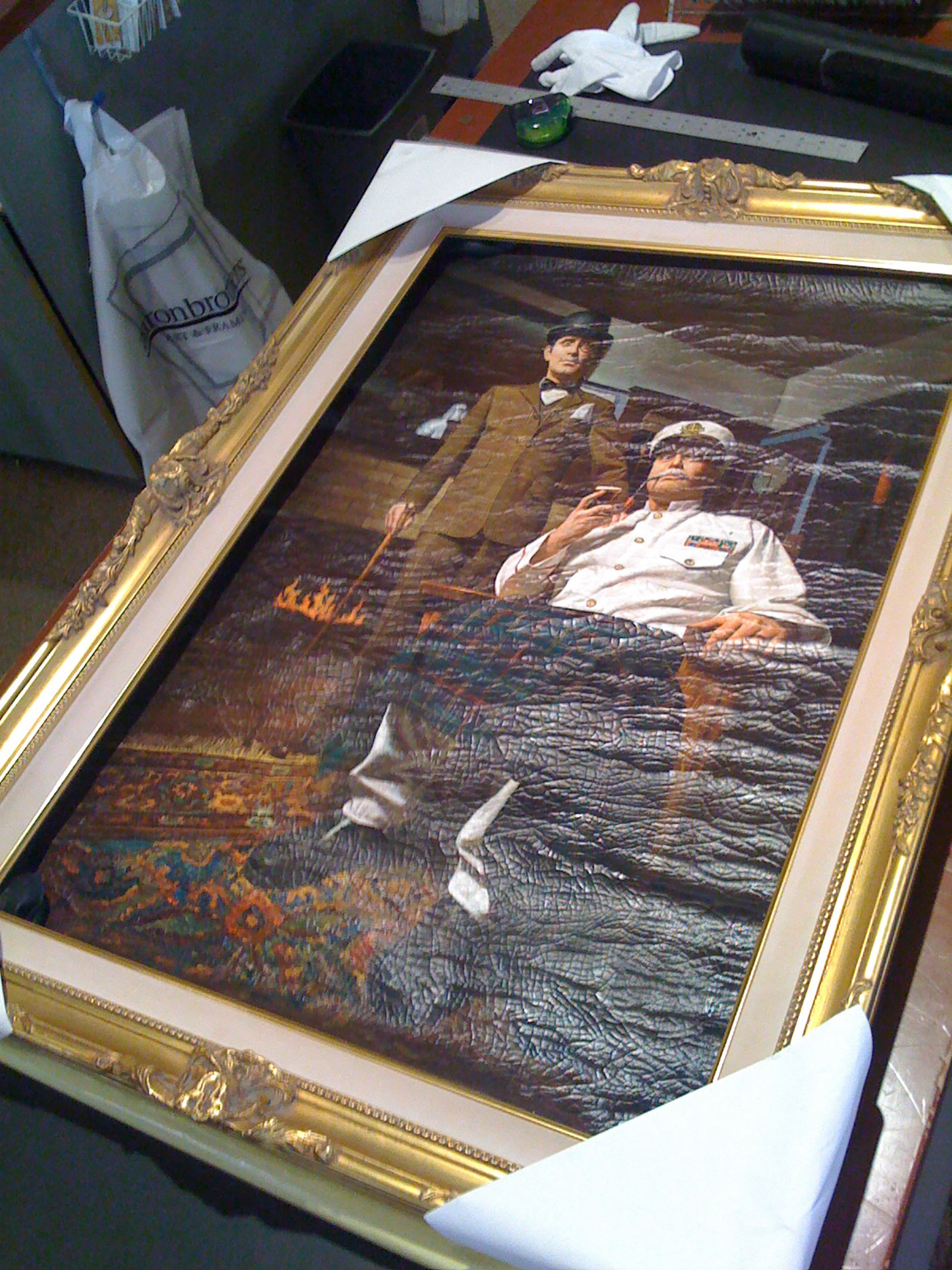
The Founders Room
So now, behind this secret wall…
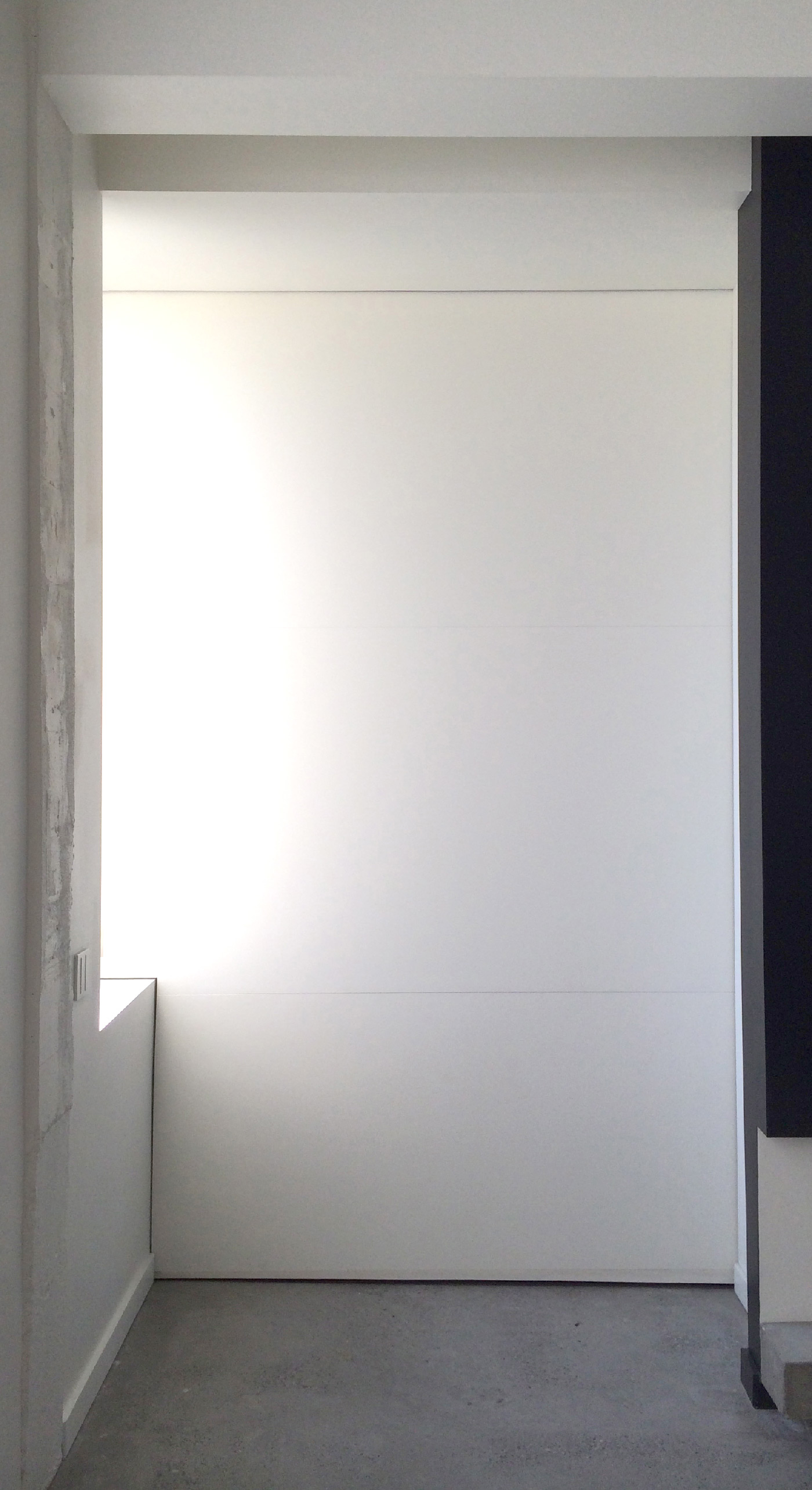
…we have something rather special:
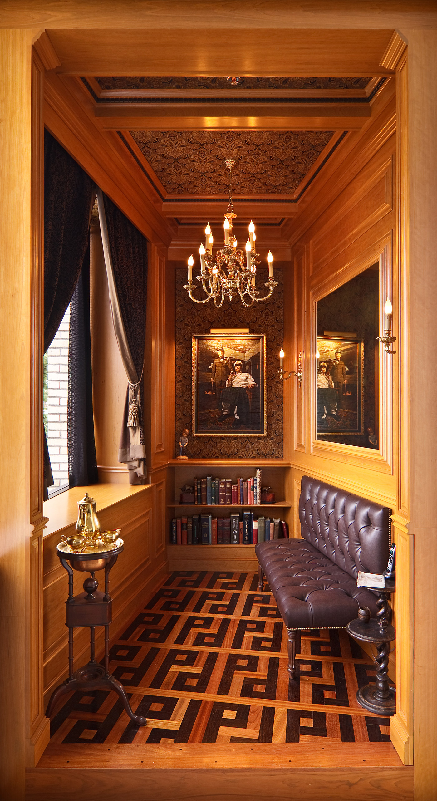
(That amazing oil painting of myself and Steve as creepy old retired businessmen — why is Steve in a naval uniform, we’re not sure — came from a digital photo we took, sent to to Dafen, China, and turned into hand-painted magic. And there’s a hidden booze cabinet you’ll have to find on your own…)
The New Carpet and The New Wall.
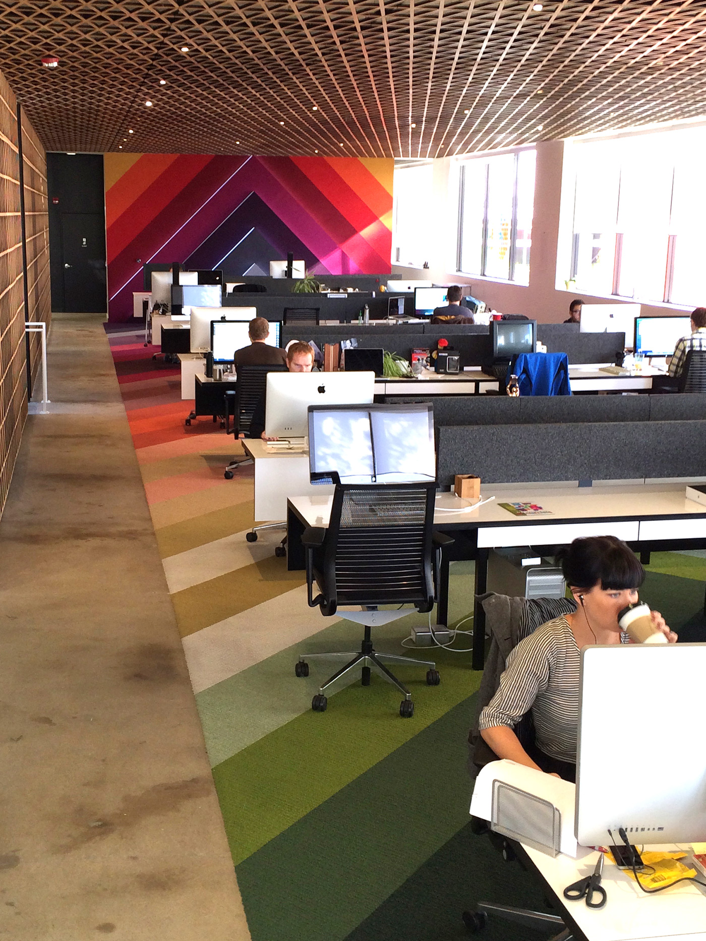
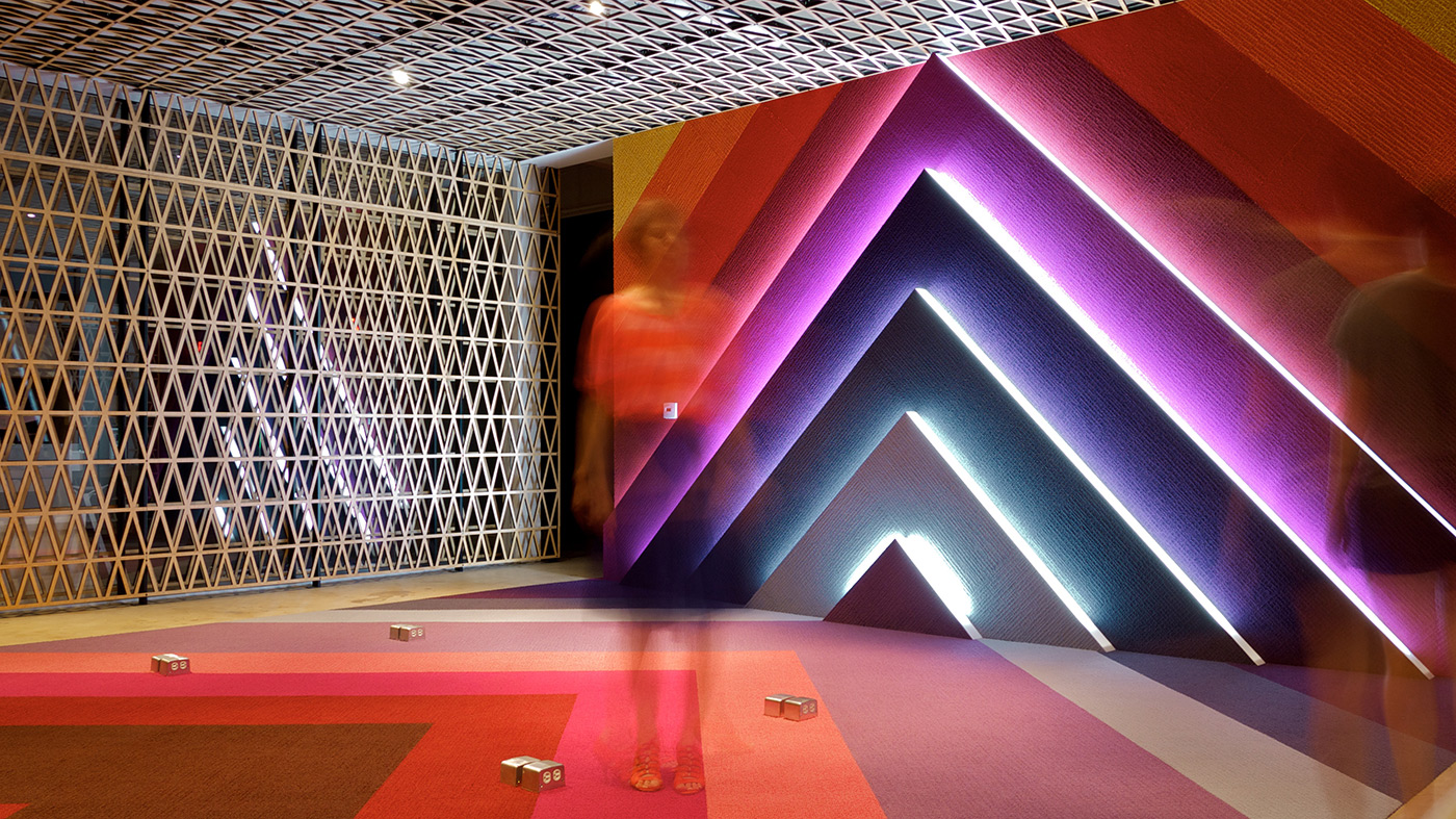
We also later decided that the green checkerboard carpet lacked a little life, a certain energy. So we replaced it — and in the process wrapped it right onto the plain back wall.
The Rooftop Hills
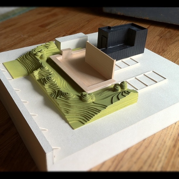
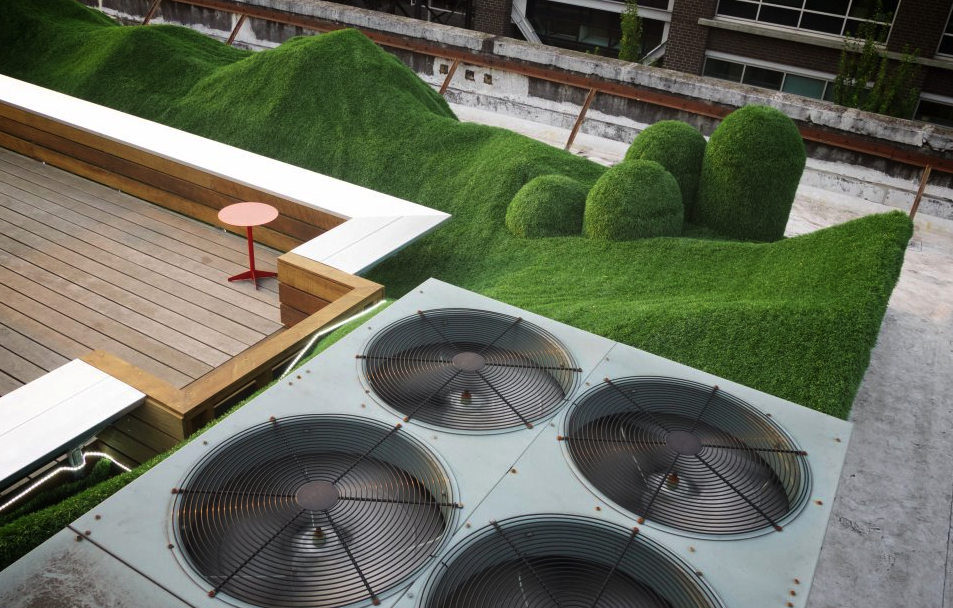
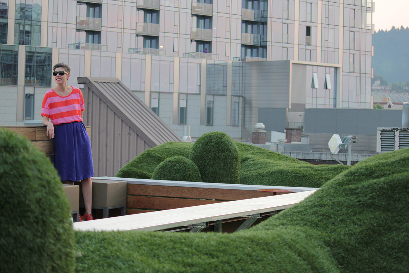
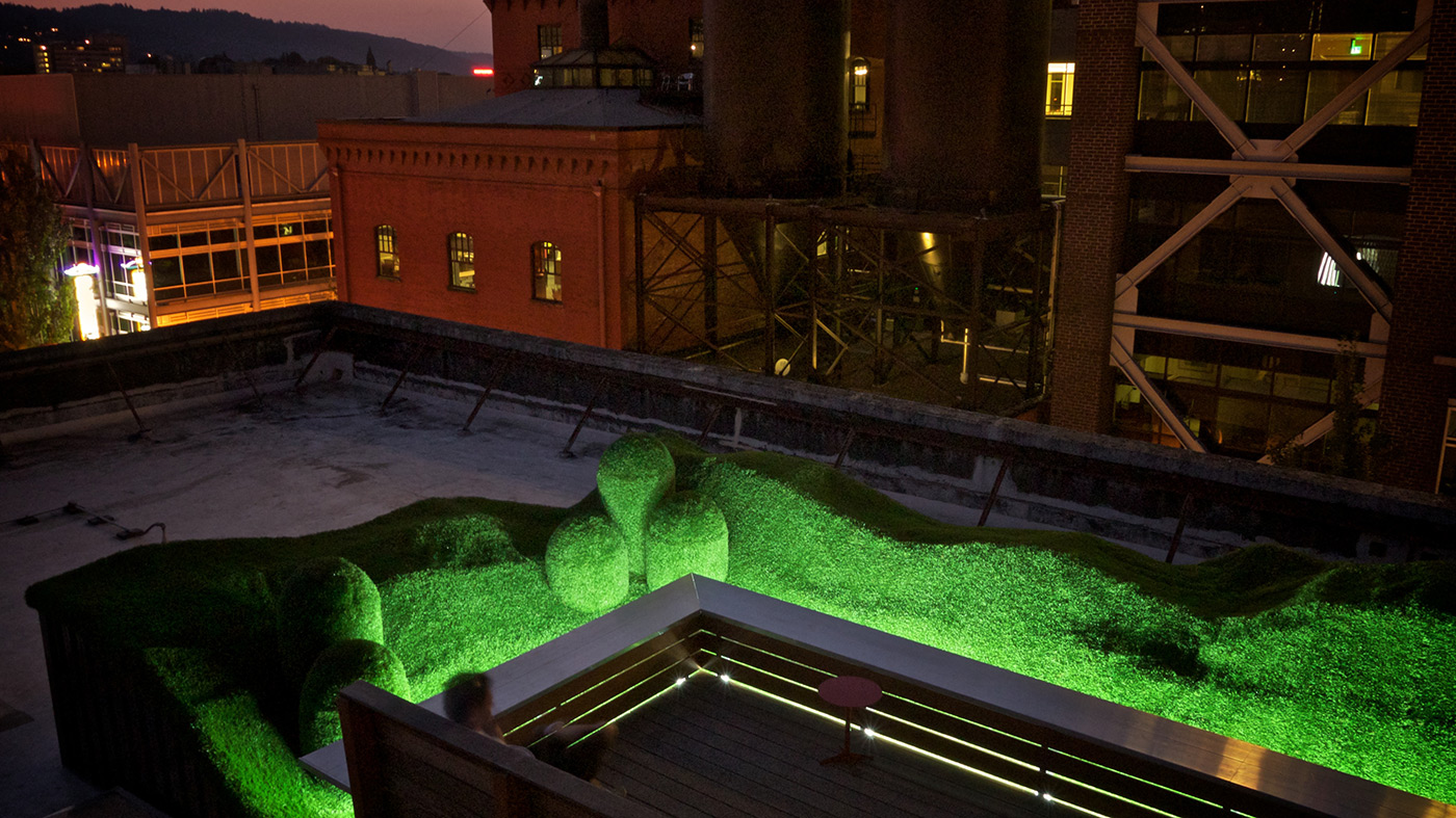
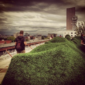
Finally, our rooftop deck was a great way to breathe fresh air, but we had a serious glare problem during sunny days. We solved it in the only way we know how: artificial, astroturf, Super Mario 3-styled hills.
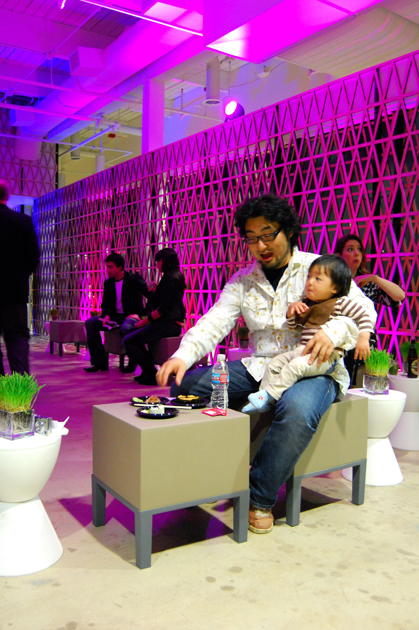
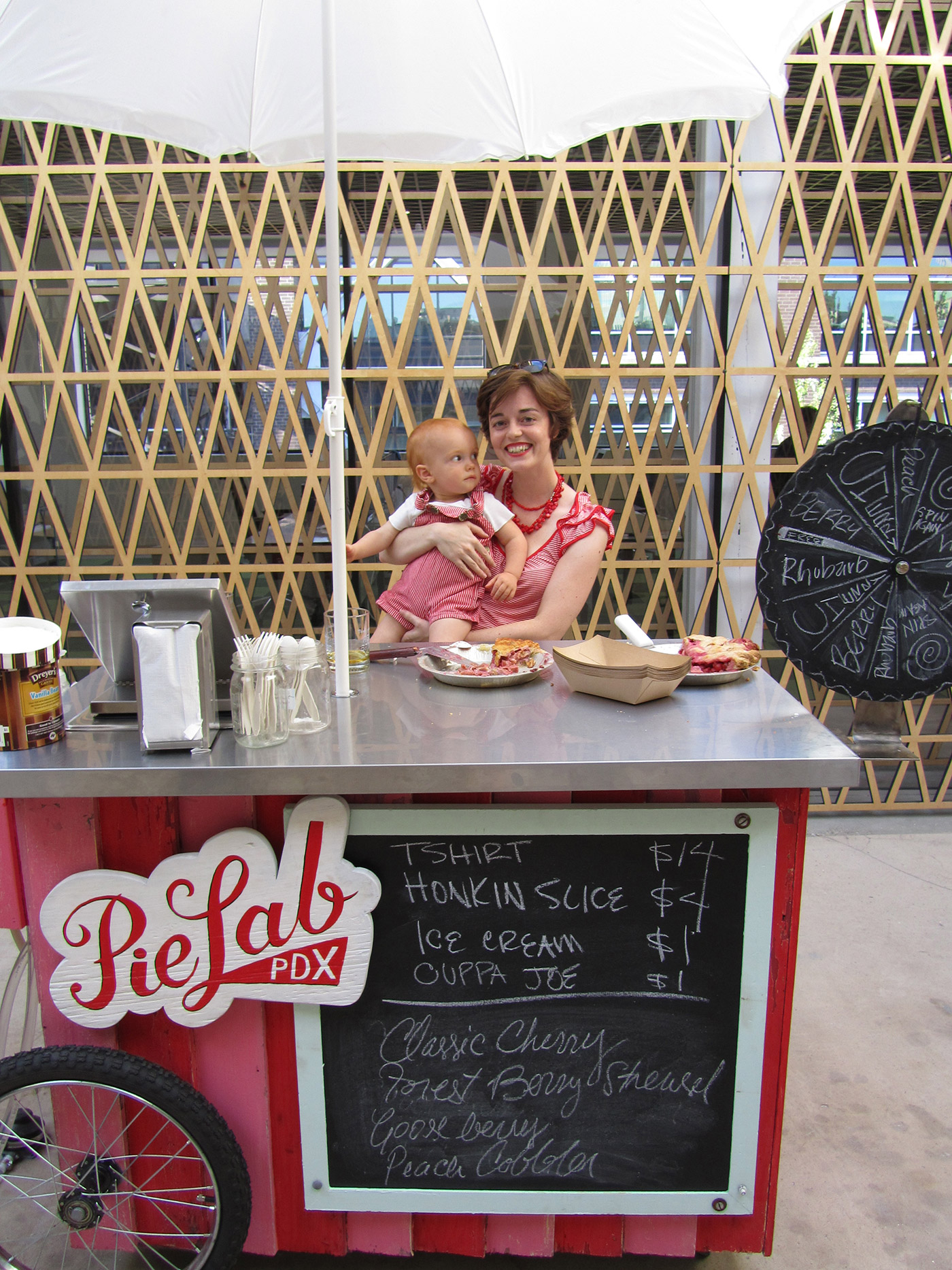
The Guests.
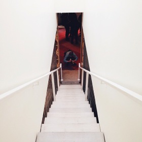
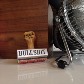
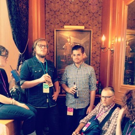
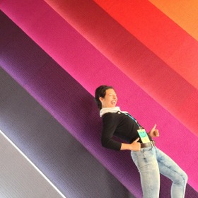
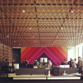
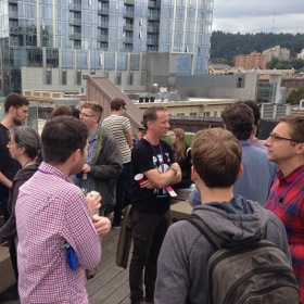
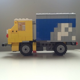
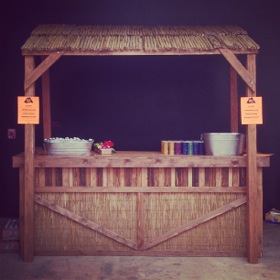
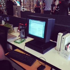
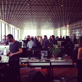
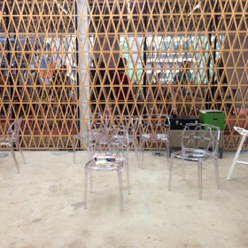
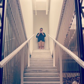
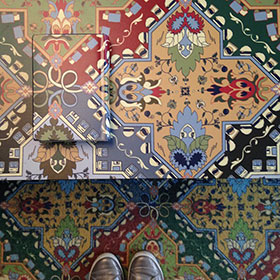
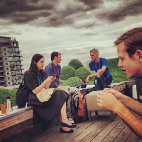
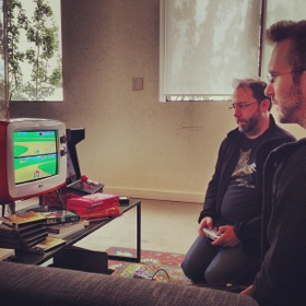
The most rewarding part of building something like this is seeing how other people view our space, when we have guests or (rare) open houses and then check Instagram.



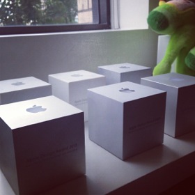
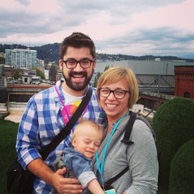
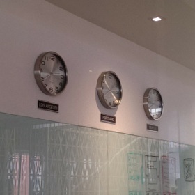

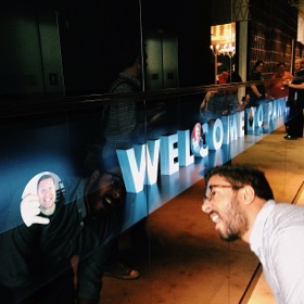




And Finally, The Bonus: Panoramas.
Here are some amazing 360° panoramas of our office, during and after construction!
Thank you for visiting our office.
Credits
Principal Architect: Chris Hodney, Holst Architecture
Interiors, Founders Room, Hills: Andee Hess, Osmose Design
General Contractor: R&H Construction
Founders Room Contractor: GRADA Inc.
Living Room Pattern: Pattern People
Ridiculous Oil Painting: QPaintings.com
Panoramas: Matt D. Smith
Photo Credits: Chris Hodney, Buzz Andersen, Andee Hess, Instagram


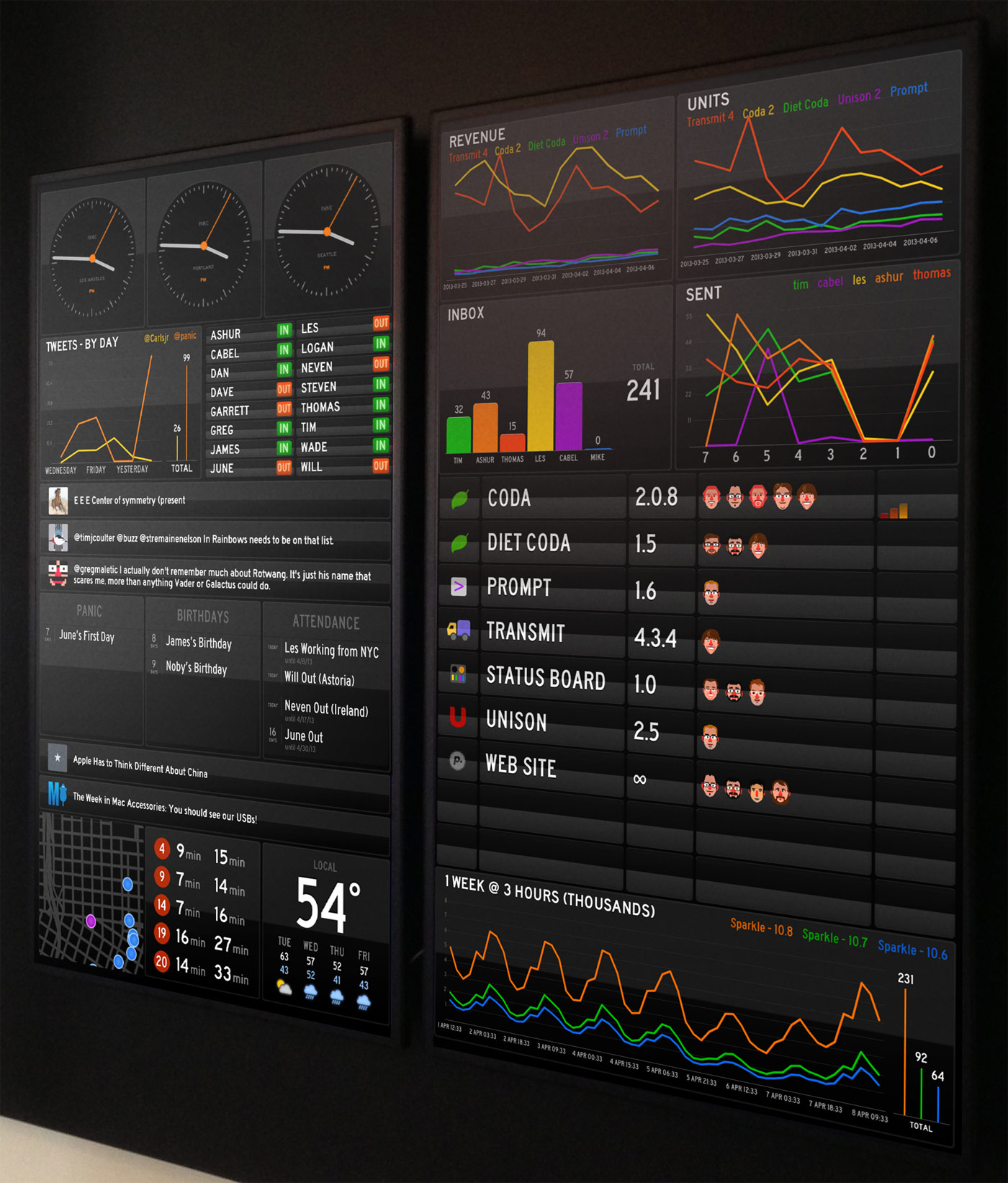
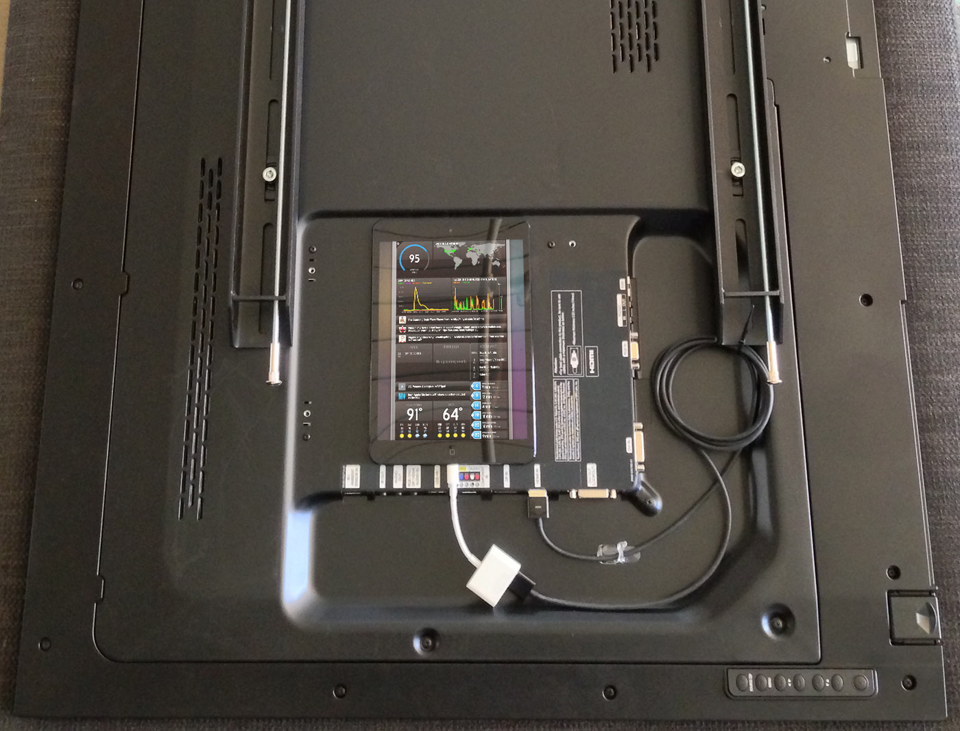
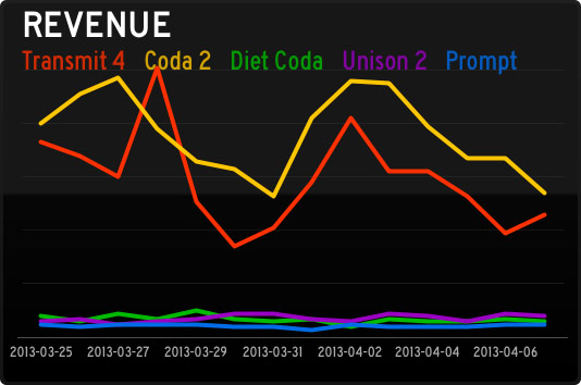 Traditionally Panic is quiet about how-are-we-doing data. It always feels like a possible distraction for our hard-working team. But we’re always changing, and this revenue Graph panel has been fascinating. Every day a script totals up our direct sales data, then retrieves our App Store sales data using
 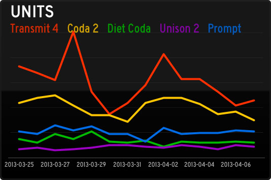 Units have been especially interesting since they reveal so much about the economics of (our) iOS software, as this Graph panel shows. Although (our) iOS apps sell a respectable number of units, the revenue they bring in barely charts compared to our Mac stalwarts. So far! We’re working hard on improving our iOS apps, and trying new ideas, in order to crack the iOS market a little bit more. (Sorry this chart was pre-Status Board, which is doing well!) By the way, Graph documentation is
 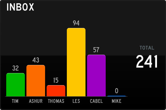 The Support team works tirelessly to fight this tide! This is just an Email panel, which ties into our IMAP server. It took about 3 minutes to set up, and has been incredibly useful to see what our support load is at a very quick glance. (On the server, each Support person shares a single “Help” IMAP account, which has folders for each support person, and a script distributes the incoming support requests round-robin style.)
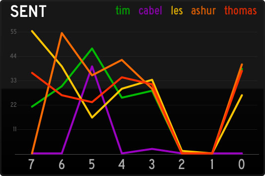 Conversely, this Graph panel this is a great way to quickly see how many support responses are going out the door. (Of course, it’s not a competition — it’s just for fun.) To get accurate Sent counts, we have a script that looks at both outgoing Twitter replies, and outgoing e-mails, and totals them up per-person into JSON.
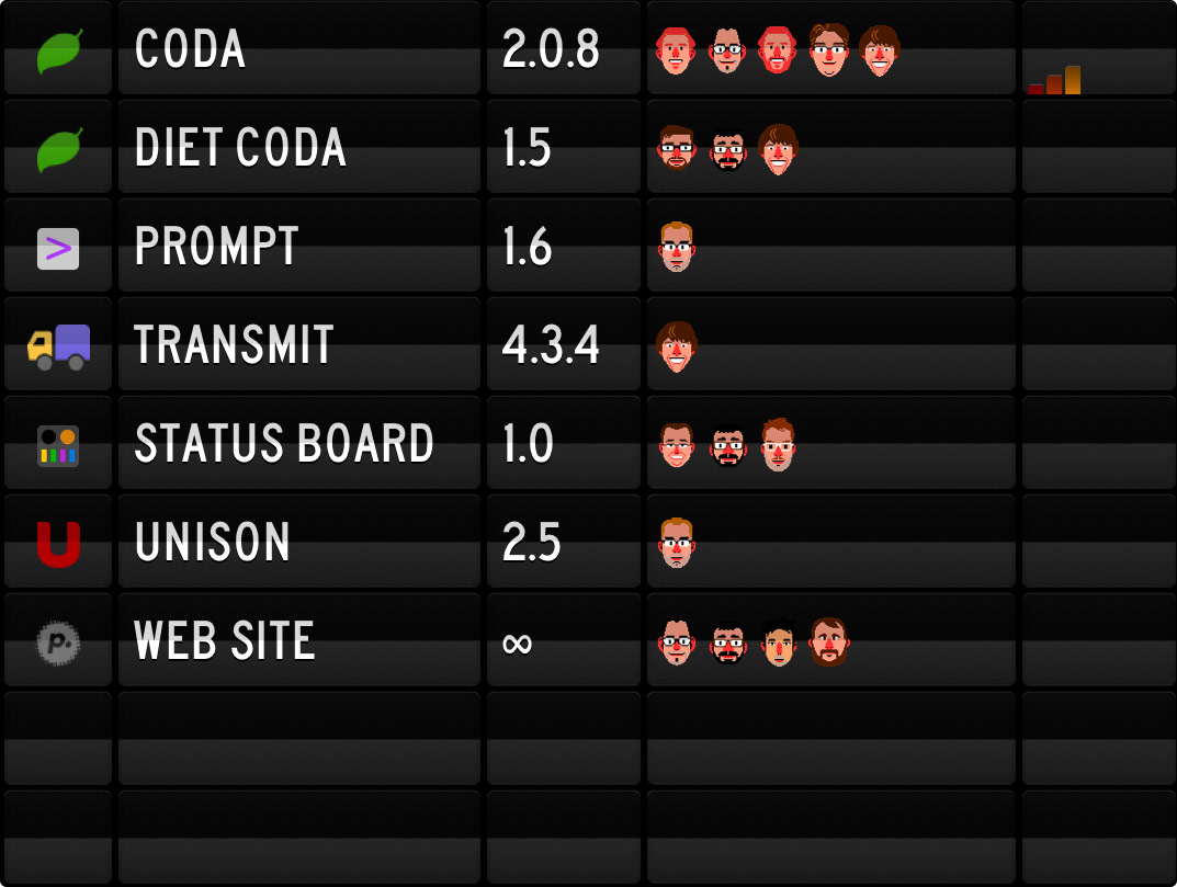 This list is using our Table panel, connecting to an HTML file on our server. (Table documentation is
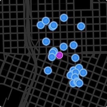 This is our
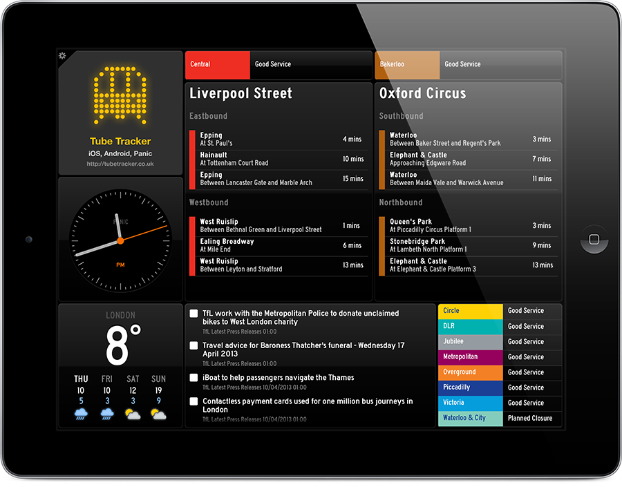
 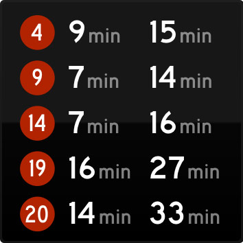 This is another Do-It-Yourself panel to show everyone’s bus lines. Sometimes end-of-the-day conversations are abruptly interrupted when we notice a bus is nearby. Logan has more recently made his own