- We’ve just updated Unison to 2.1. Good stuff. Release notes here.
- Also, Coda Notes has just hit 1.1, reducing console logging, and fixing bugs. Check your Safari Extensions preferences for the auto-update.
- User Jack Fruh made a nice looking guide to setting up Coda + Subversion.
- Some love for Kenichi’s Transmit 4 icon. [Site Down]
- Love achievements? Then you’ll love (?) Achievement Unlocked 2! [Flash]
Panic Blog
Quick Notes #5, Cabel
August 4th, 2010
From the desk of Cabel
Portland, Oregon 97205
Coda Notes for Safari: Now Available!
July 29th, 2010


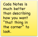
 At long last! Coda Notes, a fun Safari Extension we introduced at this year’s WWDC, is now officially available for download!
To recap, the idea is this: Coda is a great tool for web developers. But how can we make life easier for the web client, or the marketing person, or the person not developing the website but who still has a hand in the process? The person who has to give notes and ideas on web development?

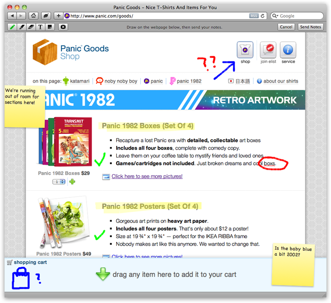
It’s simple: Coda Notes lets you annotate web pages.
 Use the pencil to scribble some drawings or thoughts.
 Highlight areas of the page.
 If you make a mistake, click the eraser and clean up.
 And, most awesomly, edit text live on web pages.
 Add sticky notes to call out thoughts. As many as you’d like!
Also, one Pro Tip: click the pen or highlighter buttons multiple times to change colors!
Once you’re done, hit “Send Notes” in the toolbar and a screenshot is taken, placed on a little postcard, and emailed to anyone you choose.
Your notes are sent through our email server¹. Which is as good a time as any to mention our privacy policy: this emailing process is fully automated, and we will not retain your images for any reason. Once your image has successfully sent, it is immediately and automatically deleted, never to be seen again. That is all.
Finally, it gets better:
Coda notes is completely free. Just download, double click, and use.
Coda Notes is a Panic side project, but you can feel free to e-mail any bugs to support@panic.com and we’ll file them away. Most importantly: enjoy!
UPDATE 10/19/2012 — Coda Notes 1.2 adds compatibility with Safari 6 / Mountain Lion. Go to Safari Preferences > Extensions > Updates to get it.
UPDATE 4/17/2014 — Coda Notes 1.3 adds compatibility with Safari 7. And since we are unlikely to do many updates in the future, we posted the source to GitHub!
¹ Why do it this way? Sadly, it’s not possible for Coda Notes to save a screenshot directly to your disk — Safari Extensions can’t access the filesystem for security reasons. Similarly, we can’t send your screenshots via Apple Mail, since Safari Extensions can’t launch or script other applications. This was the best way we could think of to e-mail a thing from an extension.

From the desk of Cabel
Portland, Oregon 97205
Toy Story 3
June 28th, 2010
A week or so ago, the loose tradition continued: Panic once again took over a Portland movie theater (this time, The Roseway, a classic single-screen neighborhooder that’s been massively updated) and invited our friends (and a handful of Twitter pals) to join us for a showing of a movie we’re excited about.
This time it was Toy Story 3. And oh, what a great movie. I won’t say more. If you haven’t seen it, go right now.
This post, however, is just an excuse to show off this beautiful thank-you card we received from a guest:
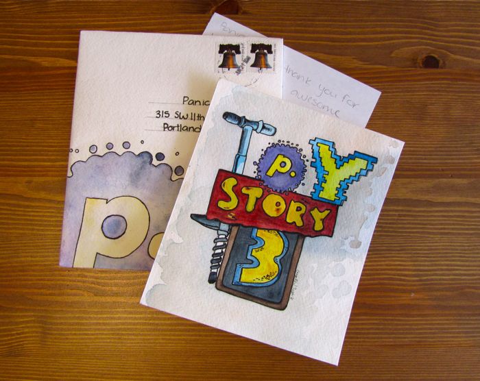
Thanks, Crystal. In our digital universe, it’s so refreshing to see some beautiful watercolors on actual paper!
Now, just because you don’t live in Portland, doesn’t mean you have to miss out on our fun. I’ve got a special surprise! We’re giving away one Toy Story 3 poster — and it’s signed by the director, Lee Unkrich!
Be the first in the comments to answer the following Toy Story trivia, and it’s yours for the taking.
“Pizza Planet pizza is likely to be delivered in what model of truck, yo?”
UPDATE: Congratulations to Brad in the comments for being the first with the correct answer: it’s a Gyoza!

Copywriter: Cabel.
Saving Icons for Snow Leopard
June 21st, 2010
Obsessive designer? You may have noticed: icons made in Mac OS X 10.6 are often washed-out/lighter.
Normally we create .png files of each icon state, then drag them into Icon Composer. But, starting with 10.6, the colors would lighten unexpectedly. It wasn’t dramatic, but with certain icons (like the one below) it was totally noticeable. The source is on the left. See how the red is washed out in the final icon on the right?
![]()
We spent a long time trying to figure this out, and the story goes something like this:
Mac OS X is a fully managed color system. Colors aren’t just RGB, but also include a colorspace that maps RGB to an abstract color. When any bitmap is drawn to the screen, it’s color-converted. But there’s always been a loophole: an image can be “untagged”, meaning it has no embedded colorspace information. Mac OS X interprets untagged data in respect to the default colorspace of the display.
Well, in 10.6, that default display colorspace changed quite a lot to be more Windows-like and less old-school Mac-like, which makes untagged images look more or less the same cross-platforms. The bad news? There’s no way to tag an icon with a colorspace, so icons from 10.5 looked odd — way darker — on 10.6. Apple’s solution? Icons in 10.6 are interpreted in the “Generic RGB” colorspace, an approximation of how it was.
In other words, old icons would look too dark with the colorspace changes in 10.6, but the Generic RGB colorspace being applied lightens them back to exactly what they looked like before. Problem solved?
Not if you’re drawing new icons on a 10.6 system that’s already using the darker colorspace! Since those new icons go through the same Generic RGB colorspace converserion, they’re lighter than they should be!
Ok, ok. So here are the steps we use to guarantee 10.6 icon color accuracy.
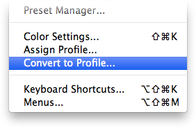
- With your final artwork open in Photoshop, choose Convert to Profile from the Edit menu.
- Choose Generic RGB Profile from the Profile pop-up.
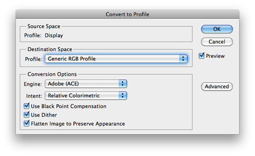
- Do a Save for Web… to make a fresh, Generic RGB .png of the icon. (Uncheck ‘Convert to sRGB’!)

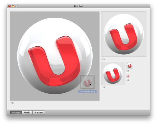
(Warning: the QuickLook preview of this .png will look too dark in the Finder. Ugh. Do not be alarmed.) - Drag your color-corrected .png into Icon Composer, and save.
That’s it! Your final icon, once the system applies the Generic RGB profile, should look exactly as you intended. One possible downside: now your icon will look too dark on 10.5! Hooray! :(
