- A nice Macworld review (!) of our ShrinkIt tool. True fact: the review is exactly 17 words longer than the ShrinkIt source code itself.
- Speaking of ShrinkIt, it apparently shaved 4.7 MB off of Übercaster. Sweet!
- NOBY NOBY BOY for the iPhone is now available! Take useful iPhone functions — a clock, or a GPS — then make them crazy. This comedic “Productivity Tool” is wonderful. And if you like it, don’t forget our NOBY NOBY SHIRTS!
- I reported a pothole using an iPhone app. 6 days later, it’s fixed. 2010… :love:
Panic Blog
Quick Notes #3, Cabel
February 19th, 2010
Copywriter: Neven.
Accolade’s Amazing Box Art
February 18th, 2010
During research for the Panic 1982 Box Project, Cabel and I came across a unique Package Design Time Paradox: game boxes, made over 20 years ago, that look as if they could have been designed yesterday.
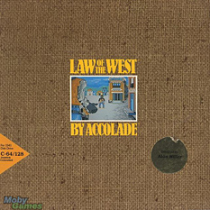
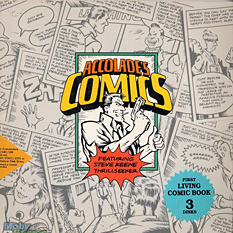
For the game developer Accolade, the period between 1984 and 1990 marked a serious and unbeatable streak of awesome. We’re talking bold, timeless art; none of this so-bad-it’s-good nonsense. Click ’em:
It’s obvious that all these games are from the same company, and yet the variety of illustration/photo/type styles is fabulous. That Killed Until Dead image: how understated and powerful is that? Who does that sort of classy thing with video game covers anymore? (No, really, who? Please feel free to tell us!) Take heed: the simplicity and clarity of these boxes has given them eternal life.
Note also that since these are very design-y, often abstract covers, there’s less potential for Box Disappointment™. I mean, Mr. Grumpy obviously won’t be there in photographic flesh when you fire up Mini-Putt; no one expects that. But his curmudgeonly spirit will be, regardless of how many pixels he’s built of. That’s what a product box should ideally do: make the product more badass.
Unfortunately, right around 1991, as Accolade began to hire Boris Vallejo as a cover artist, things became… a little too much badass. And a whole lot less timeless.
You had a great run, Accolade. I wonder who the art director was?
(All images found at the invaluable MobyGames.com. Oh, how many nostalgic hours we’ve spent there!)
From the desk of
Neven
Engineering Dept.
ShrinkIt 1.1
February 16th, 2010
Update: ShrinkIt 1.3 is now available over here.
Is your application larger than necessary because of needless data stored in image resources? What is making your PDFs four times the size they ought to be? More on this shocking discovery at 11!
(It’s 11.) Being a responsible and forward-thinking developer, you’re probably good and ready for the day Mac OS X supports resolution independence – lol – so you use multilayer TIFFs and PDFs instead of flat bitmap images whenever possible.
Try this: get the file size of one of those Adobe Illustrator®-produced PDFs. Now open it in Preview and resave it. Notice anything? Once a PDF has gone though Apple’s PDF processing, it’s way, way smaller.

We sure noticed this, and it bugged us. A lot. What was all this extra crud? Will started digging into the files and brother, you won’t believe what he found. Swatches, patterns, preview bitmaps, all sort of metadata; even though we’d specifically turned off all the extra options when saving from Illustrator: Preserve Illustrator Editing Capabilities, Embed Page Thumbnails, etc.
We could have re-saved all our PDFs in Preview, but why not make it totally batch-y? Thanks to Will, we present:

ShrinkIt
Update: ShrinkIt 1.3 is now available over here.
ShrinkIt is a simple, small, Panic-internal tool (for Mac OS X Snow Leopard) that will automate the process of stripping needless metadata from PDFs by re-saving them using Apple’s PDF processor. For app resources and icons that aren’t using high-end Illustrator features, this should be lossless — Apple’s PDF code is not compressing anything, just removing cruft. Simply drop a bunch of files (not folders) onto it — such as the contents of your app’s Resources folder — to have it find the PDFs and do its magic. The original files will be renamed with the prefix “_org_” for backup safety. That’s it!
We’ve seen it shave 4 megabytes off an app bundle. Hopefully it’ll shave you as well. Oo-er.
Update: ShrinkIt is intended for simple vector resource PDF’s that have more Illustrator cruft than vector data. It may not work well for complex bitmap-heavy or press-ready PDF’s.
Copywriter: Cabel.
Clear
February 2nd, 2010
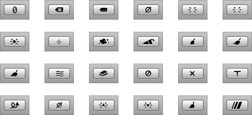
Quick: what’s a good, one-color icon shape that says “clear”?
A circle with an X? A circle slash? No, this isn’t delete — this is like clearing the list in Safari’s download window. Just removing things you don’t need to see anymore. A little brush, dustpan style? Without color, it reads as a paintbrush, and seems too detailed.
As it turns out, this is tricky. Apple solved this problem… by using the word “Clear”.

Cheaters! Well, fully understandable cheaters.
Well, for your curiosity, here’s what the Panic Art Department has come up with so far:

Our final choice? None of these. You’ll have to wait for a future software release to see what we decided on. (Yeah. Total mocktease.)
As a side note, amazingly, Google dug up an actual patent for “CLEAR DATA FROM A BATCH QUEUE” ICON FOR A DISPLAY SCREEN OF A PROGRAMMED COMPUTER SYSTEM. Well, that sounds perfect!

Yeah… I don’t think we’re going to use that one.
From the desk of Cabel
Portland, Oregon 97205
Steve American
January 26th, 2010
Here’s a little known secret: Steve, co-founder of Panic, was actually born in the UK. His family immigrated to the USA when he was 6. He uses a British accent when he talks to his parents. When I met him, he actually pronounced vitamin “vit-uh-min”. In other words, Steve wasn’t technically an American.
Until now.
Last week, Steve filed the paperwork, took the interview, jumped through some bureaucratic hoops, and became an official American. Hooray!
I made a quick little video to document this fascinating and momentous moment — it was legitimately wonderful — and to illustrate some of Steve’s difficulties in adjusting to American life. As if in a sitcom. A sitcom where he hasn’t already lived here for almost three decades.

Welcome to America, Steve!


