You knew Panic was making a game, right?
Technically, we’re not actually making the game — we provided the funds to launch both a brand new game studio, Campo Santo, and an ambitious upcoming game… Firewatch.
Panic is, I guess, the “publisher”, although to me that conjures up imagery of a guy in a suit slamming a table and yelling “If you don’t add a goddamn assault rifle in the first five minutes of this snooze-fest we’re shutting this whole thing down!”. We are not that publisher. Campo Santo has become extended Panic family, and we feel as strongly about Firewatch as we do any of our apps.
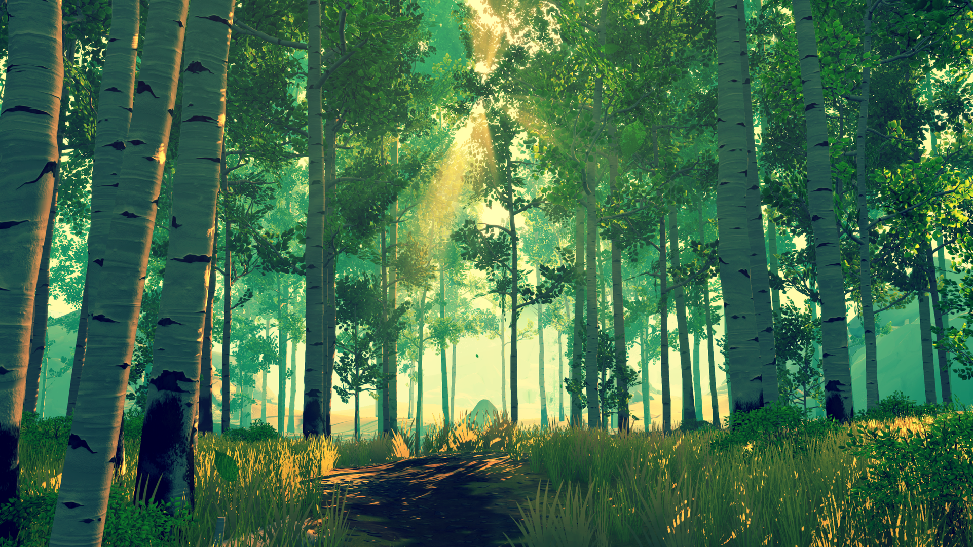
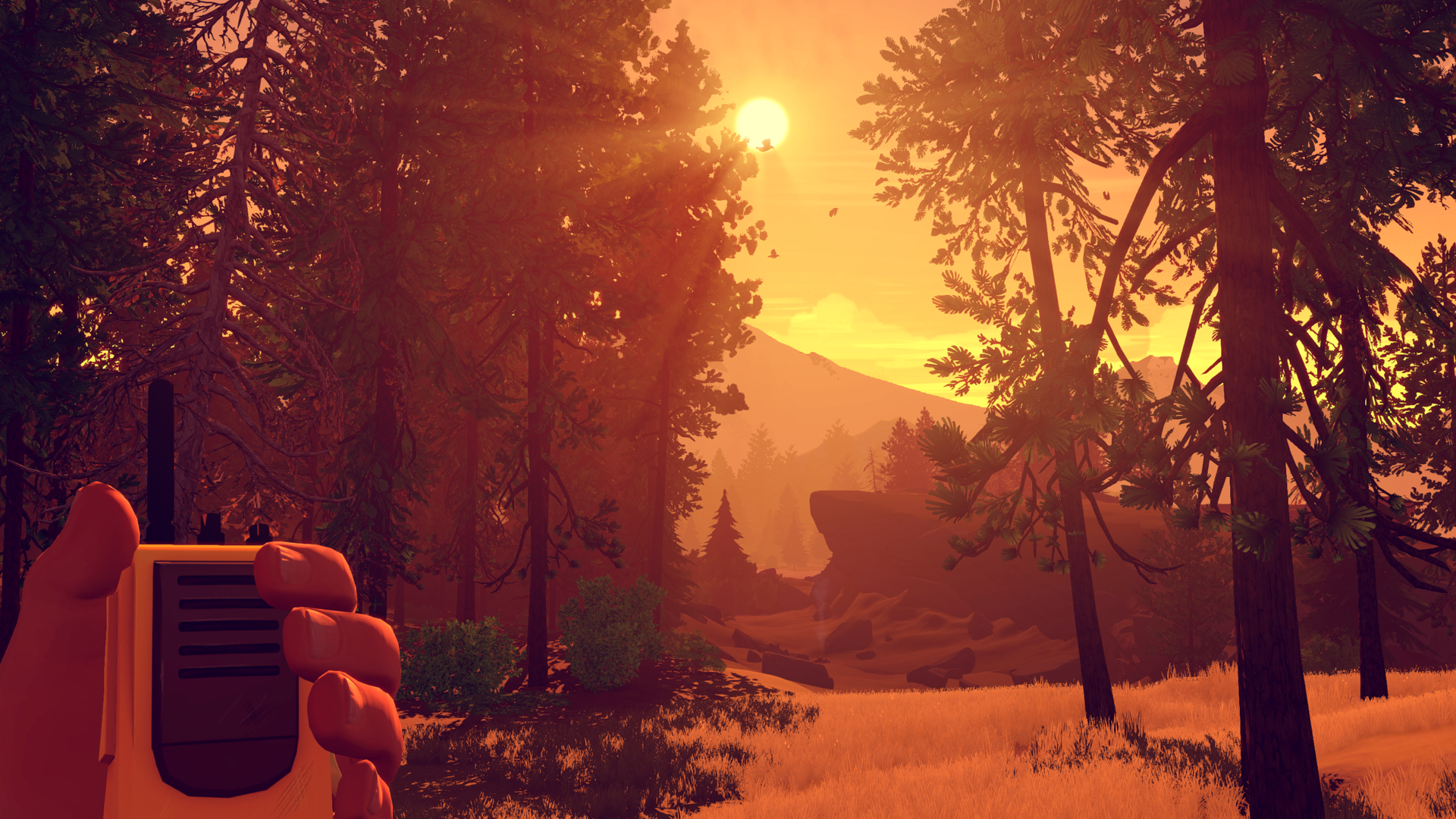
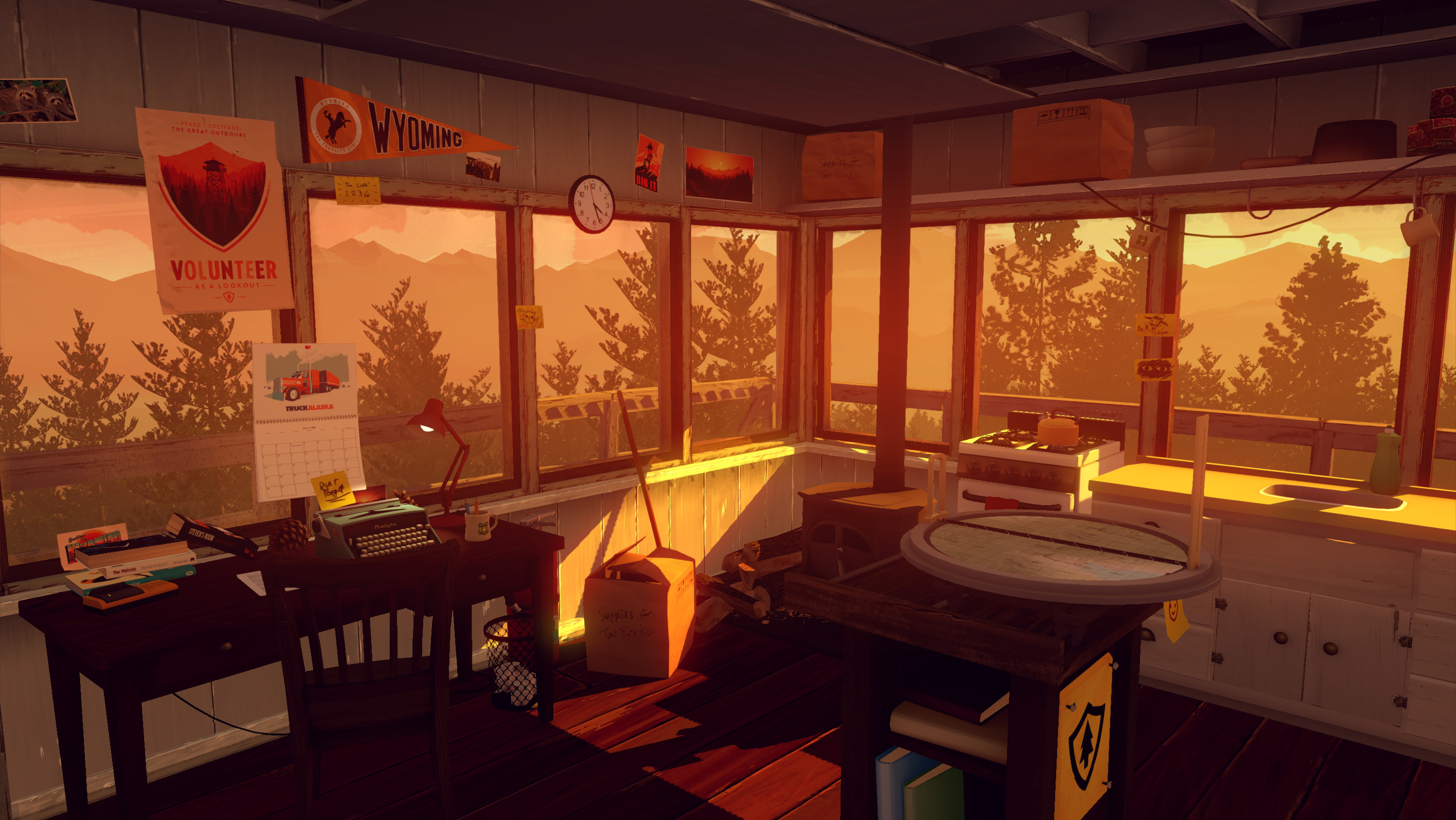
“In Firewatch, you play as a man named Henry who has retreated from his messy life to work as a fire lookout in the Wyoming wilderness. Perched high atop a mountain, it’s your job to look for smoke and keep the wilderness safe. Your supervisor, a woman named Delilah, is available to you at all times over a small, handheld radio — and is your only contact with the world you’ve left behind.”
You can watch 17 minutes of gameplay here. The game already looks incredible:


Now, while Campo builds the game, it’s Panic’s job to help sell it.
We talked a lot about how we wanted to do that. Should we get a booth at PAX? E3? What’ll get the word out best? Trade show booths are notoriously expensive — I’ll never forget getting yelled at once because I was carrying in a single box to our Macworld Booth one year, that was the Union’s job!, not to mention the $1,500 three-day internet — plus your game gets lost in a giant sea of bright lights and loud garbage.
So, we focused on GDC — the Game Developer’s Conference — a time when a lot of press and peers are in one place. Then, we thought it’d be more cost effective and possibly more powerful to do something “off-campus” — make a destination for attendees. And since not everyone can afford to attend GDC, we thought it’d be incredible to do a Public Demo Day, where anyone in town could play an early build of Firewatch for themselves, for free.
Sounds great. But how could we make this event feel amazing for our guests?
We needed to find the right space… and lights… and trees.
Because we brought Firewatch to life.

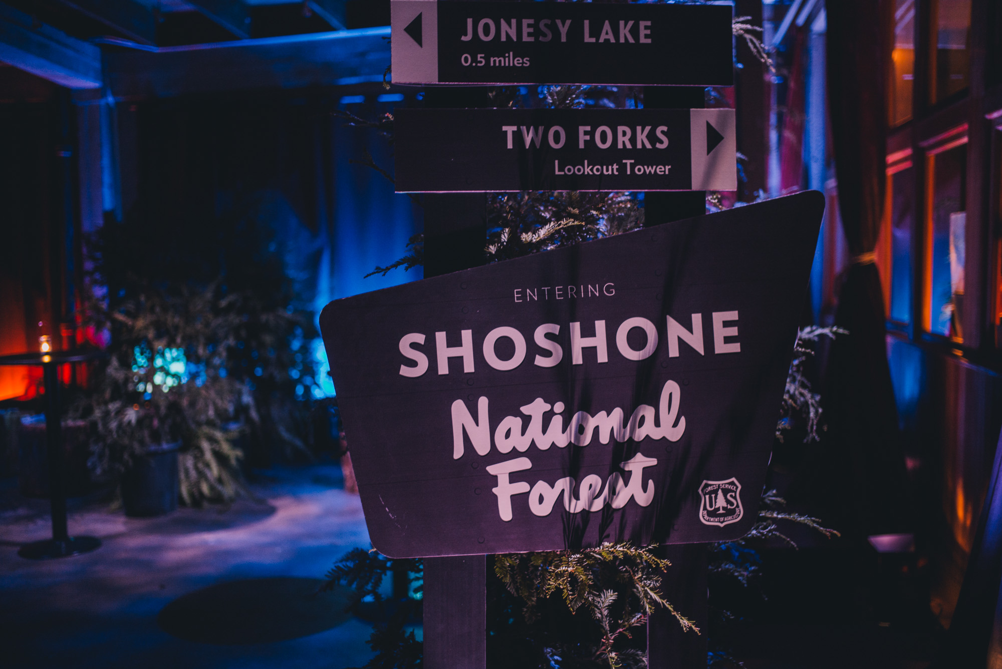
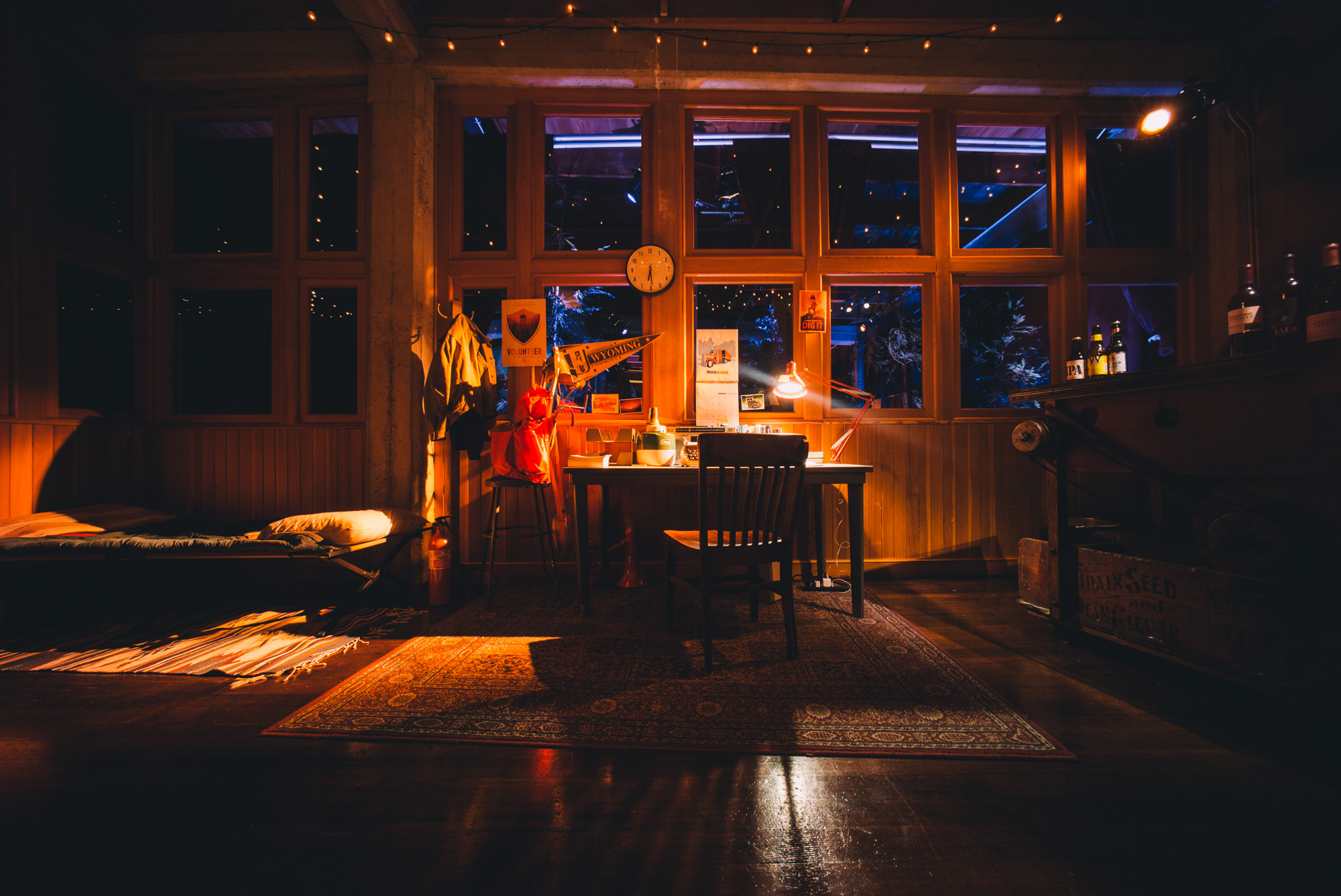
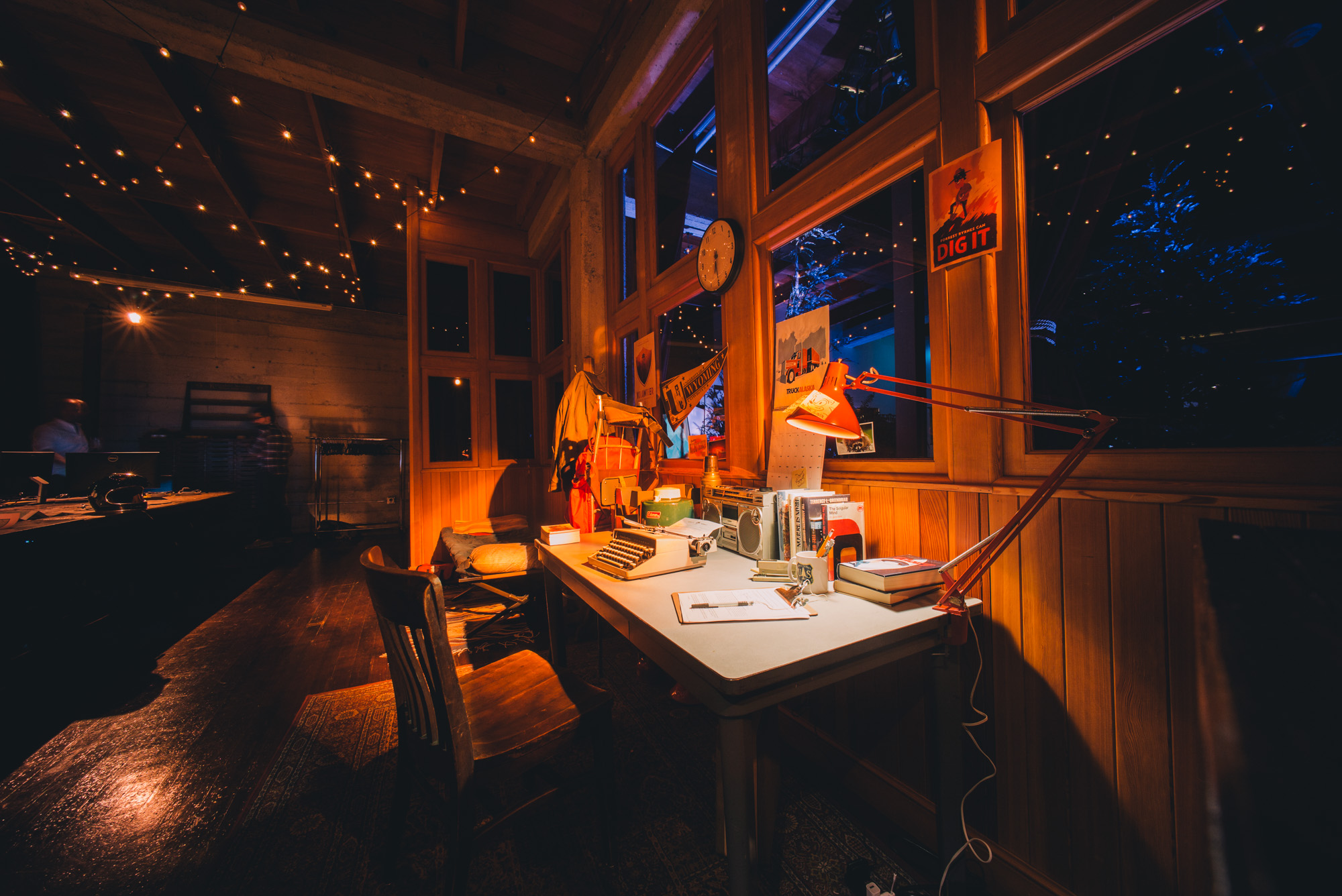
Guests were greeted with some helpful signage. To the right, we built a full recreation of Henry’s tower and desk… down to the smallest Olly Moss-crafted detail.


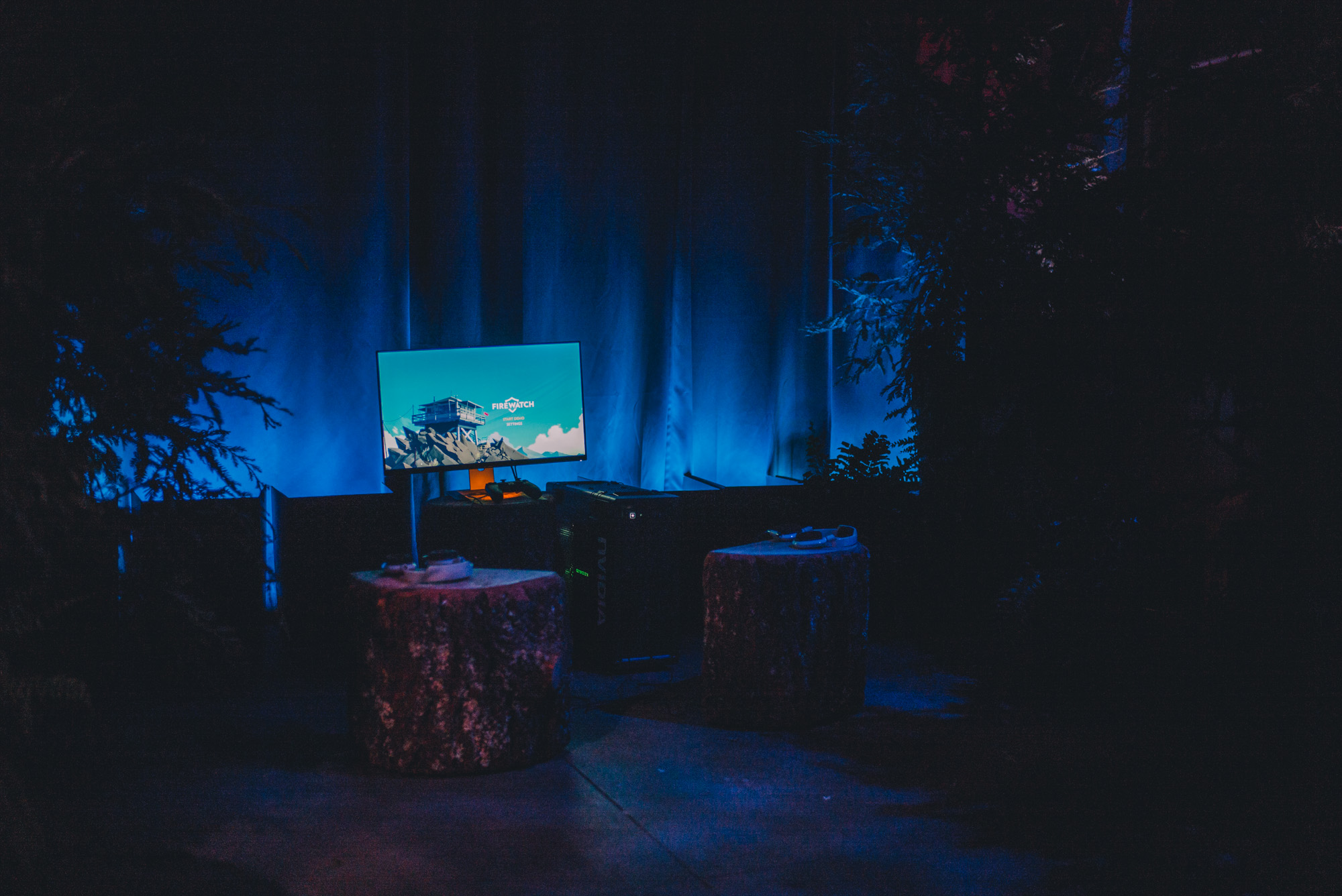
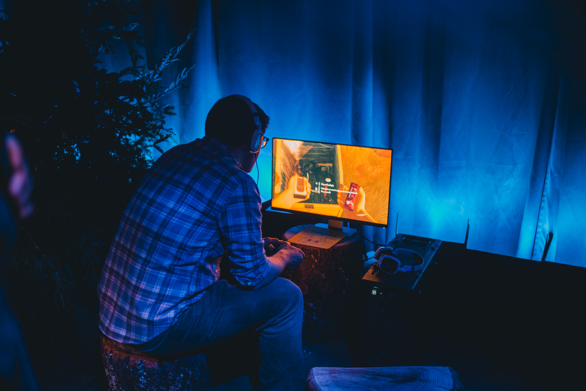
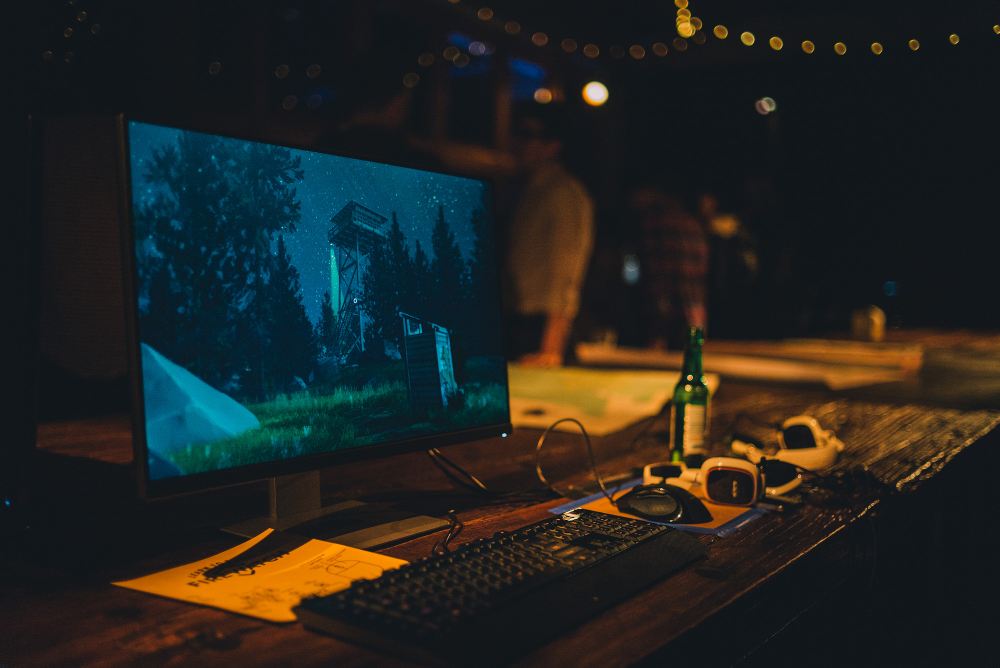
On the left, we set up these demo stations with the latest build of the game right in the middle of our own tiny forest.


(That’s Rich Sommer, the voice of Henry in our game — you know him as Harry Crane from Mad Men. I asked if it was weird playing a game with his own voice but he said that kind of out-of-body experience doesn’t really affect him anymore.)
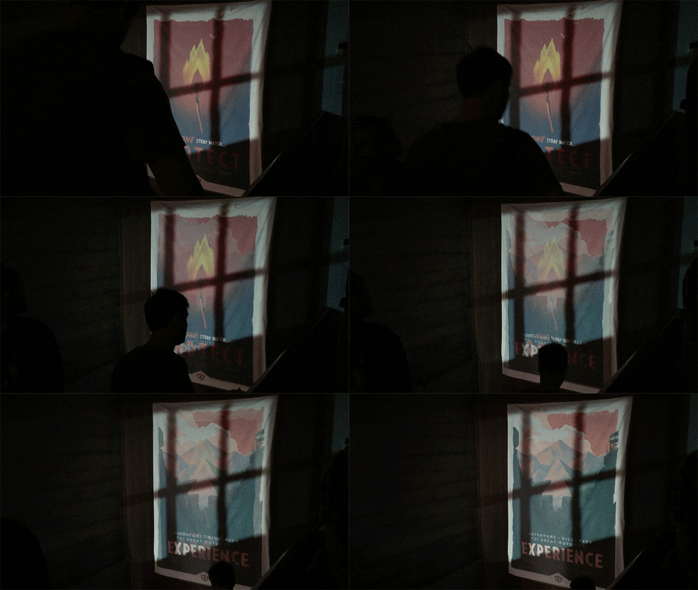
We even included some cool special effects, like this magic poster at the entry stairs:

(FYI, the secret to an eye-fooling projection is to project onto a textured surface — in our case, canvas — and layer a lighting effect on top that spills outside the primary surface — in this case, faux window light.)
The doors opened and we were slammed. Nearly a thousand people showed up to our (quickly-very-toasty) venue and played the game. We got a giant stack of feedback forms and learned a lot about what was, and what wasn’t, working. The experience was invaluable for us.

Plus, the reactions to the demo have blown us away:
Rock Paper Shotgun: “It was agonising when the demo ended – I desperately wanted to play more. I wanted to know what happens next! Despite the fact that, looking back, what had happened so far was so relatively mundane. It was the strength of the characters, and the wonderful sense of place, that made me not want to have to leave.”
gameinformer: “Firewatch is my favorite game from GDC. It immediately hooked me, and I never knew what I would find next. […] I’m still thinking a lot about my time with Firewatch, and that says something.”
Spectre Collie: “If we get enough people pointing at a beautiful, engaging, and mature experience and saying, ‘This. We want to make more of this,’ then the entire medium will be better off.”
Firewatch has been teed up.
The goal is in our sights.
Now we just have to hit a home run.
I’m not good with sports analogies.
We hope to release Firewatch in late 2015 for Mac, PC, and an as-yet-undisclosed console.
(Production notes! The bulk of the planning, design, and hard work for this event was done by Greg here at Panic, who really did an incredible job. Beautiful photos courtesy Sebastiaan De With. The venue was The Box SF, which was already laden with warm wood and tower-ready windows. Lighting and sound was installed by Got Light. Props came from the incredible Prop House. Our ambient forest sound loops were crafted by Jared Emerson-Johnson. Boombox audio from the incredible Cheap Talk as discovered by Chris Remo. PCs were provided by Nvidia. Our stump tables and chairs came from Campo’s downstairs neighbor, a woodworker, and they were heavy as all hell as it turns out trees are heavy. When we unloaded the stumps to the Campo office, a random San-Fran-coolguy quickly roosted on one and we love him. Secret party weapon: ambient pine scent provided by a hidden Accuscent HD, which delighted me to no end. And everyone at Campo, of course, worked incredibly hard to guide players, talk to press, make everyone feel welcome! Thanks!)
