Archive for December, 2012

Coda and Sandboxing

Wednesday, December 12th, 2012

Before we can add new features to Coda 2 in the Mac App Store, we must first “Sandbox” it — adhere to a set of Apple guidelines aimed at increasing the security of Mac OS X.

What does this mean, really?

Well, for safety, sandboxing limits an app’s access to your local files until you give the app explicit permission to interact with those files. And once you’ve done this, your permission is remembered in the future. In other words, Coda won’t be able to see most of your local folders until you specifically select them in a traditional “Choose” dialog. The good news? Coda has Sites, and Sites have a Local Path, and once you “Choose” the Local Path when setting up your site, you’ll be able to view that folder and interact with it in the future. The bad news? You’ve got to reset all of your Local Paths, and if you don’t use Sites in Coda (which would be a bit weird) there will be brief bumps.

These changes should only affect the Mac App Store version. And we think most users won’t even notice that anything has changed.

Here’s the full list of what will change, slated for a future Coda release:

1 Local Root

Your site’s “Local Root” will have to be reset. You’ll be prompted to do this the first time you try to connect.

You only have to do this once for each of your sites!

2 Go To Folder

It will no longer be possible to “Go To” any local path by typing it in. “Go To Folder” on a Local path will now bring down a traditional “Choose” panel.
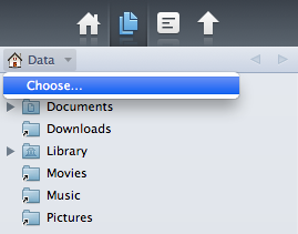
3 Path History

In the Sidebar and the Files browser, the “Path” pop-up can no longer show anything above your defined Local Root. To go above your Local Root, you’ll have to use Choose.

If you’re not working in a Site, you will land in a generic sandboxed home directory, and must Choose another folder to continue.

You only need to “Choose” a folder once!
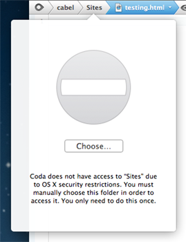
4 Path Bar Browsers

If you click on a folder outside of your Local Root, you have to manually choose the folder via Choose panel.

You only need to “Choose” a folder once!

5 Saving Files

It’s no longer possible to Save files you don’t have write access to, and Coda is no longer able to offer an authorization dialog to permit this behavior.

This includes any files you don’t own and don’t have proper permissions to write, such as files owned by a “web” process.

This is also an App Store restriction.

6 Get Info

It’s no longer possible to change permissions of files that require Administrator/Root access from Coda’s Get Info window.

You’ll have to switch to the Finder and adjust permissions there before editing these items.

This is also an App Store restriction.

7 Places

Any Local places will be cleared during the upgrade, and will need to be recreated, once.

Note: Places are defined per computer, so they will need to be reset on each computer Coda is used on.

8 SVN and GIT

Tool paths may need to be reset depending on their location on your computer.

9 Local Shell

Coda will no longer be able to open a direct local shell/terminal. (You could always turn on Remote Login in Sharing preferences, and connect through that.)

That’s it. What do you think?

For the truly curious we’ve put together a special Coda 2 build with these changes.

Experimental

If you wish to try Coda Sandboxing Test, it’s critical you understand this build is experimental and beta-quality. You must back up your system first.

Also, you must be currently using Coda 2.0.6 or higher. And if you’re using the Mac App Store + iCloud version of Coda 2, you must first turn off iCloud Sync in your current Coda, before launching this build.

Got that? Download the build here. (50 MB .zip)

We don’t have a timeline on this release, but we’re curious to know your general thoughts on Coda 2 and Sandboxing. Once again, we do not think these changes will affect most people, but we’d love it if you could please take this survey:

[polldaddy survey=”CE7F658FF4C50ABA” type=”button” title=”Take Our Survey!” style=”inline” text_color=”000000″]

Thanks for reading, and thanks for using Coda 2. We’re excited to finish sandboxing and start work on more new, awesome things!
iTunes 11 and Colors

Tuesday, December 11th, 2012

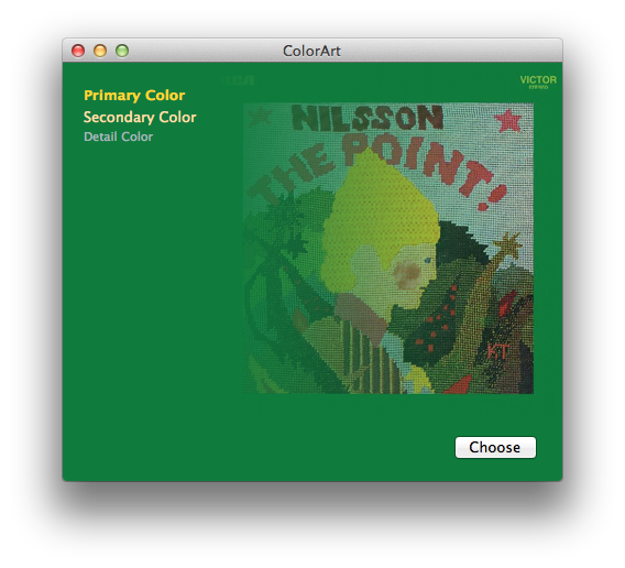
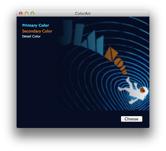
iTunes 11 is a radical departure from previous versions and nothing illustrates this more than the new album display mode. The headlining feature of this display is the new view style that visually matches the track listing to the album’s cover art. The result is an attractive display of textual information that seamlessly integrates with the album’s artwork.

After using iTunes for a day I wondered just how hard it would be to mimic this functionality — use a source image to create a themed image/text display.

The first step in replicating iTunes theming is obvious: getting the background color used for the track listing. This seemed easy enough, just use simple color frequency to determine the most prevalent color along the left hand side of the artwork. Doing a simple color count gives pretty good results, but looking at iTunes it was clear there was more to it than just that. I proceeded to add a bit of logic to add preference for colored backgrounds instead of just using black and white when those were the most prevalent colors. Doing this presents more interesting styles since seeing only black and white backgrounds would be a bit boring. Of course you don’t want to replace black or white if those colors really are dominant, so I made sure that the fallback color was at least 30% as common as the default black or white.

Once I started filtering black and white backgrounds my results started to get a bit closer to iTunes. After doing some more analysis I saw that iTunes also looks for borders around the artwork. So lets say you have a solid white border around the artwork picture, iTunes will remove the border and base its theming colors off the remaining interior content. I didn’t add this functionality as it was outside the scope of my simple demo application.

After the background color was determined, the next step is to find contrasting text colors. Again, the first thing I tried was simple color counting, this provides surprisingly good results but iTunes does better. If we relied only on color frequency you’d get variants of the same color for the different types of text (EG: primary, secondary, detail). So the next thing I did to improve the results were to make sure the text colors were distinct enough from each other to be considered a separate color. At this point things were really starting to look good. But what other aspects would need to be considered to ensure the text always looked good on the chosen background color? To ensure colorful text I also added a bit of code to make sure the color used for the text had a minimum saturation level. This prevents washed out colors or very light pastel colors from being used that might not give the best appearance. Now that the text had unique colors that looked good with the background, the only remaining problem was that the resulting text colors could end up lacking enough contrast with the background to be readable. So the last thing I added was a check to make sure any text color would provide enough contrast with the background to be readable. Unfortunately this requirement does cause a rare “miss” when finding text colors which then cause the default black/white colors to be used.

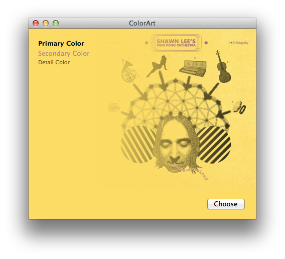
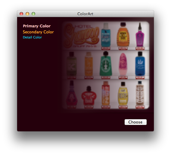
The end result looks something like this:

It’s not 100% identical to iTunes — sometimes it’s better! Sometimes just different — but it works pretty well overall.

You can see exactly what I did in the following Xcode demo project:


A few notes about this demo. I did very basic frequency filtering to prevent random colors from appearing as text colors. In my case I chose to ignore colors that only appear once. This threshold should be based on your input image size since smaller images won’t have as many pixels to sample from. Another processing technique that iTunes does, that I would also do if this were shipping code, is to look for compression fringing around the edges of the image. I’ve noticed a few cover art images that contain a single pixel edge of white/gray fringe that should be ignored and removed before sampling for the colors.

(Last but not least, this code was written in a few hours, and is very rough. So just in case you have thoughts about speed or optimizations, please note it was more of a thought exercise than a lesson in algorithm design. Engineer disclaimer complete.)

That being said, I hope this is somewhat interesting! It shows that with just a bit of work you too can have fancy themed designs too.

UPDATE: Thanks to Aaron Brethorst, this code is also now on GitHub.

Coda 2.0.7 Beta 1

Tuesday, December 4th, 2012

It’s minor, but we thought our deepest Coda fans could give Coda 2.0.7 a whirl.

If you’re interested, grab Coda 2.0.7b1 here (51MB).

UPDATE 12/10: The beta has ended. The app has been released for direct customers and submitted to Apple.

Notable changes: improved stability and syntax highlighting performance.

If you find issues, promptly report them thoroughly via Hive!

PS: We also recently solicited, via Twitter, testers for Transmit w/iCloud and Dropbox Favorites Sync (coming soon!), and a new Panic iPad app that’s all about Status. You should follow us!