iTunes 11 is a radical departure from previous versions and nothing illustrates this more than the new album display mode. The headlining feature of this display is the new view style that visually matches the track listing to the album’s cover art. The result is an attractive display of textual information that seamlessly integrates with the album’s artwork.
After using iTunes for a day I wondered just how hard it would be to mimic this functionality — use a source image to create a themed image/text display.
The first step in replicating iTunes theming is obvious: getting the background color used for the track listing. This seemed easy enough, just use simple color frequency to determine the most prevalent color along the left hand side of the artwork. Doing a simple color count gives pretty good results, but looking at iTunes it was clear there was more to it than just that. I proceeded to add a bit of logic to add preference for colored backgrounds instead of just using black and white when those were the most prevalent colors. Doing this presents more interesting styles since seeing only black and white backgrounds would be a bit boring. Of course you don’t want to replace black or white if those colors really are dominant, so I made sure that the fallback color was at least 30% as common as the default black or white.
Once I started filtering black and white backgrounds my results started to get a bit closer to iTunes. After doing some more analysis I saw that iTunes also looks for borders around the artwork. So lets say you have a solid white border around the artwork picture, iTunes will remove the border and base its theming colors off the remaining interior content. I didn’t add this functionality as it was outside the scope of my simple demo application.
After the background color was determined, the next step is to find contrasting text colors. Again, the first thing I tried was simple color counting, this provides surprisingly good results but iTunes does better. If we relied only on color frequency you’d get variants of the same color for the different types of text (EG: primary, secondary, detail). So the next thing I did to improve the results were to make sure the text colors were distinct enough from each other to be considered a separate color. At this point things were really starting to look good. But what other aspects would need to be considered to ensure the text always looked good on the chosen background color? To ensure colorful text I also added a bit of code to make sure the color used for the text had a minimum saturation level. This prevents washed out colors or very light pastel colors from being used that might not give the best appearance. Now that the text had unique colors that looked good with the background, the only remaining problem was that the resulting text colors could end up lacking enough contrast with the background to be readable. So the last thing I added was a check to make sure any text color would provide enough contrast with the background to be readable. Unfortunately this requirement does cause a rare “miss” when finding text colors which then cause the default black/white colors to be used.
The end result looks something like this:
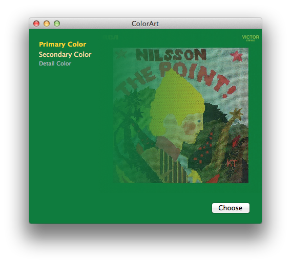
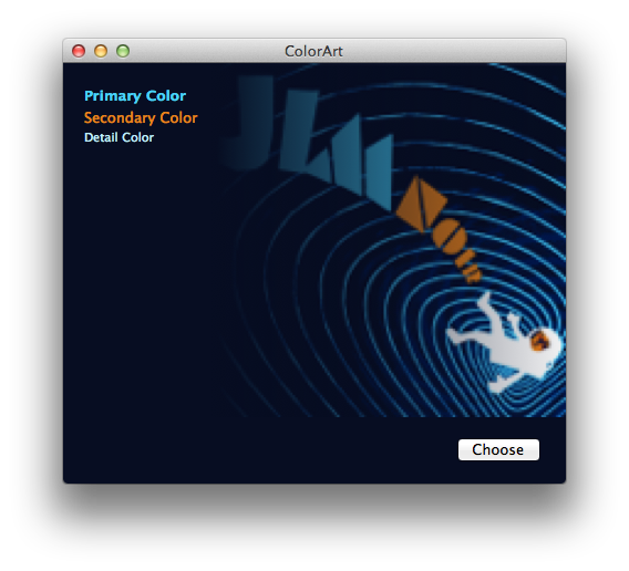
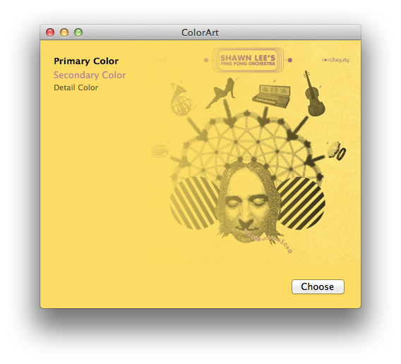
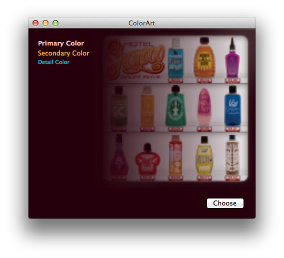
It’s not 100% identical to iTunes — sometimes it’s better! Sometimes just different — but it works pretty well overall.
You can see exactly what I did in the following Xcode demo project:
A few notes about this demo. I did very basic frequency filtering to prevent random colors from appearing as text colors. In my case I chose to ignore colors that only appear once. This threshold should be based on your input image size since smaller images won’t have as many pixels to sample from. Another processing technique that iTunes does, that I would also do if this were shipping code, is to look for compression fringing around the edges of the image. I’ve noticed a few cover art images that contain a single pixel edge of white/gray fringe that should be ignored and removed before sampling for the colors.
(Last but not least, this code was written in a few hours, and is very rough. So just in case you have thoughts about speed or optimizations, please note it was more of a thought exercise than a lesson in algorithm design. Engineer disclaimer complete.)
That being said, I hope this is somewhat interesting! It shows that with just a bit of work you too can have fancy themed designs too.
UPDATE: Thanks to Aaron Brethorst, this code is also now on GitHub.
 Wade here, which means it’s time to get all Cocoa-programmer-y.