Author Archive

Toy Story 3

Monday, June 28th, 2010

A week or so ago, the loose tradition continued: Panic once again took over a Portland movie theater (this time, The Roseway, a classic single-screen neighborhooder that’s been massively updated) and invited our friends (and a handful of Twitter pals) to join us for a showing of a movie we’re excited about.

This time it was Toy Story 3. And oh, what a great movie. I won’t say more. If you haven’t seen it, go right now.

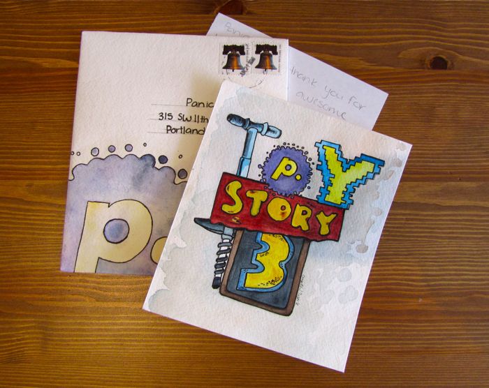
This post, however, is just an excuse to show off this beautiful thank-you card we received from a guest:

Thanks, Crystal. In our digital universe, it’s so refreshing to see some beautiful watercolors on actual paper!

Now, just because you don’t live in Portland, doesn’t mean you have to miss out on our fun. I’ve got a special surprise! We’re giving away one Toy Story 3 poster — and it’s signed by the director, Lee Unkrich!

Be the first in the comments to answer the following Toy Story trivia, and it’s yours for the taking.

“Pizza Planet pizza is likely to be delivered in what model of truck, yo?”

UPDATE: Congratulations to Brad in the comments for being the first with the correct answer: it’s a Gyoza!

Saving Icons for Snow Leopard

Monday, June 21st, 2010

Obsessive designer? You may have noticed: icons made in Mac OS X 10.6 are often washed-out/lighter.

Normally we create .png files of each icon state, then drag them into Icon Composer. But, starting with 10.6, the colors would lighten unexpectedly. It wasn’t dramatic, but with certain icons (like the one below) it was totally noticeable. The source is on the left. See how the red is washed out in the final icon on the right?

We spent a long time trying to figure this out, and the story goes something like this:

Mac OS X is a fully managed color system. Colors aren’t just RGB, but also include a colorspace that maps RGB to an abstract color. When any bitmap is drawn to the screen, it’s color-converted. But there’s always been a loophole: an image can be “untagged”, meaning it has no embedded colorspace information. Mac OS X interprets untagged data in respect to the default colorspace of the display.

Well, in 10.6, that default display colorspace changed quite a lot to be more Windows-like and less old-school Mac-like, which makes untagged images look more or less the same cross-platforms. The bad news? There’s no way to tag an icon with a colorspace, so icons from 10.5 looked odd — way darker — on 10.6. Apple’s solution? Icons in 10.6 are interpreted in the “Generic RGB” colorspace, an approximation of how it was.

In other words, old icons would look too dark with the colorspace changes in 10.6, but the Generic RGB colorspace being applied lightens them back to exactly what they looked like before. Problem solved?

Not if you’re drawing new icons on a 10.6 system that’s already using the darker colorspace! Since those new icons go through the same Generic RGB colorspace converserion, they’re lighter than they should be!

Ok, ok. So here are the steps we use to guarantee 10.6 icon color accuracy.

  1. With your final artwork open in Photoshop, choose Convert to Profile from the Edit menu.
  2. Choose Generic RGB Profile from the Profile pop-up.
  3. Do a Save for Web… to make a fresh, Generic RGB .png of the icon. (Uncheck ‘Convert to sRGB’!)
    (Warning: the QuickLook preview of this .png will look too dark in the Finder. Ugh. Do not be alarmed.)
  4. Drag your color-corrected .png into Icon Composer, and save.

That’s it! Your final icon, once the system applies the Generic RGB profile, should look exactly as you intended. One possible downside: now your icon will look too dark on 10.5! Hooray! :(

(Footnote: Even after solving this problem, Kenichi’s computer continued to shift the color of icons unexpectedly, lightening his icons. We re-installed Photoshop. We created a new user account. We re-installed Mac OS X. And finally, as a classic joke, I zapped the PRAM. Immediately, colors were rendering correctly. My jaw hit the floor. We rebooted, and colors were broken again. I was so disturbed by this, we just bought him a new machine.)

Coda Notes: a Safari Extension

Monday, June 7th, 2010

So, just a few moments ago, Apple introduced Safari 5, the next major version of our favorite web browser. And with Safari 5? Safari Extensions, a new way for developers to add new functionality to Safari.

And, also a few moments ago, we have our very first crack at a Safari extension! What is it?

Well, the pitch goes something like this: we do a pretty good job making life easier for people who hand-code websites using Coda, our all-in-one web development environment. But is there anything we can do to make life better for the client? The person who’s paying the bills, or the marketing person, or the guy or girl who’s likely to call you and say, “Hey, can you make that one thing bigger, move that one thing and do that thing? By tomorrow?” Nobody knows what that means. And that’s something we thought we could improve.

Introducing Coda Notes, our Safari Extension for website annotation, and a fun little project.

Coda Notes

When you install Coda Notes, you’ll get a new button in your toolbar. Click it to see all our annotation tools, built right into Safari. Draw some notes on your favorite website. Communicate changes, ideas, concepts, or problems. Then, when you’re done, hit the Send Notes button and the whole page flips over as a postcard.
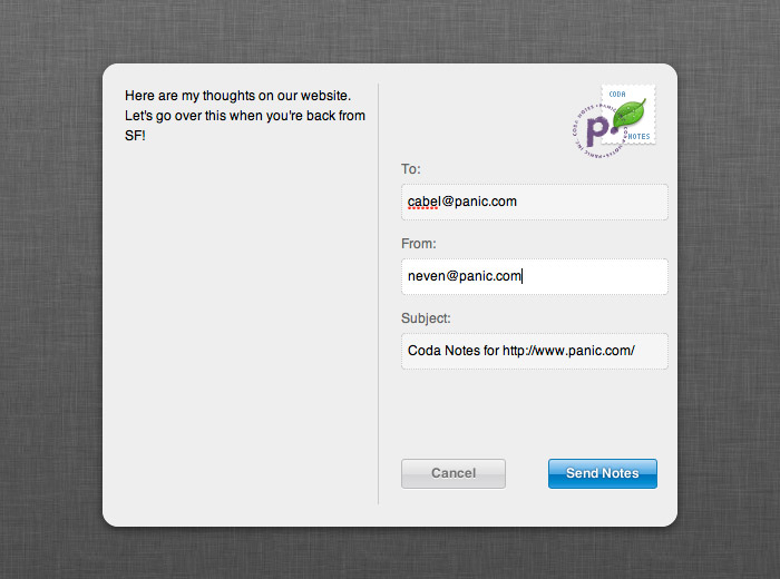
Enter your comments, e-mail addresses, hit the nice looking “Send Notes” button, and that’s it! The developer gets an e-mail with your screenshot and notes, instantly. In short, with Coda Notes, you can communicate in seconds what would have been much harder to communicate before, all without ever leaving Safari.

And let’s not forget cool thing #2: we literally added a new feature to Safari. In a standards-based, clean way. This, my friends, is awesome.

(Tech Note: The Coda Notes extension is built entirely in JavaScript, HTML, and CSS; the extension bar is basically an HTML file, and the page-flip effect is accomplished using a CSS transform. We draw on a transparent canvas element injected over the target page. Live text editing is done by setting the contentEditable attribute on the body of the page, thus turning Safari into an editor, similar to how Apple Mail works!)

When will this be available?

Update: Coda Notes is now available for download!

We’re feeling it out. It’s certainly “quick and dirty” in its current form, and Coda Notes was a bit of an experiment for us — made in only 4 days! But when Safari Extensions are more available to the public, it’s likely you’ll see Coda Notes too. Keep an eye on this blog and/or follow us on Twitter!

Thanks to Apple for letting us play with Safari Extensions, and thanks to Neven and Garrett for such great quick work on this project. If you have ideas for Coda Notes, let us know!

Quick Notes #4

Tuesday, June 1st, 2010

The Best Award

Monday, May 24th, 2010

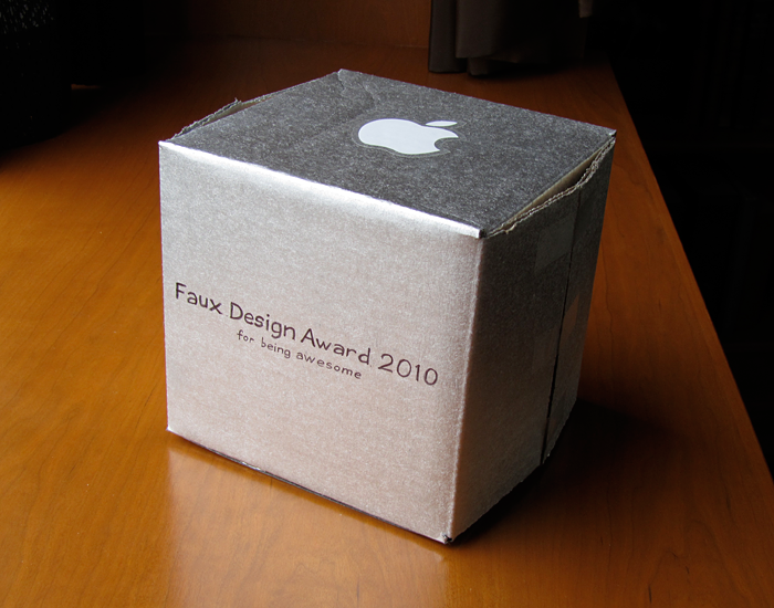
This came in the mail today.

May 11, 2010

Dear Panic folk,

When Apple announced that only iPhone apps would be eligible for the Apple Design Awards this year, I was pretty shocked. Every so often we wonder if Apple has forgotten about the Mac in favor of its iPhone OS devices. I really don’t think they have, but when they do something like this, it’s… well, a bummer. It does seem like most of the new cool apps coming out are iPhone-based, because while where are a lot of fantastic Mac apps, pretty much all the bases are covered at this point.

Still, it’s hard to ignore the fact that Transmit 4 just came out, so the timing is less than ideal.

I’ve been using Transmit since version 2. Before it came along, I had nothing but neutral feelings towards FTP programs. The best I could find was Fetch, and it, frankly, was terrible. I’m not exaggerating in the least in saying that Transmit has changed the way I work, and every version has just made it better. In addition, I could never live without CandyBar, and I love what you guys and The Iconfactory did when it was merged with Pixadex.

All this praise leads me to why I made this ridiculous box. Transmit 4 was a long time coming, and it was well worth the wait. The UI is possibly the best on the Mac, Transmit Disk has instantly proven invaluable to my work, and even the purchasing page on your website is gorgeous. The progress bar and transitions on the credit card icons were something I’ve never seen, and it proves that no developer pays attention to detail as much as Panic.

So for whatever it’s worth, since Apple cancelled the chance for you to win something that I have little doubt you would have won, I humbly present you with, again, this ridiculous Faux Apple Design Award.

And also some Pretzel M&Ms, because Cabel’s lamenting over the empty store display on Twitter made me sad, and I wanted to make sure he got to try them.

Anyway, thank you for all that you guys do, and I look forward to seeing what you come out with next.

Michael Salbato

We are very lucky to have such nice users.