I don’t know who designed the iOS “Unlocking” UI, but they did a pretty good job.

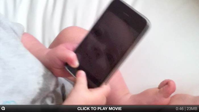
Joby just turned one. (And isn’t alone!)
I don’t know who designed the iOS “Unlocking” UI, but they did a pretty good job.

Joby just turned one. (And isn’t alone!)
Obsessive designer? You may have noticed: icons made in Mac OS X 10.6 are often washed-out/lighter.
Normally we create .png files of each icon state, then drag them into Icon Composer. But, starting with 10.6, the colors would lighten unexpectedly. It wasn’t dramatic, but with certain icons (like the one below) it was totally noticeable. The source is on the left. See how the red is washed out in the final icon on the right?
![]()
We spent a long time trying to figure this out, and the story goes something like this:
Mac OS X is a fully managed color system. Colors aren’t just RGB, but also include a colorspace that maps RGB to an abstract color. When any bitmap is drawn to the screen, it’s color-converted. But there’s always been a loophole: an image can be “untagged”, meaning it has no embedded colorspace information. Mac OS X interprets untagged data in respect to the default colorspace of the display.
Well, in 10.6, that default display colorspace changed quite a lot to be more Windows-like and less old-school Mac-like, which makes untagged images look more or less the same cross-platforms. The bad news? There’s no way to tag an icon with a colorspace, so icons from 10.5 looked odd — way darker — on 10.6. Apple’s solution? Icons in 10.6 are interpreted in the “Generic RGB” colorspace, an approximation of how it was.
In other words, old icons would look too dark with the colorspace changes in 10.6, but the Generic RGB colorspace being applied lightens them back to exactly what they looked like before. Problem solved?
Not if you’re drawing new icons on a 10.6 system that’s already using the darker colorspace! Since those new icons go through the same Generic RGB colorspace converserion, they’re lighter than they should be!
Ok, ok. So here are the steps we use to guarantee 10.6 icon color accuracy.
That’s it! Your final icon, once the system applies the Generic RGB profile, should look exactly as you intended. One possible downside: now your icon will look too dark on 10.5! Hooray! :(
The response to our launch of Transmit 4 this week has been beyond great; I was tearing up a little, reading all the nice things The Internet has had to say about our new little truck app. Thank you all – we’re proud of our work and our customers.
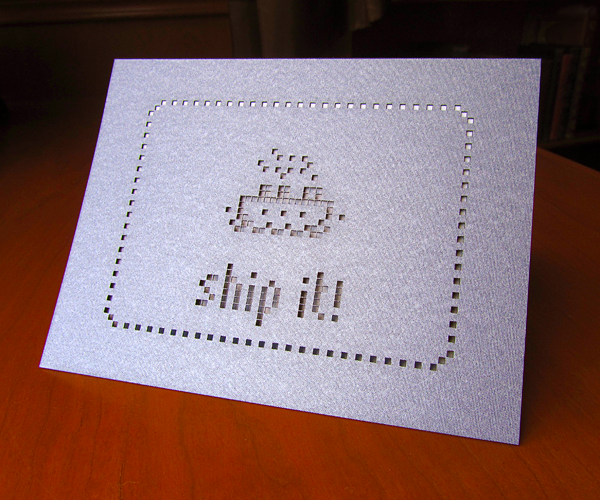
Maybe the best message of support and congratulations came about an hour before our midnight release. Long-time friend of Panic Sarah Holbrook delivered her custom-made cards to our loopy, Cocoa-and-Mtn-Dew™ fueled office.

No photo does justice to these silken, intricately detailed, laser-cut wonders. You’ll just have to see for yourself; you can do that by ordering some paper magic from Sarah’s awesome website, Candyspotting. We’re sure glad she invested in that garage-laser!
(Also, see the “Art Department” cut-out-style header at the top of this post? That’s not ‘shopped — it was literally laser cut by Sarah, then photographed by us; a fun Art Department experiment.)
Thanks, Sarah! And once again, thank you all!
Keita Takahashi, the creator of Katamari Damacy (the “roll stuff into a ball” game) and Noby Noby Boy (the “stretch a thing around other things” game), is an interesting study: he’s an artist in the traditional sense, making non-traditional video games, for a very traditional Japanese company.
Of course, you know we’re huge fans — we even improbably made a whole series of Katamari and Noby Noby Boy t-shirts together.
Recently, Keita and his team shipped Noby Noby Boy for the iPhone. What is it? Wh.. where do I begin? Take basic iPhone utilities — camera, music player, notes, etc. — then press them through the mind of a toddler, squeeze a couple drops of comedy, sprinkle a little ground physics engine, then coat them in pastel fondant. I’ll say this: the built in GPS function has the best music of any GPS, ever. Give it a try for $1.99.
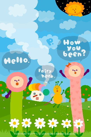
Anyway, to celebrate, Keita drew the following Panic/Noby wallpaper for readers of the Panic Blog.
Enjoy! We can’t wait to see what Keita comes up with next.

During research for the Panic 1982 Box Project, Cabel and I came across a unique Package Design Time Paradox: game boxes, made over 20 years ago, that look as if they could have been designed yesterday.
For the game developer Accolade, the period between 1984 and 1990 marked a serious and unbeatable streak of awesome. We’re talking bold, timeless art; none of this so-bad-it’s-good nonsense. Click ’em:
It’s obvious that all these games are from the same company, and yet the variety of illustration/photo/type styles is fabulous. That Killed Until Dead image: how understated and powerful is that? Who does that sort of classy thing with video game covers anymore? (No, really, who? Please feel free to tell us!) Take heed: the simplicity and clarity of these boxes has given them eternal life.
Note also that since these are very design-y, often abstract covers, there’s less potential for Box Disappointment™. I mean, Mr. Grumpy obviously won’t be there in photographic flesh when you fire up Mini-Putt; no one expects that. But his curmudgeonly spirit will be, regardless of how many pixels he’s built of. That’s what a product box should ideally do: make the product more badass.
Unfortunately, right around 1991, as Accolade began to hire Boris Vallejo as a cover artist, things became… a little too much badass. And a whole lot less timeless.
You had a great run, Accolade. I wonder who the art director was?
(All images found at the invaluable MobyGames.com. Oh, how many nostalgic hours we’ve spent there!)