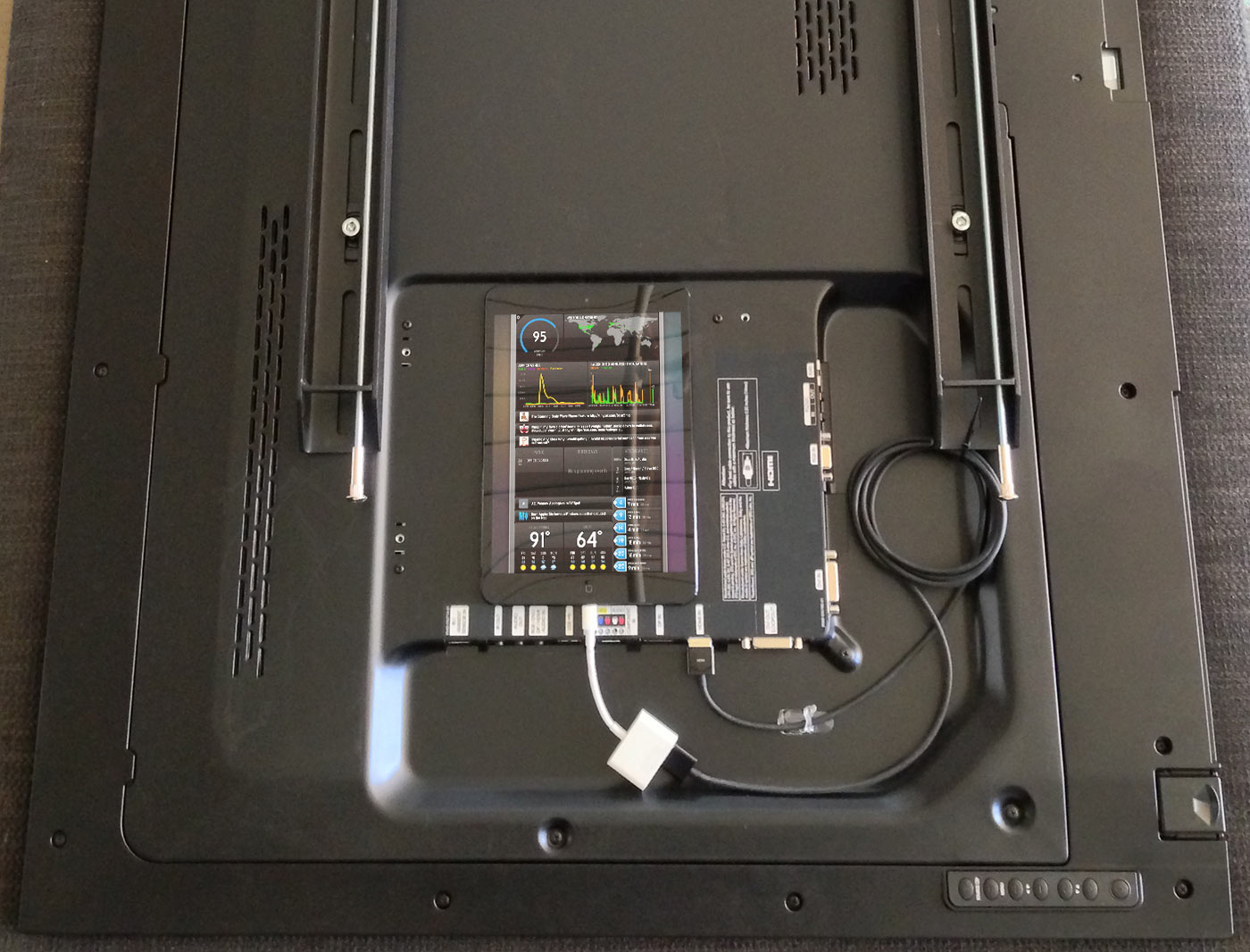
You might be familiar with where it all started: the status board we put on our Panic office wall in 2010.
Since then, as you may know, we turned that status board into an iPad app called Status Board. Now everyone can have a cool, beautiful, data-packed status board on their desk or wall.
And since we built the app, we rebuilt our status board, making it twice as good! (Literally.)
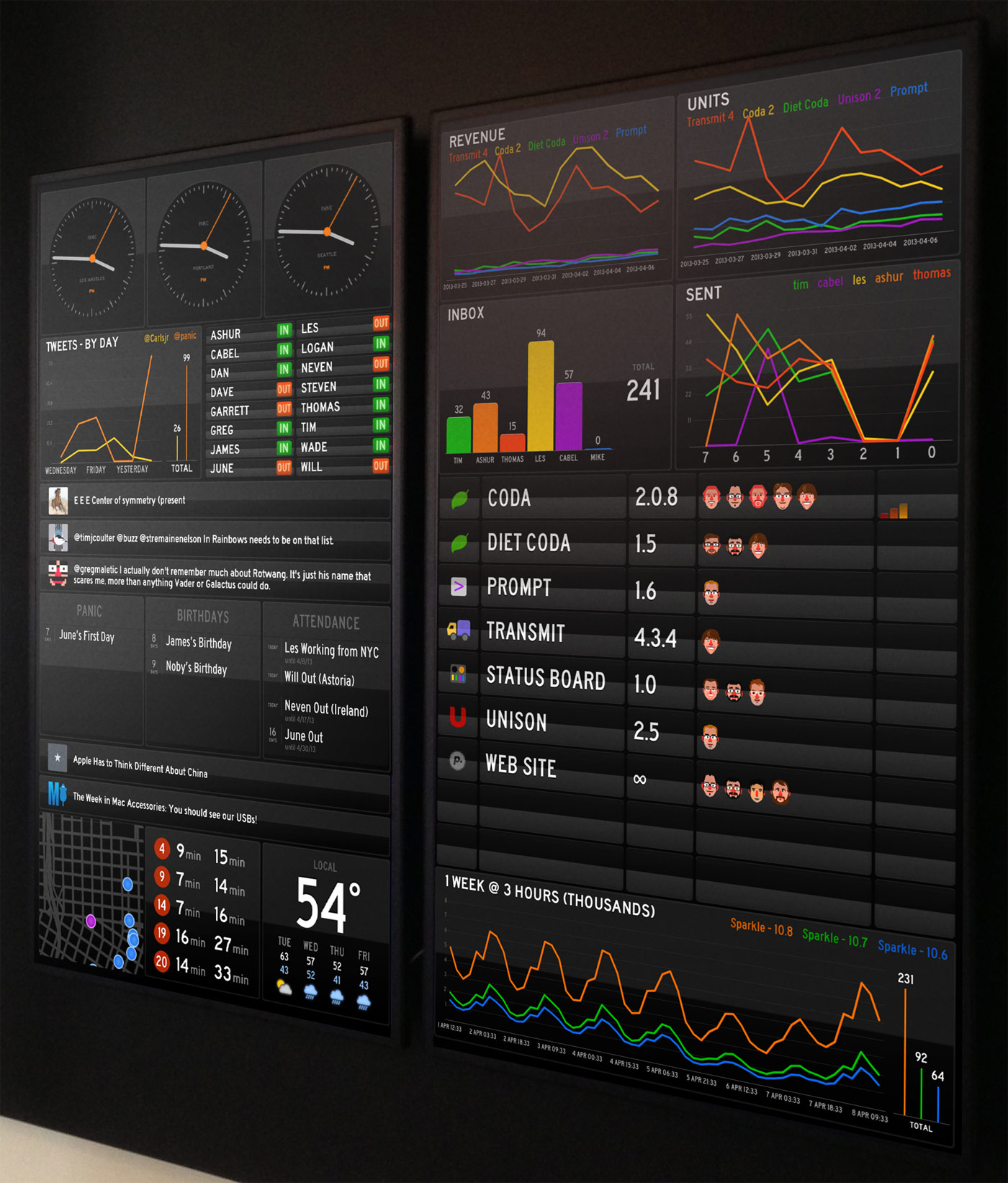
No, you’re not seeing double — this time we went with two goofy screens of stuff.
It’s pretty glorious.
About The Panels
Here are some implementation notes on our board:
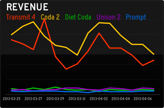
Traditionally Panic is quiet about how-are-we-doing data. It always feels like a possible distraction for our hard-working team. But we’re always changing, and this revenue
Graph panel has been fascinating. Every day a script totals up our direct sales data, then retrieves our App Store sales data using
AppFigures and their nice API. The totals get dumped into a database, and then we make that available via a simple PHP script that outputs JSON to the Status Board. That might sound tricky, but all told it took about a day of work to make happen.
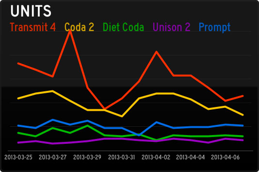
Units have been especially interesting since they reveal so much about the economics of (our) iOS software, as this
Graph panel shows. Although (our) iOS apps sell a respectable number of units, the revenue they bring in barely charts compared to our Mac stalwarts. So far! We’re working hard on improving our iOS apps, and trying new ideas, in order to crack the iOS market a little bit more. (Sorry this chart was pre-Status Board, which is doing well!) By the way, Graph documentation is
here.
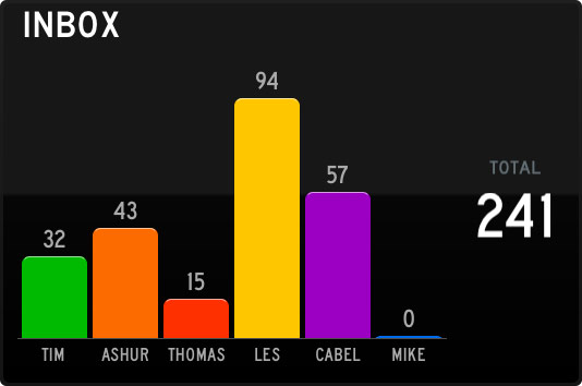
The Support team works tirelessly to fight this tide! This is just an
Email panel, which ties into our IMAP server. It took about 3 minutes to set up, and has been incredibly useful to see what our support load is at a very quick glance. (On the server, each Support person shares a single “Help” IMAP account, which has folders for each support person, and a script distributes the incoming support requests round-robin style.)
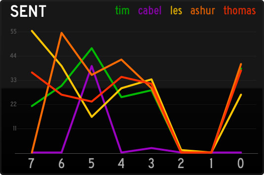
Conversely, this
Graph panel this is a great way to quickly see how many support responses are going out the door. (Of course, it’s not a competition — it’s just for fun.) To get accurate Sent counts, we have a script that looks at both outgoing Twitter replies, and outgoing e-mails, and totals them up per-person into JSON.
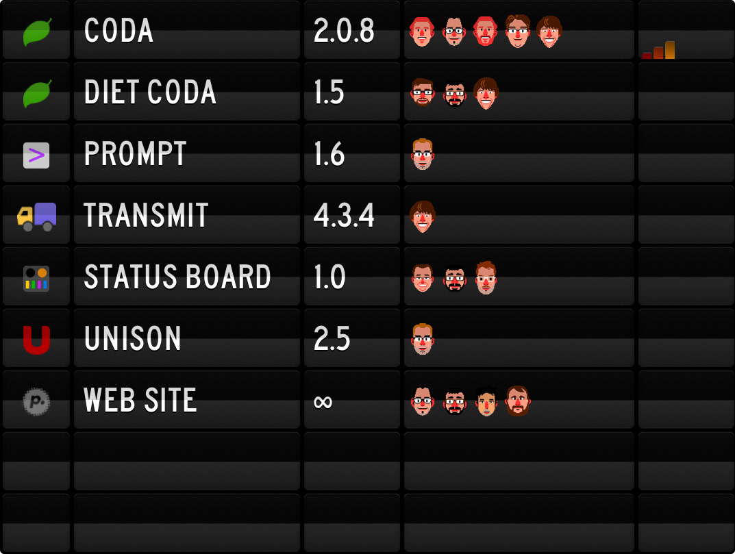
This list is using our
Table panel, connecting to an HTML file on our server. (Table documentation is
here.) This is an edited version to protect our secret projects, of course. A project list is always tricky, since it’s the most manually-updated thing on the board, and always runs the risk of being stale. But, it’s fun to see who’s working on what.
What version of OS X are our users using? Using
StatHat, which lets you track data incredibly quickly, I added one line of code to our PHP script that handles Sparkle updates. StatHat can output to Status Board natively via the
Graph panel. Boom: instant OS version graph. (Also, fascinating how people use our Mac apps during the day, and not very much on the weekend.)
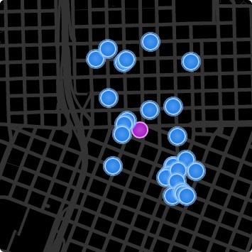
This is our
car2go map, so we can quickly see if there are any cars near the office that we can hijack and drive home at the end of the day. It’s totally custom — we’re using the
Do-It-Yourself panel so it’s just a little web page on our server. We signed up for the car2go API and combined their data with Google maps and some nice CSS animation. If enough people are interested, we might make this available to others. (Does your city have car2go?)
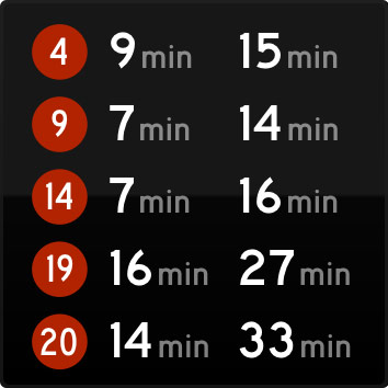
This is another
Do-It-Yourself panel to show everyone’s bus lines. Sometimes end-of-the-day conversations are abruptly interrupted when we notice a bus is nearby. Logan has more recently made his own
TriMet panel that we like a lot.
Of course, we’re also using the stock Weather, Twitter, and RSS panels for different things. And naturally, the Clock, to show the current time in Portland, Seattle, and San Francisco. You know, for conference call scheduling.
Hardware Notes
- This time, we chose the Samsung DE55A 55″ Professional Display. Bright, thin bezel, built to stay on.
- To cover up the Samsung logo, we used a piece of black non-glare artist tape. (Electrical tape was too shiny.)
- We installed a double gang outlet in the wall, to support 2 TV’s and 2 iPad chargers. Permanent power.
- We applied 3M Magnet Tape to the back of our iPads. They just stick right to the back of the display:

As people continue to build new things, our Status Board seems to change every week. Since taking these photos we’ve already added GoSquared, SNMP traffic graphs, and much more. That’s the best/worst thing about Status Board: it’s now so easy to make a cool Status Board that it’s hard to know when to stop. But hey, it’s fun!
If you’ve used Status Board to make a cool status board, send us a photo!
 Unison — our excellent OS X app for accessing Usenet Newsgroups and the many wonders and mysteries contained within — has reached the end of its road after years of faithful service.


 Over a year ago, I wrote a blog post about Coda and Sandboxing.
 Traditionally Panic is quiet about how-are-we-doing data. It always feels like a possible distraction for our hard-working team. But we’re always changing, and this revenue Graph panel has been fascinating. Every day a script totals up our direct sales data, then retrieves our App Store sales data using
  Units have been especially interesting since they reveal so much about the economics of (our) iOS software, as this Graph panel shows. Although (our) iOS apps sell a respectable number of units, the revenue they bring in barely charts compared to our Mac stalwarts. So far! We’re working hard on improving our iOS apps, and trying new ideas, in order to crack the iOS market a little bit more. (Sorry this chart was pre-Status Board, which is doing well!) By the way, Graph documentation is
  The Support team works tirelessly to fight this tide! This is just an Email panel, which ties into our IMAP server. It took about 3 minutes to set up, and has been incredibly useful to see what our support load is at a very quick glance. (On the server, each Support person shares a single “Help” IMAP account, which has folders for each support person, and a script distributes the incoming support requests round-robin style.)
 Conversely, this Graph panel this is a great way to quickly see how many support responses are going out the door. (Of course, it’s not a competition — it’s just for fun.) To get accurate Sent counts, we have a script that looks at both outgoing Twitter replies, and outgoing e-mails, and totals them up per-person into JSON.
 This list is using our Table panel, connecting to an HTML file on our server. (Table documentation is
 This is our
  This is another Do-It-Yourself panel to show everyone’s bus lines. Sometimes end-of-the-day conversations are abruptly interrupted when we notice a bus is nearby. Logan has more recently made his own